type directors club - exposition typographique internationale - 15 mars > 26 avril - type directors club - exposition typographique internationale - 15 mars > 26 avril - type directors club - exposition typographique internationale - 15 mars > 26 avril -
retour catégorie page accueil TDC Type Directors Club

Tangible Type

This is an experimental and interactive set of type components that enables users to bring physical gestures into the whole letter set. Each component was found by breaking and tweaking the typeface Avenir into seven essential letter parts: Stroke, Diagonal, Counter, U shape, Shoulder, Terminal, and Spine. Utilizing bidirectional flex sensors and silicone controllers, the project explores the boundary between the physical and digital space, which enables more intuitive typographic interaction.

Tangible Type TDC ECV

Design
Hyeong Geun Song
Providence, Rhode Island

URL
hnrysng.com

Advisors
Cem Eskinazi
Hammett Nurosi

School
Rhode Island School of Design

Principal Type
Avenir

Dimensions
Various

Voir aussi dans la même catégorie

retour catégorie page accueil TDC Type Directors Club

Bonsai Beer

With support from the Shunkaen Bonsai Museum, Bad Preacher and Wang Yuan selected nine bonsai for each season and artistically integrated them into sceneries. The font of the brand’s Chinese name is also designed by borrowing the form of the bonsai. The poster design takes a bold approach to introduce the idea of a label, which prioritizes the purpose of branding by enlarging the basic information of the product. Pictorial and literal information, after being embedded into abstracted geometrical shapes, is reasonably categorized for people to read and digest while it delivers a sense of beauty in both function and form.

Bonsai Beer TDC ECV
Bonsai Beer TDC ECV
Bonsai Beer TDC ECV

Design and Art Direction
Bad Preacher
Wang Yuan
Shanghai

URLs
studioyuan.com
badpreacher.co

Design Firm
Auf Dich

Client
Tasteroom

Principal Type
Antique Olive Regular
Custom Chinese Typeface

Dimensions
22.8 x 32.2 in.
(58 x 81.8 cm)

Voir aussi dans la même catégorie

retour catégorie page accueil TDC Type Directors Club

PORT Magazine “Der CONTENT ist der CONTENT”

The PORT is an annually published student magazine with a changing main topic. Projects from all faculties are showcased. It was particularly important to us in 2019 to counter the lack of exhibition space at our university while questioning the magazine’s ability to be an exhibition or (even) an archive. We felt that the depicted works should be shown as authentically as possible so as to offer genuine insight into the projects that is not overshadowed by the design of the magazine itself. In order to represent the varied works from different fields, we worked with the Artivive app. This augmented reality feature enabled us to digitally expand the analog, two-dimensional medium and made it multidimensional to reflect the character of every project in a more vivid way.

PORT Magazine “Der CONTENT ist der CONTENT”

Design
Carla Baumeister
Antonia Dieti
Coco Lobinger
Weimar, Germany

Professor
Ricarda Löser

School
Bauhaus-Universität Weimar

Principal Type
Neue Haas Unica
Neue Machina

Dimensions
9.5 x 13 in.
(24 x 33 cm)

Voir aussi dans la même catégorie

retour catégorie page accueil TDC Type Directors Club

Lo—TEK: Design by Radical Indigenism

In an era of high-tech and climate extremes, we are drowning in information while starving for wisdom. Enter Lo—TEK, a design movement building on indigenous philosophy and vernacular infrastructure to generate sustainable, resilient, nature-based technology. With four chapters spanning mountains, forests, deserts, and wetlands representing twenty countries, this book explores millennia-old human ingenuity on how to live in symbiosis with nature. The copper color reflects precious, ancient knowledge, sophisticated and pure as the Swiss brochure binding. This interactive book features an altitude ruler that links to the bars visible on the book block.

Lo—TEK: Design by Radical Indigenism

Design
Claudine Eriksson and Piera Wolf
Brooklyn, New York, and Zürich

Art Direction
Claudine Eriksson
Julia Watson
Piera Wolf

Illustrations
Berke Yazicioglu

Author
Julia Watson

URL
w-e.studio

Design Studio
W—E studio

Client
Taschen

Principal Type
Favorit Std
Favorit Std Mono

Dimensions
6.7 x 9.6 in.
(17 x 24.4 cm)

Voir aussi dans la même catégorie

retour catégorie page accueil TDC Type Directors Club

Maison Dentaire—No32

Maison Dentaire is a dental clinic run by two partners from different generations, blending heritage and youth to form an old-school reminiscing celebration. The creative intention behind the rebranding of the clinic was to convey a feeling of establishment, confidence, and experience, as well as a youthful, straightforward attitude. This was done through a gritty and genuine tone of voice and a crisp yet daring type treatment.

Maison Dentaire—No32 TDC ECV

Design and Creative Direction
Emanuel Cohen
Montréal

Art Direction and Creative Strategist
Mariane Vaillancourt

URL
studiojuly.co

Instagram
@studiojuly.co

Studio
Studio July

Client
Maison Dentaire

Principal Type
Gascogne Light
Swiss 721 Extended

Dimensions
Various

Voir aussi dans la même catégorie

retour catégorie page accueil TDC Type Directors Club

Sets Sets Sets

sets.raoulgottschling.de was created as a platform to showcase personal and professional passion projects within a single medium. It combines DJ sets that were recorded over the past five years but never shared outside a small circle and type sketches that were collecting dust in drawers and digital folders. This is an interactive type specimen that also showcases music or a playlist that also showcases type. In many ways, music and typography speak a similar language. Developing both outside a commercial environment allowed for a deeply ingenious approach.

Sets Sets Sets TDC ECV

Type Design and Layout
Raoul Gottschling
New York and Berlin

Development
Marco Land

Music
PLANETZ (Sven Dübbers and Raoul Gottschling)

URL
raoulgottschling.de

Design Firm
Raoul Gottschling

Principal Type
1972
G3O
Kurve Grotesk
La Nord
La Nord Serif
Literal
Willoughby

Voir aussi dans la même catégorie

retour catégorie page accueil TDC Type Directors Club

Almost

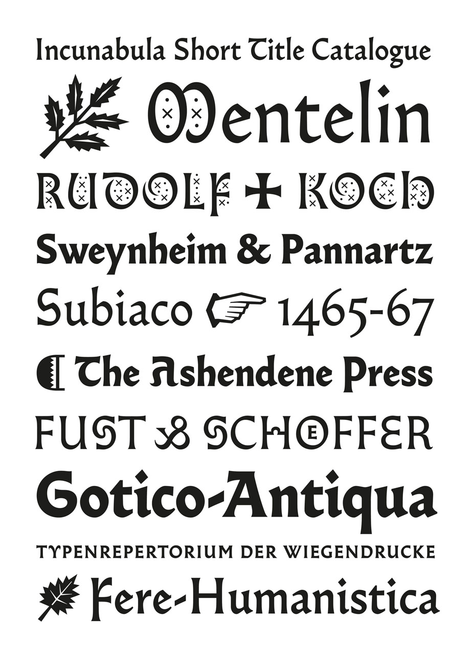
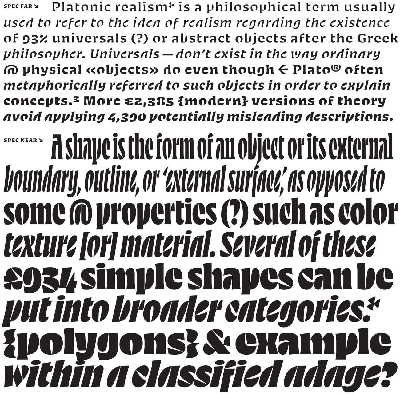
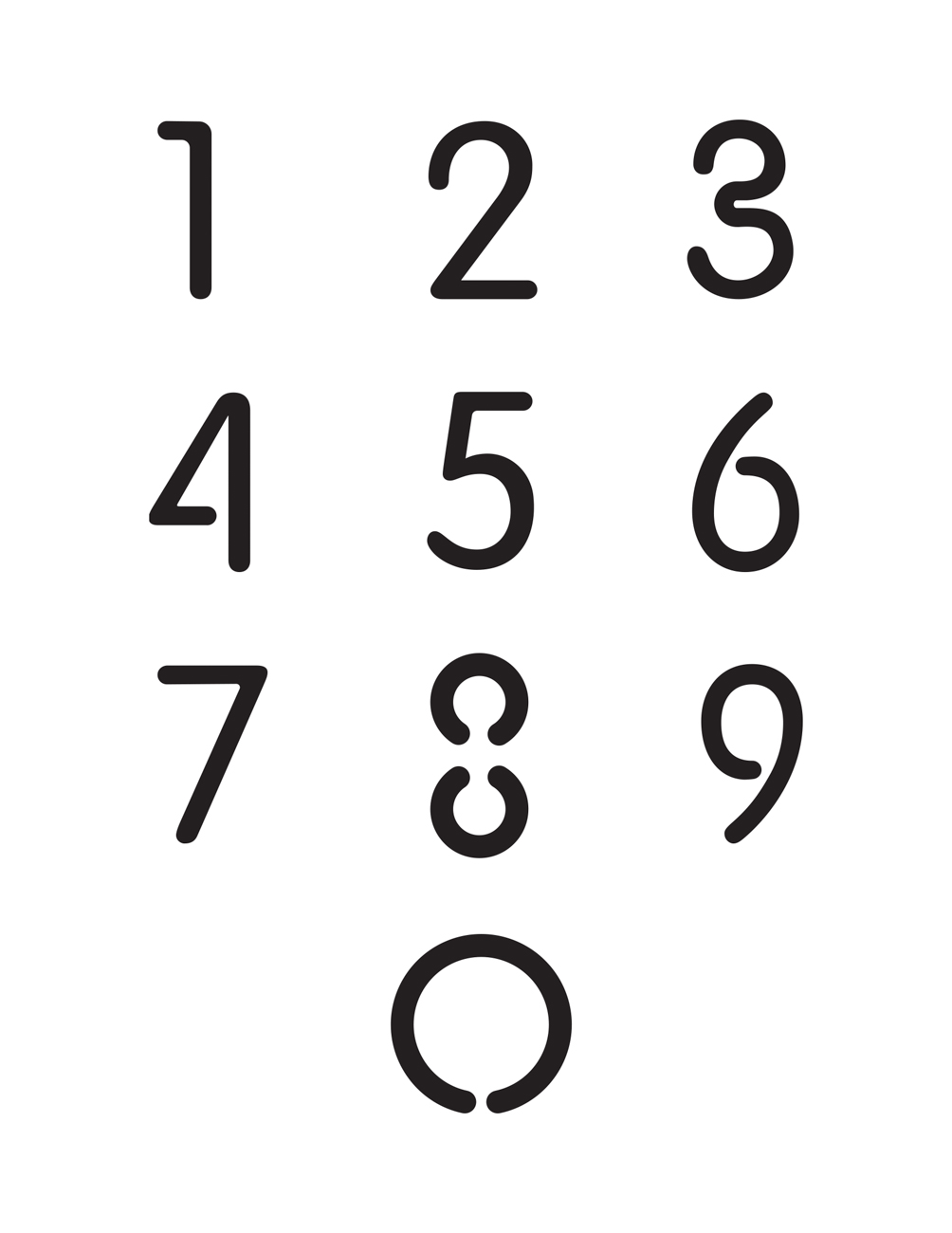
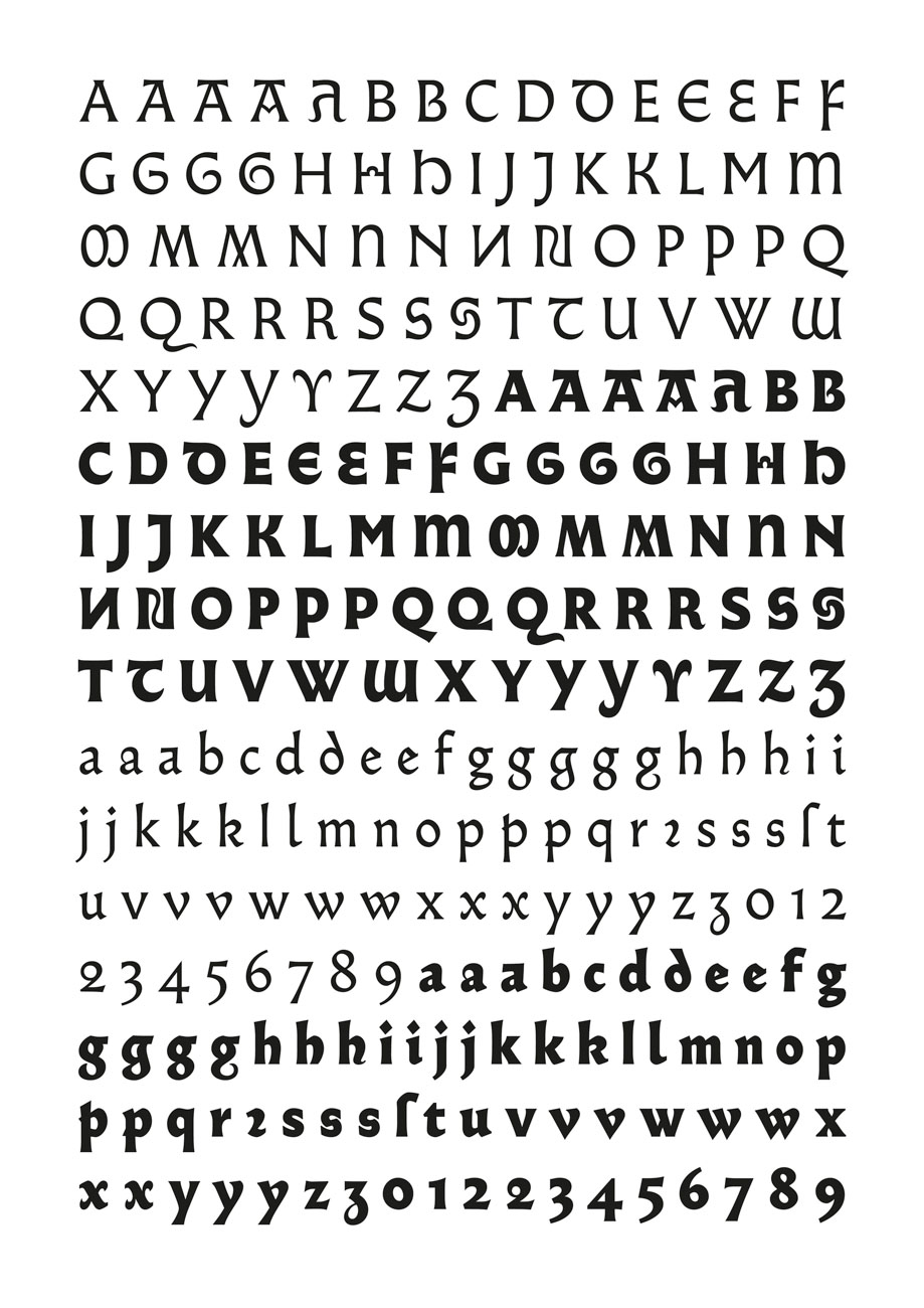
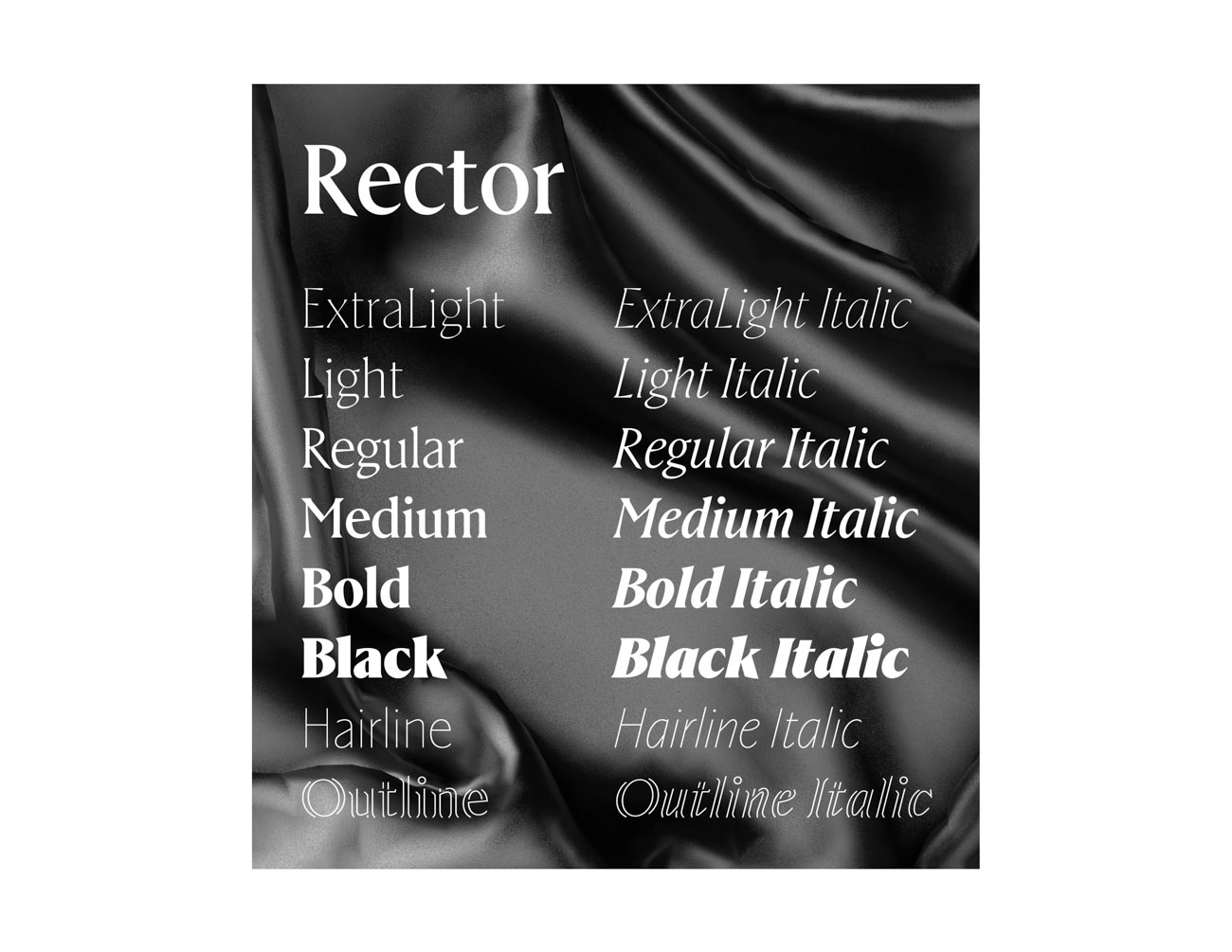
Almost is a typeface between gothic and roman. It was designed by Jérôme Knebusch in five weights and many alternates. They can be endlessly combined, taking either a roman or gothic direction, without falling in a strong, broken script nor becoming a “pure” roman design. Above, uncialesque and bizarre (Byzantine) letterforms and a full set of initials complete the fonts. All take their inspiration in the fifteenth century, specifically in the period of 1459–1482 with Gotico-Antiqua typefaces, like the Durandus of Fust & Schöffer, the first type to present a humanistic tendency. A few years later, Sweynheim & Pannartz used a type in Subiaco that some consider to be the first roman, although gothic influences remain clearly visible. Roman type was finally defined in 1469–1470 in Venice by the de Spira brothers and Nicolas Jenson. But roman did not precipitate the death of gothic forms; mixtures of gothic and roman were tried out and the two coexisted for some time. Almost is an homage to these types, which represent a unique, transitory moment in history of typography.

Almost TDC ECV

Typeface Design
Jérôme Knebusch

Publisher
Poem, Frankfurt am Main, Germany

URL
poem-editions.com

Twitter
@poem_editions

Voir aussi dans la même catégorie

retour catégorie page accueil TDC Type Directors Club

Birra Saison

Concept A single-style display typeface, an act of play and a search for pleasure. It starts an argument with consistency. It is not a servant of legibility. It will not be your problem solver, your workhorse, or your crystal goblet. And don’t you ever dare calling it a “tool”! Why design it or use it? Well, the real question is why not? Birra Saison is to be published as part of the Birra type flight by Darden Studio in early 2020.

Birra Saison TDC ECV

Typeface Design
Viktoriya Grabowska
Poznań, Poland, and New York

Foundry
Darden Studio

URLs
viktoriyagrabowska.com
dardenstudio.com

Twitter
@vika_grabowska
@dardenstudio

Voir aussi dans la même catégorie

retour catégorie page accueil TDC Type Directors Club

Falling Script

Falling Script is an experimental font that adapts Latin type to the vertical orientation used in various Asian scripts. Since Western script developed in a horizontal style, it had to be reexamined to determine what would look natural in vertical writing. When letters are written vertically, the weight distribution of the strokes goes mainly from top right to bottom left. That creates different stem proportions from those of typical scripts. Another particular challenge was creating this script’s continuous style. My solution: categorizing the characters into four groups. The shape of the characters is determined by the character that follows.

Typeface Design
Masahiro Naruse
New York

URL
masahiro-n.com

Instagram
@rohisamaseruna

Copywriter
Stephen Singerman

Voir aussi dans la même catégorie

retour catégorie page accueil TDC Type Directors Club

Spec

Spec shows both the graphic and functional sides of abstraction. Half of the family is designed for short-distance viewing, and the other half is for long-distance: Spec Near and Spec Far. Near compresses the alphabet, simplifying shapes and crunching the letter widths. Far interprets the same shapes in an even cruder manner. Across the family, Spec lets the reader’s mind do some of the work.

Typeface Design
Ryan Bugden
Brooklyn, New York

URL
ryanbugden.com

Twitter
@rynbgdn

Instagram
@ryanbugden

Professors
Erik van Blokland
Paul van der Laan
Peter Verheul

School
Master TypeMedia
KABK, Royal Academy of Art

Voir aussi dans la même catégorie