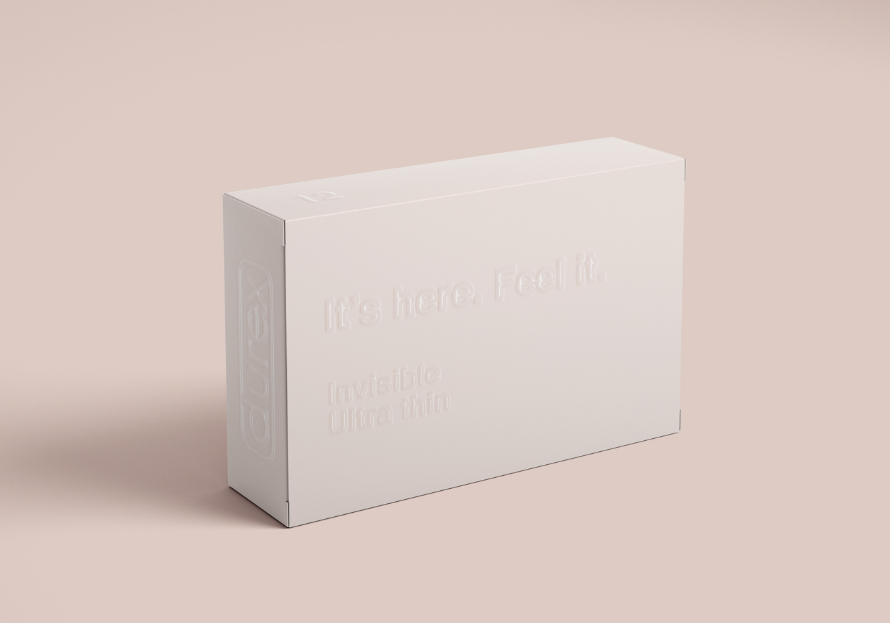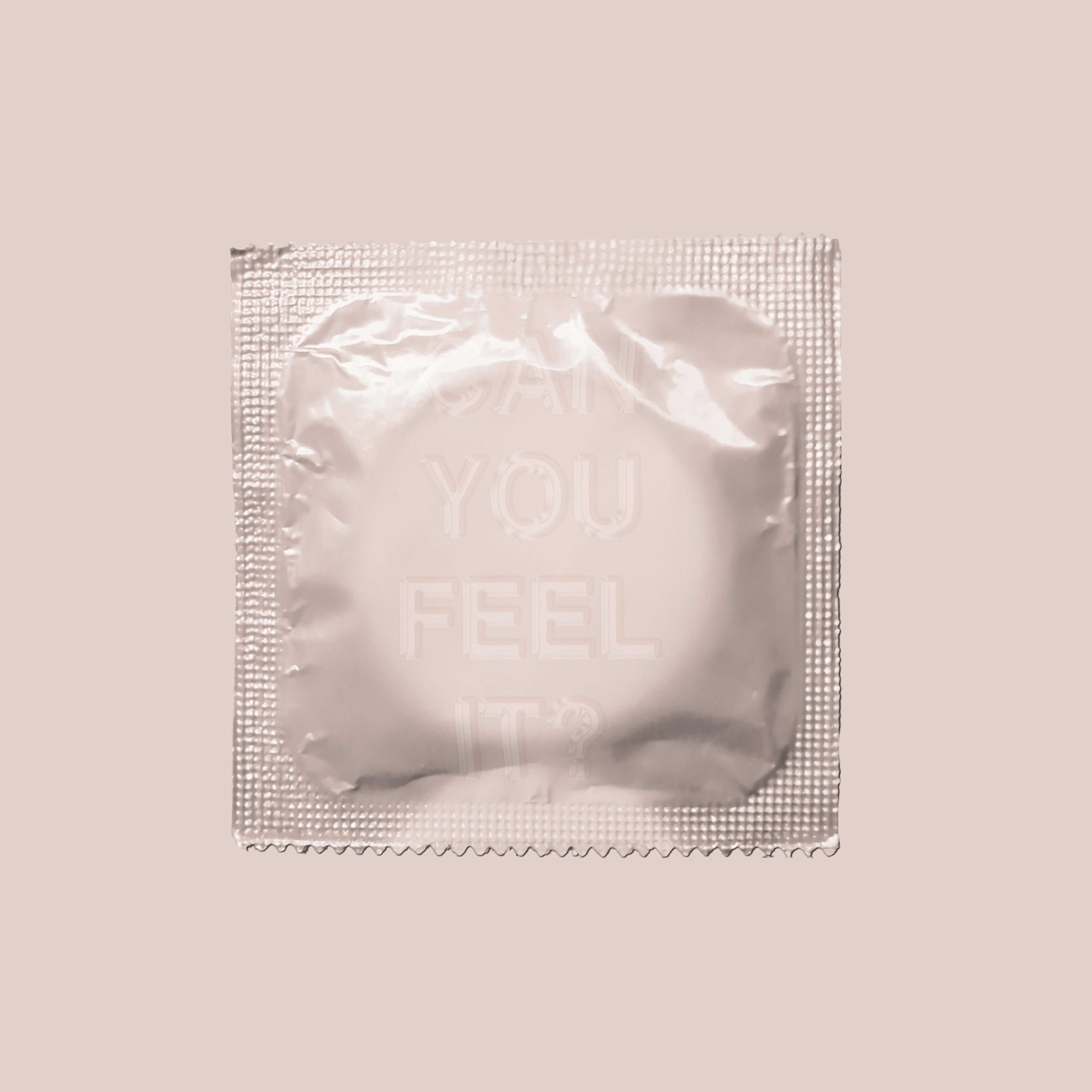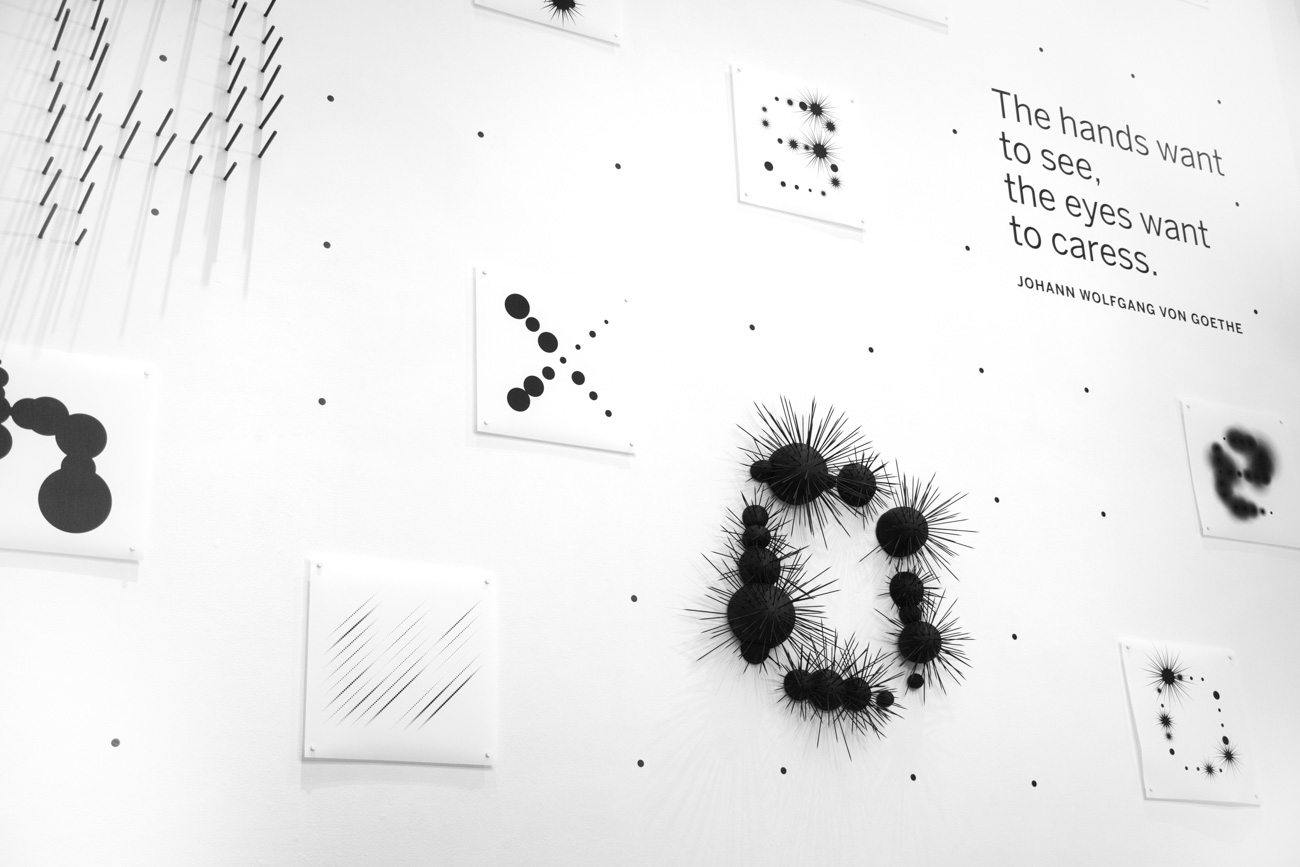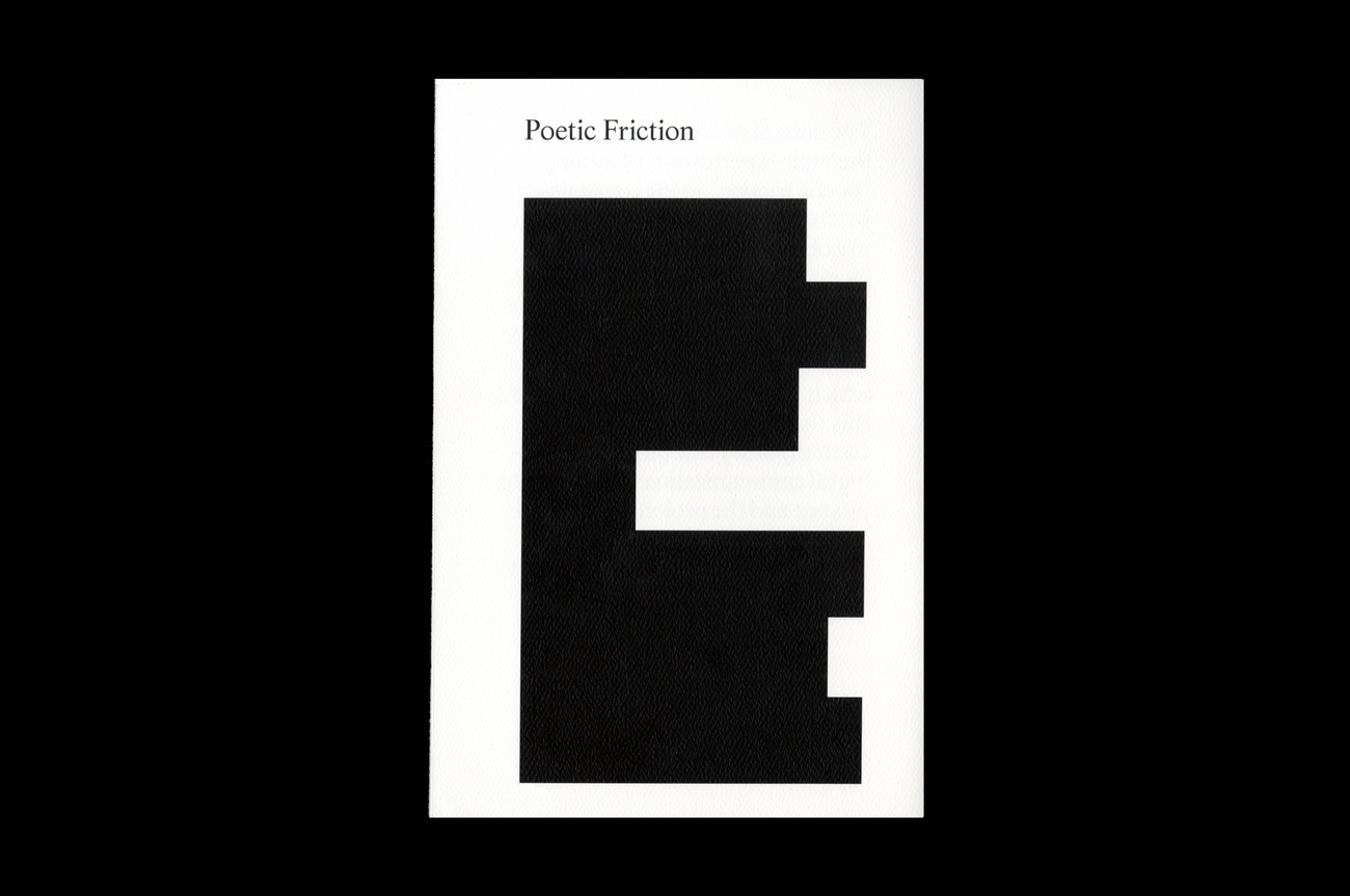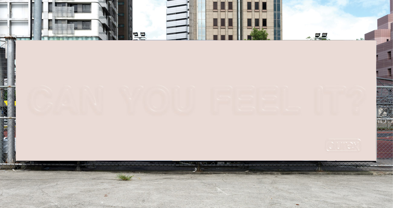
Durex “Invisible”
Sex is interesting, but condoms are not. I designed advertisement and packaging for Durex “Invisible” condoms with textured and illegible typography. I was inspired by the material and thinness of condoms. I used copy like “It’s here. Feel it” and “Can you feel it?” to emphasize this concept of thinness and invisibility. This is to invite people to touch and feel the words so they can experience the product before buying. The feeling of the text can also help people imagine what they will feel sexually when using the product.