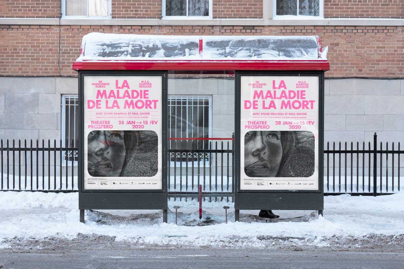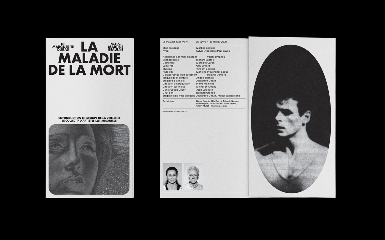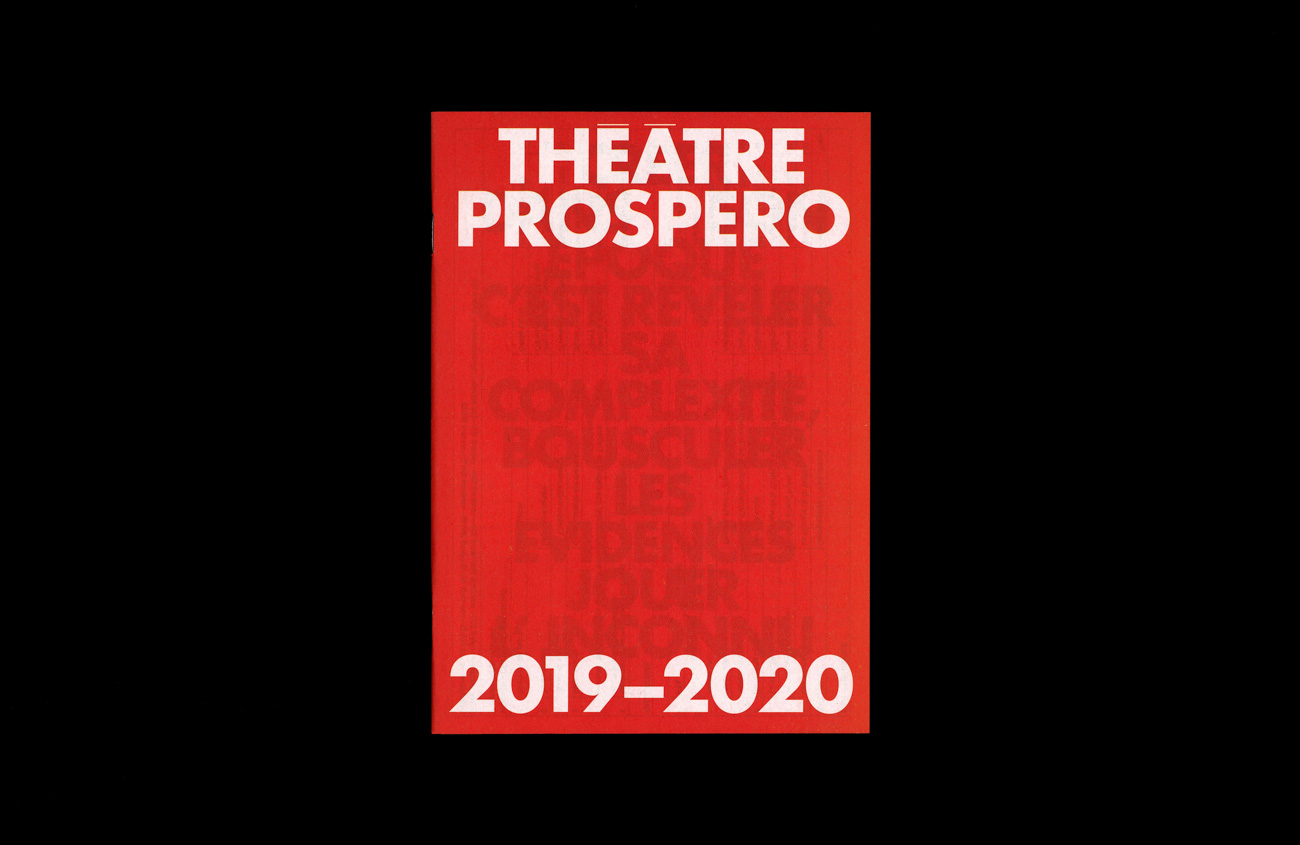
Théâtre Prospero—Saison 2019–2020
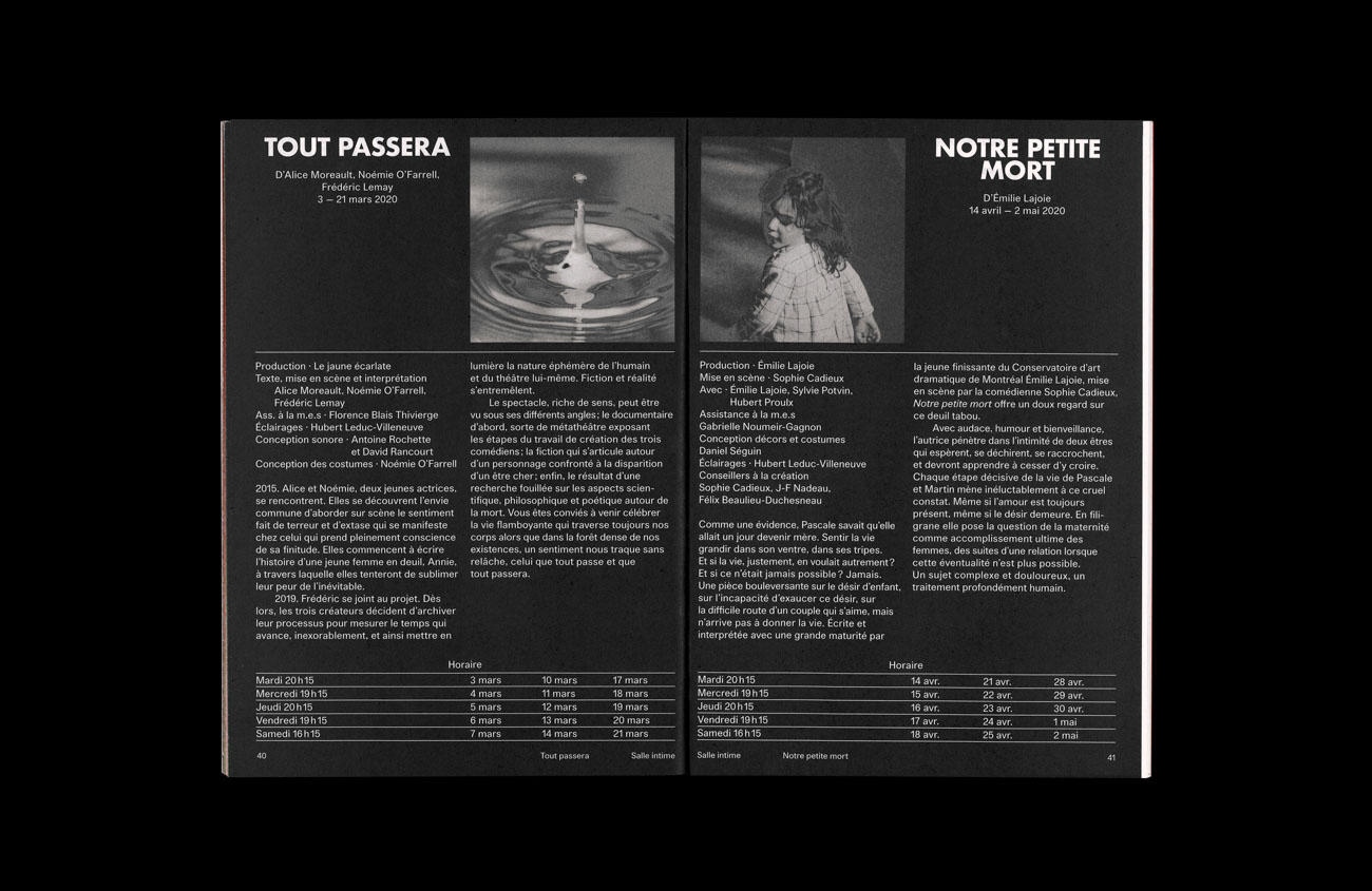
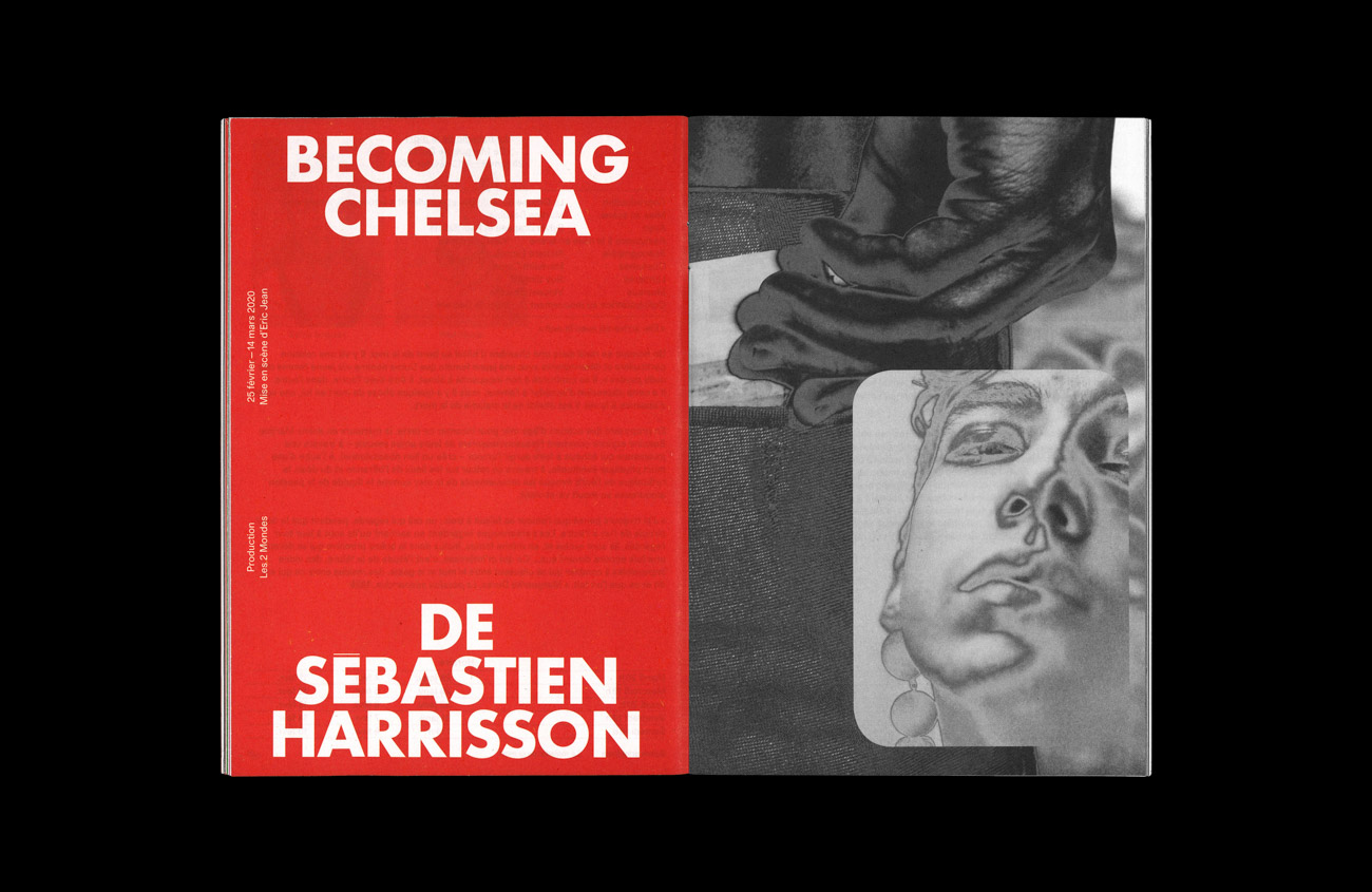
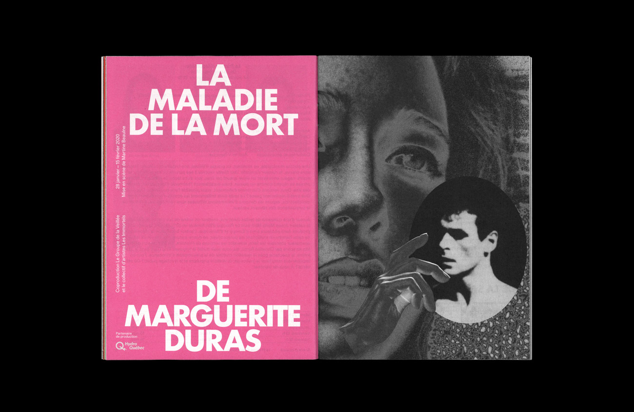
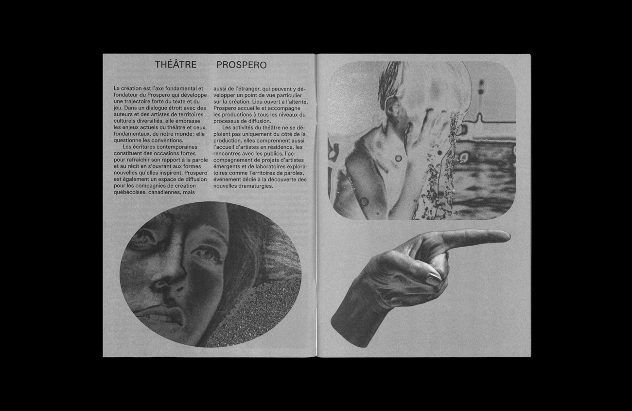
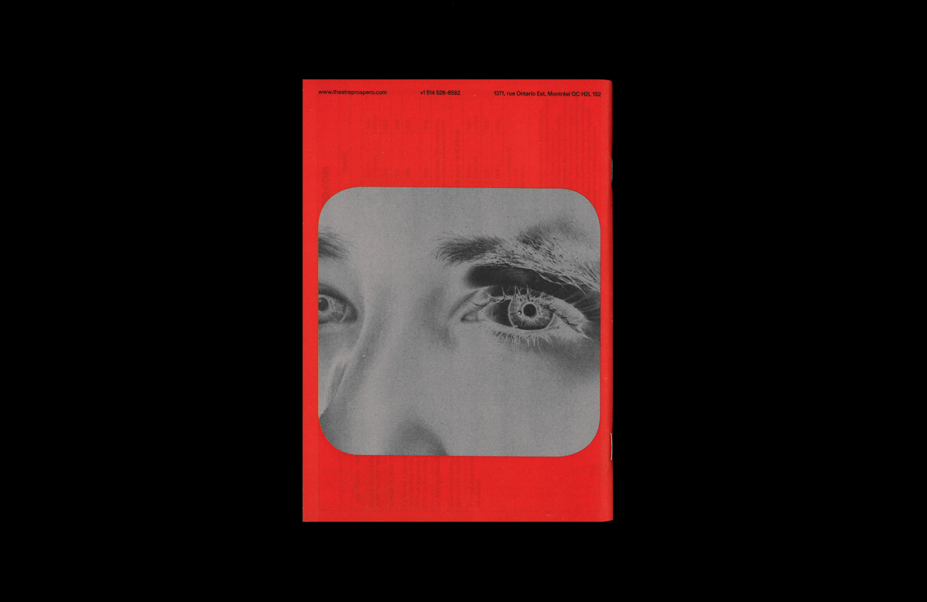
The main feature of Prospero’s 2019–2020 season is the use of a surreal photographic transformation technique known as the Sabattier effect, more commonly known as pseudo-solarization. The images accompanying the program all have a silver finish, distancing them from our reality. This inversion of tonalities, where light becomes dark and dark becomes light, underlines the theater’s mission of openness to otherness and the unknown.