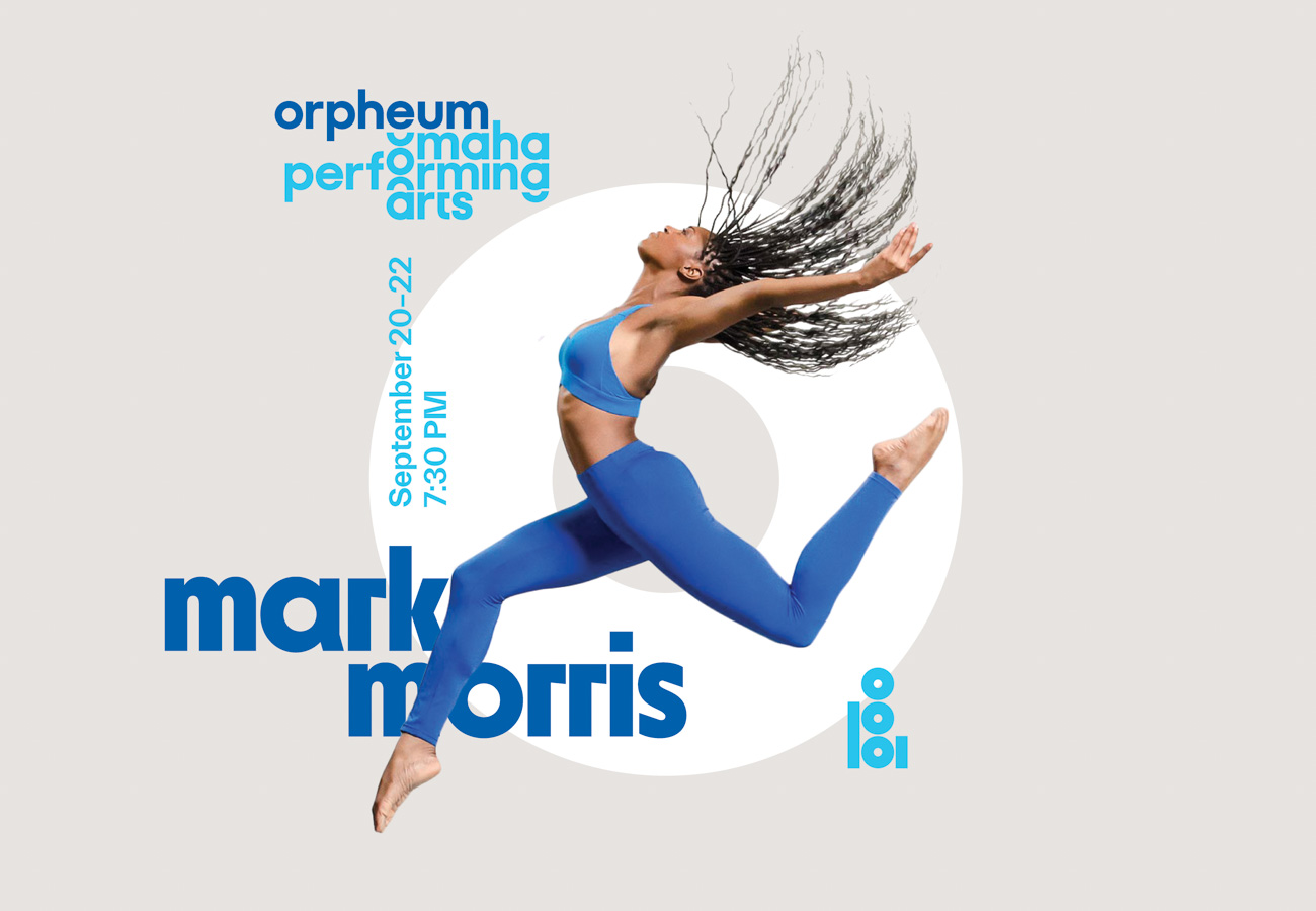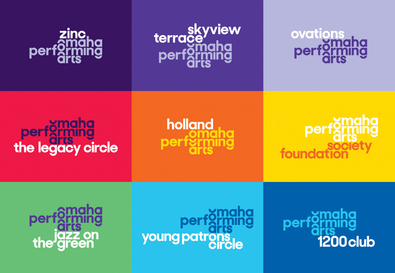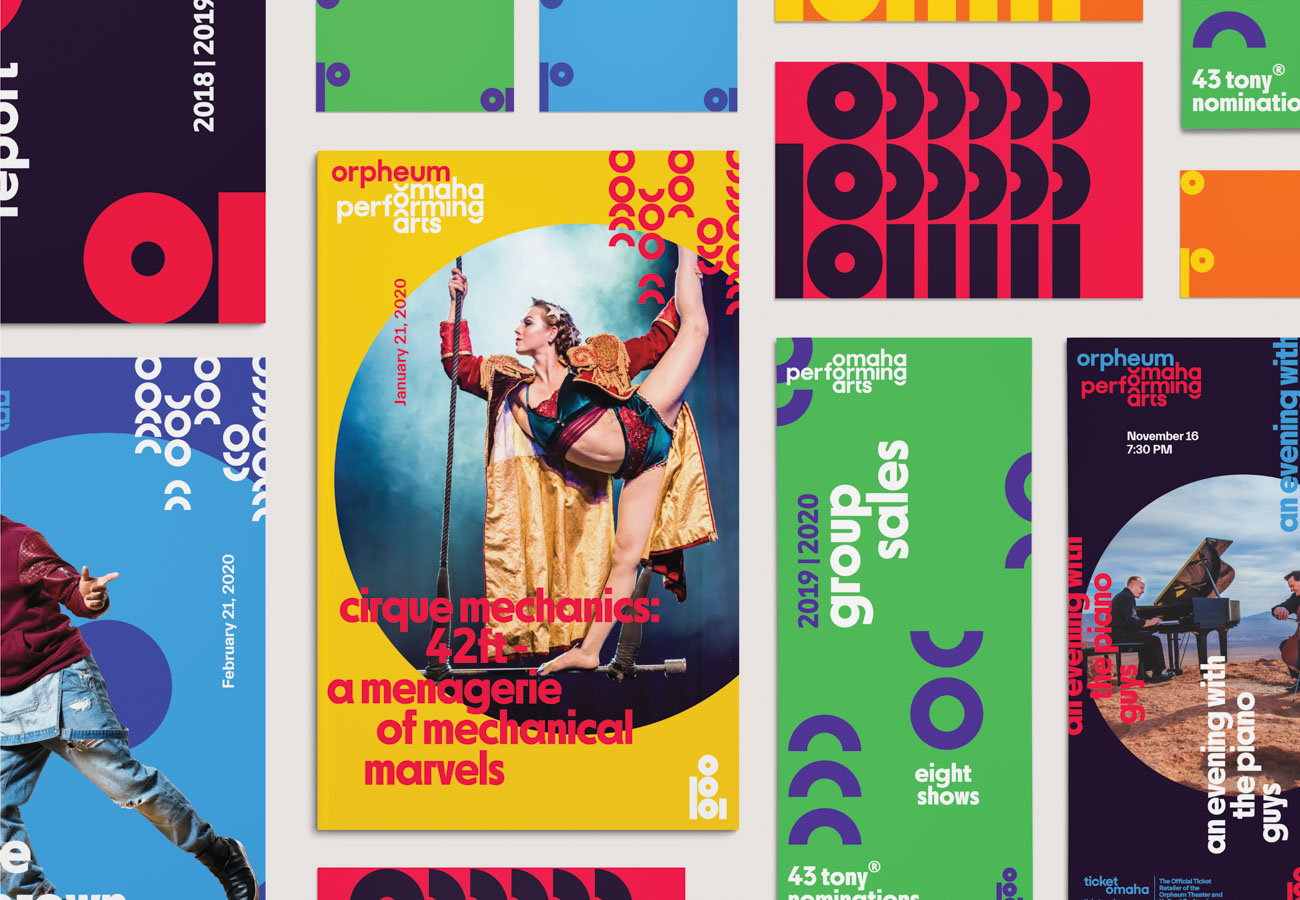
Omaha Performing Arts
Omaha Performing Arts is centered on performance. But more importantly, it takes great pride in the community of Omaha. The core of the mark is a geometric O, stemming from the word “Omaha.” It echoes throughout each of the letterforms in its acronym: opa. The visual system celebrates the life and soul of this incredible institution.