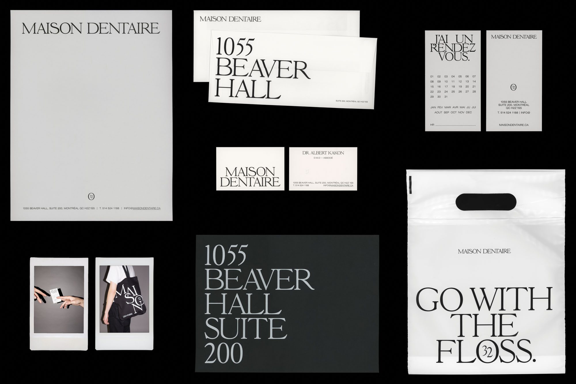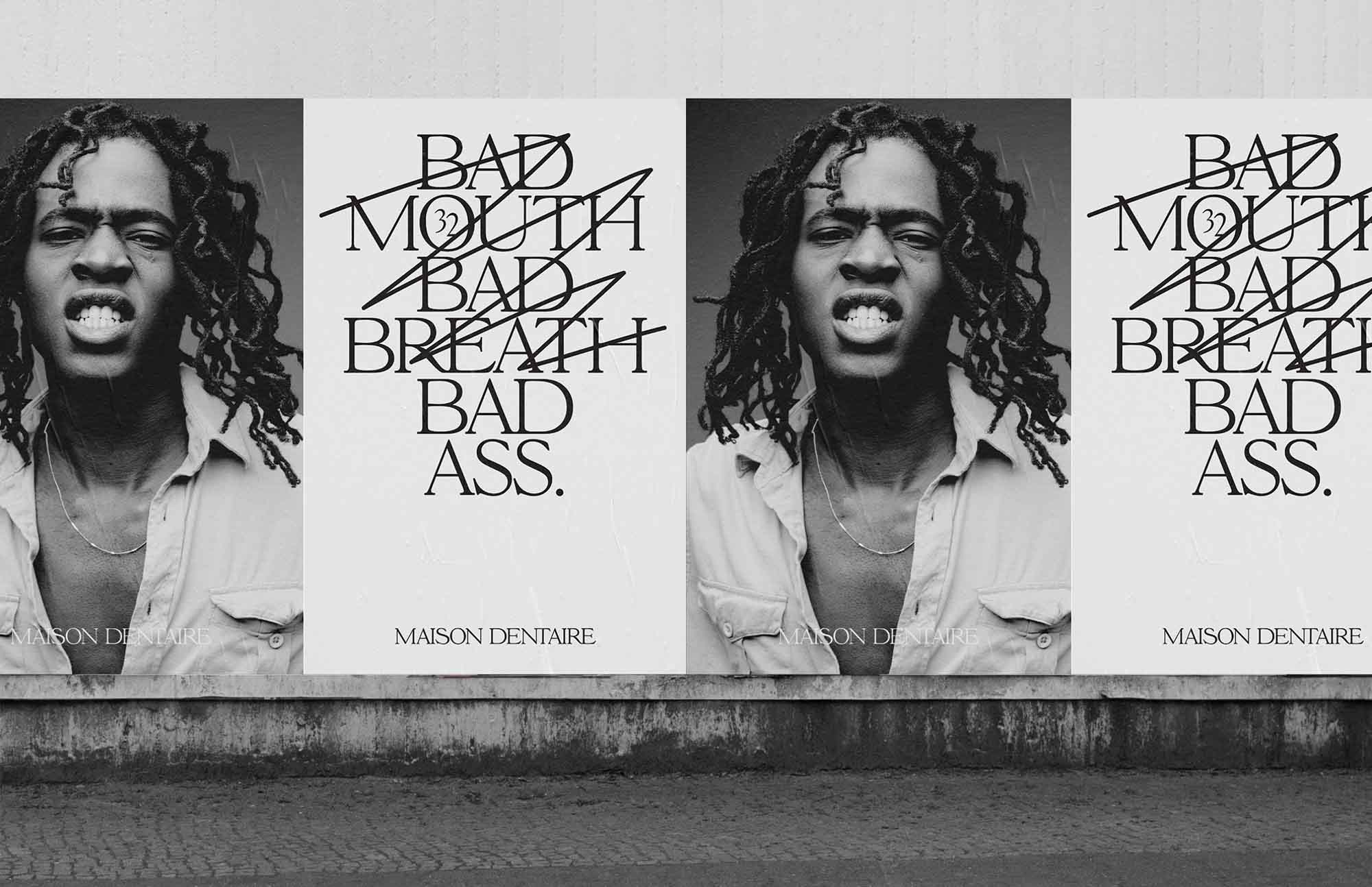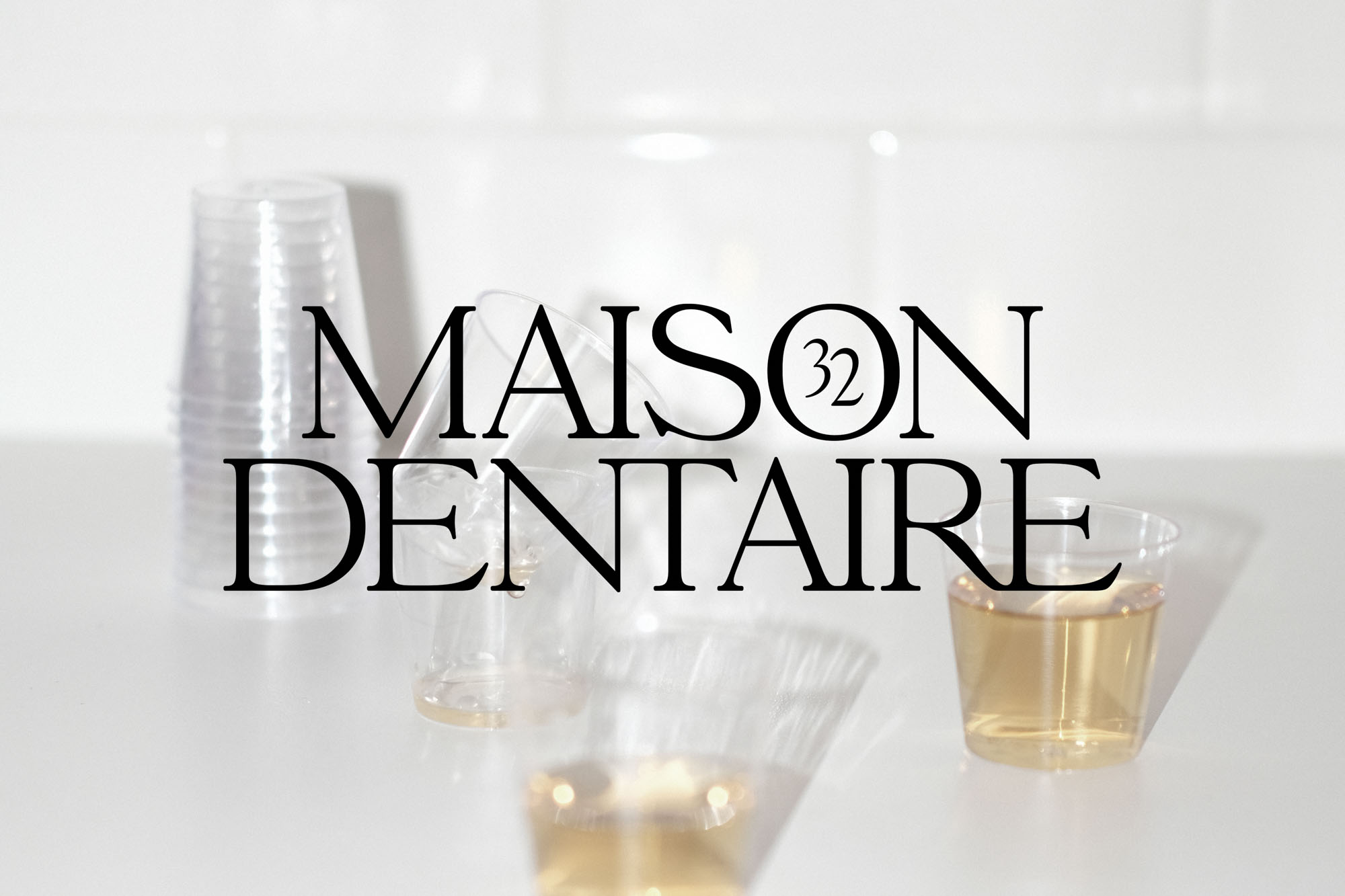
Maison Dentaire—No32
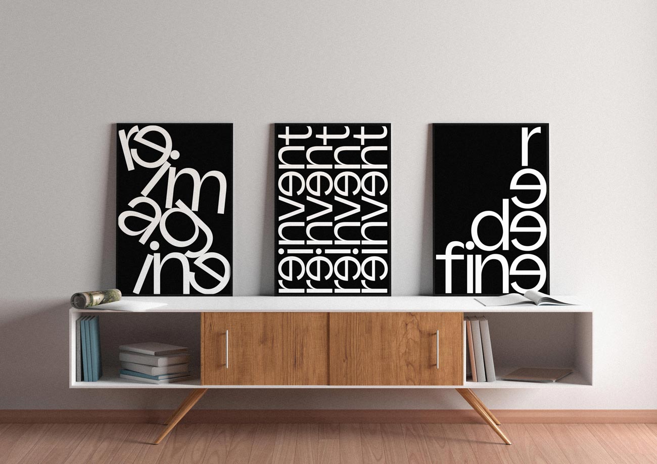
Maison Dentaire is a dental clinic run by two partners from different generations, blending heritage and youth to form an old-school reminiscing celebration. The creative intention behind the rebranding of the clinic was to convey a feeling of establishment, confidence, and experience, as well as a youthful, straightforward attitude. This was done through a gritty and genuine tone of voice and a crisp yet daring type treatment.