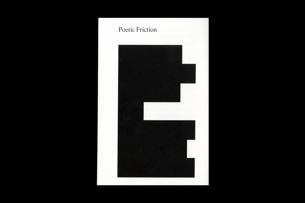
Chasing the Light
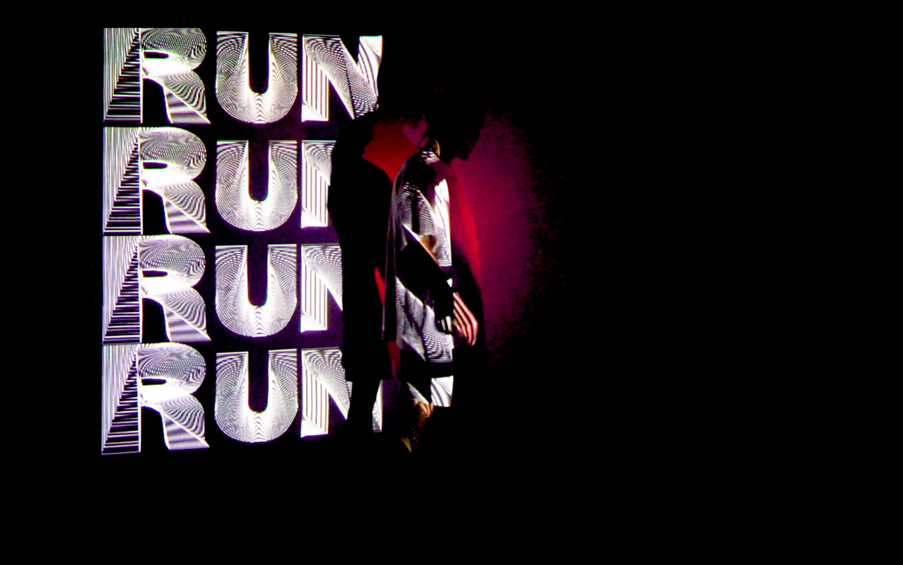
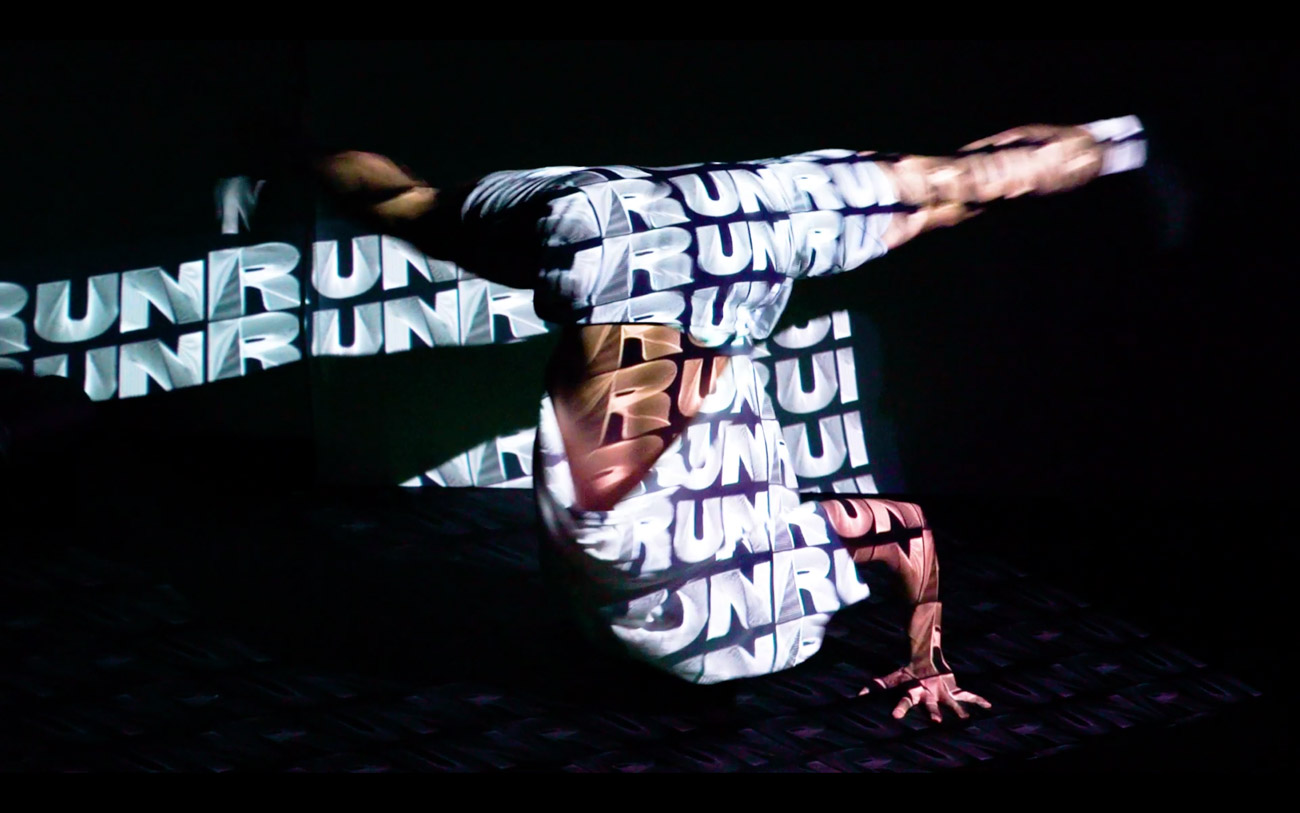
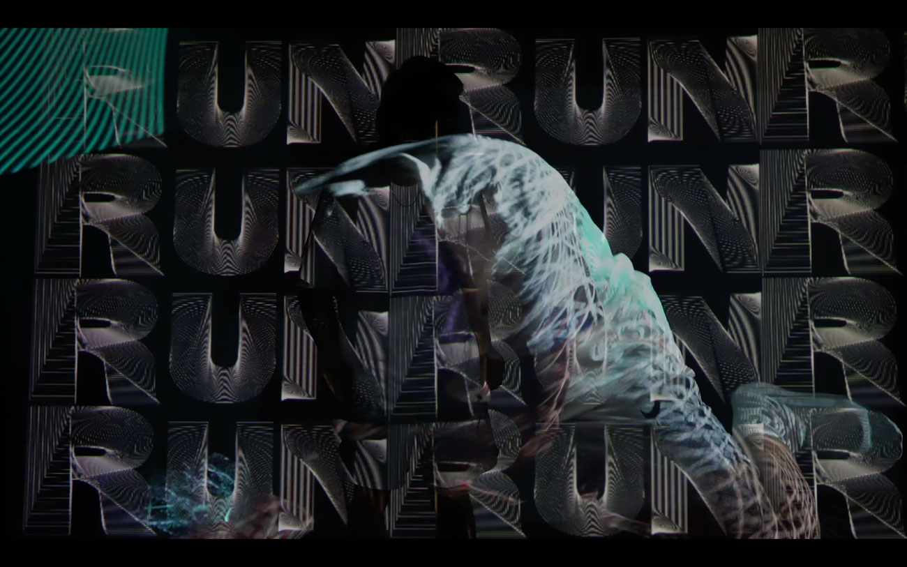
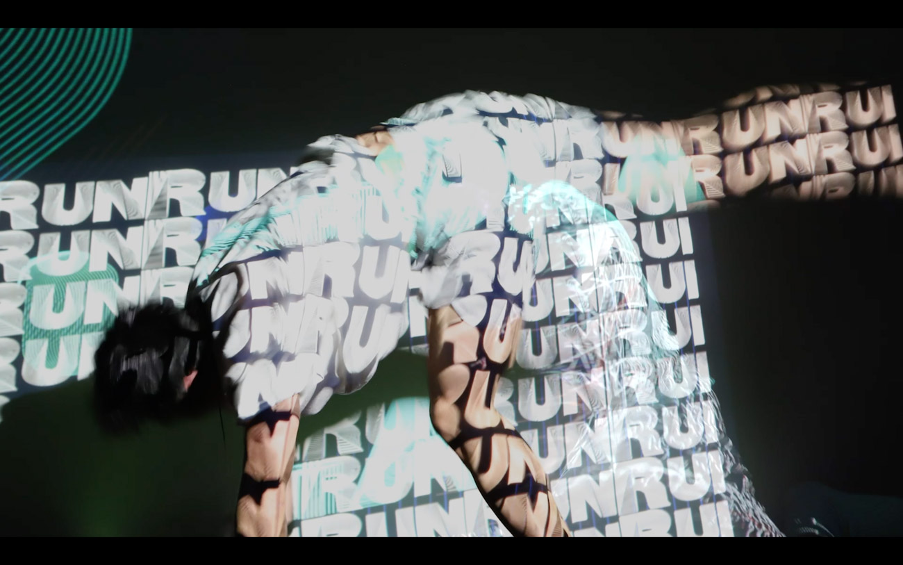
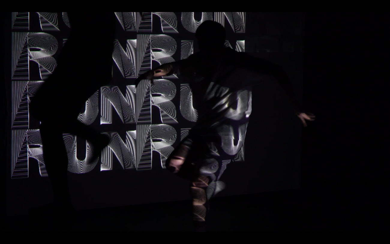
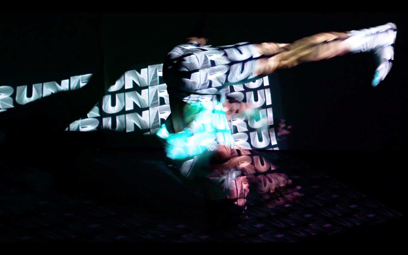
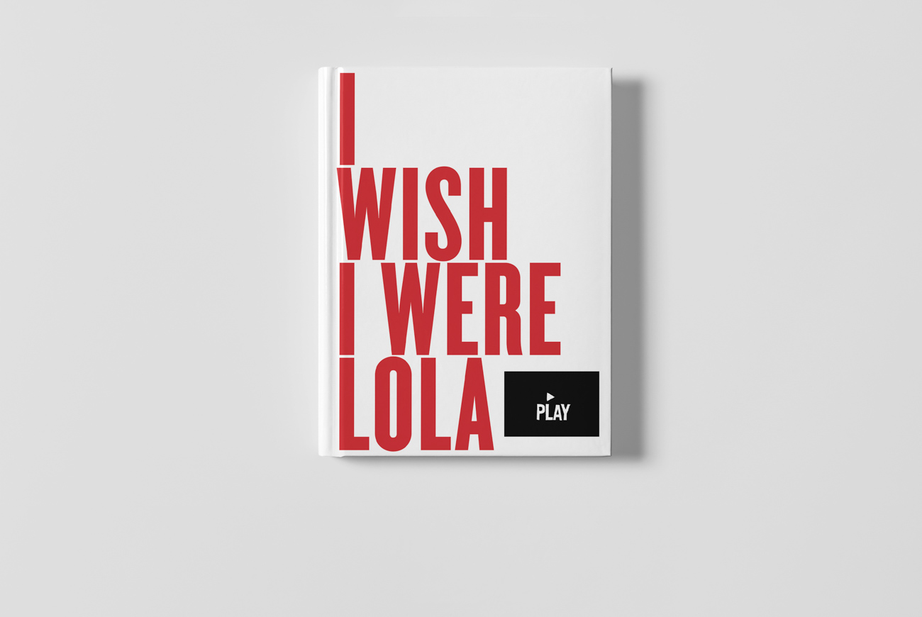
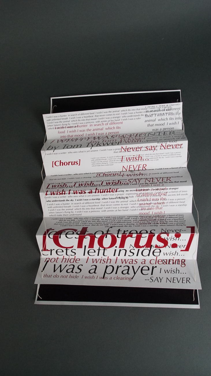
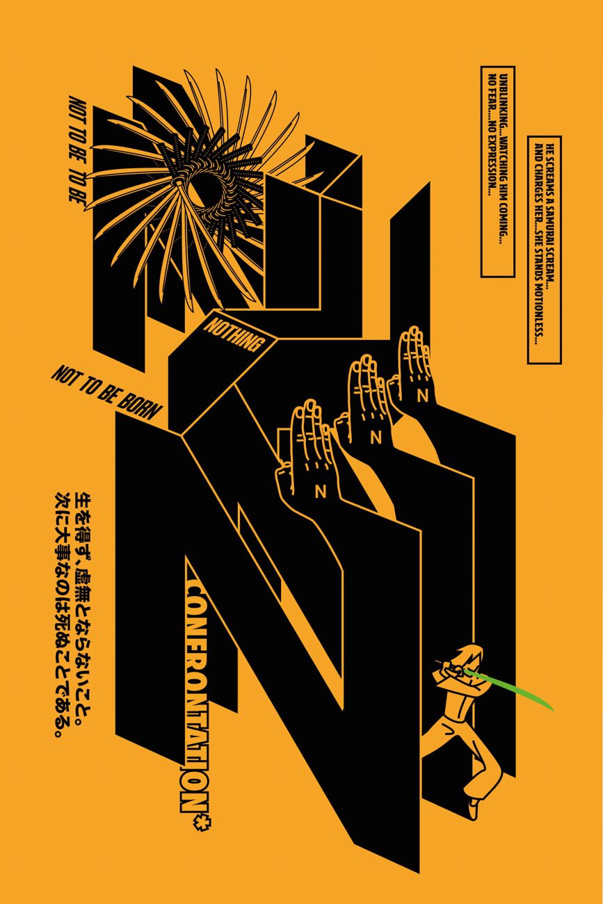
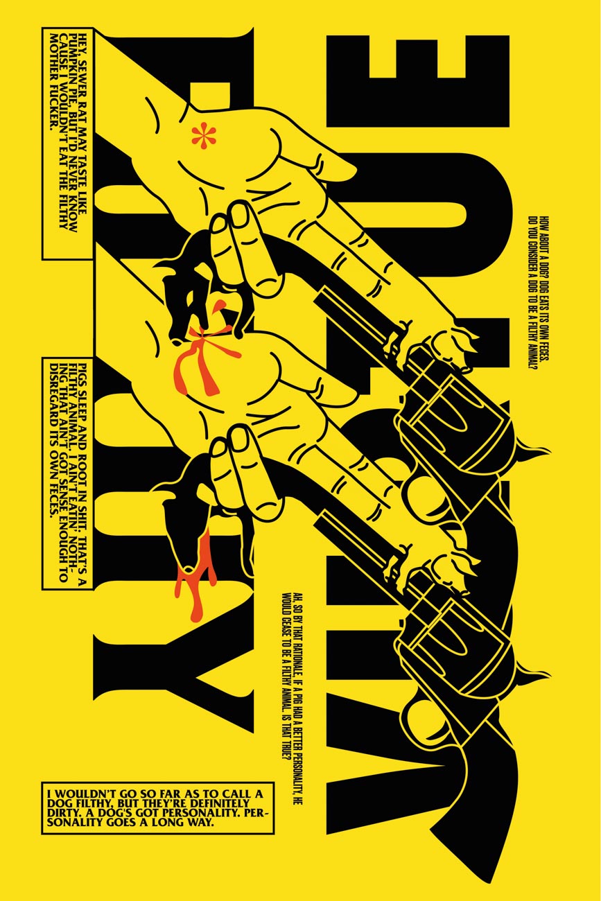
In this class project, we were instructed to watch a movie and make our own design inspired by it. The movie itself was pretty chaotic, so I tried to design characters as line art.


In this class project, we were instructed to watch a movie and make our own design inspired by it. The movie itself was pretty chaotic, so I tried to design characters as line art.
School
School of Visual Arts, New York
Principal Type
Custom
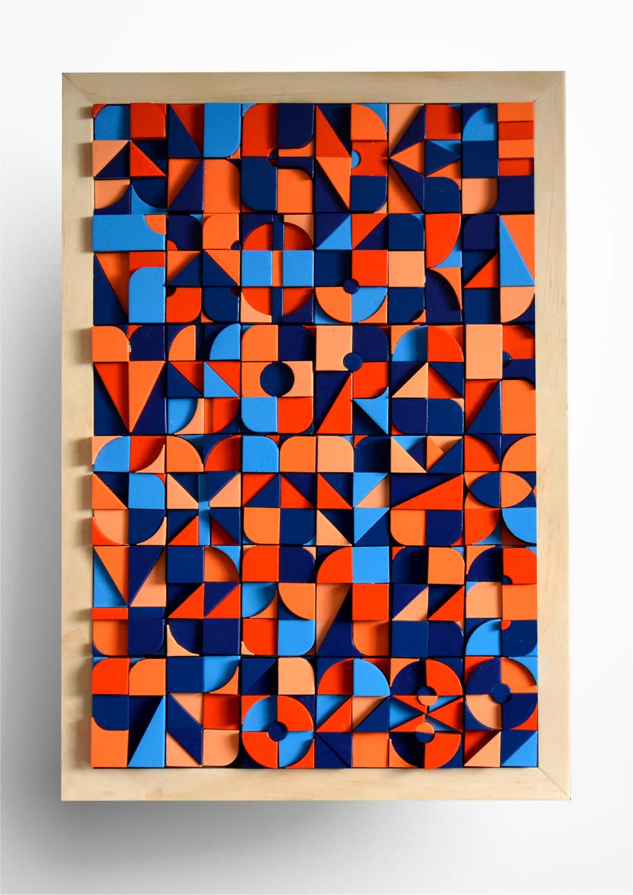
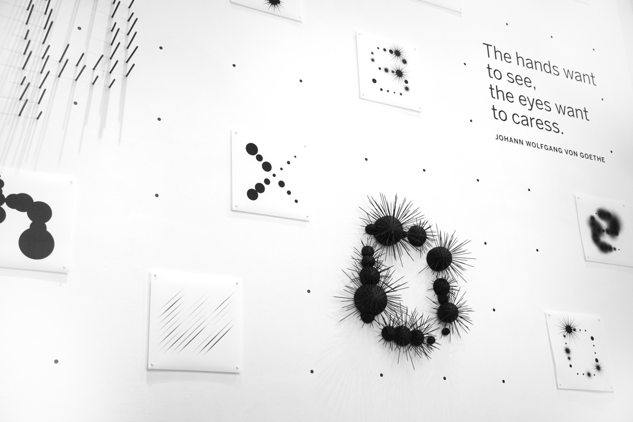


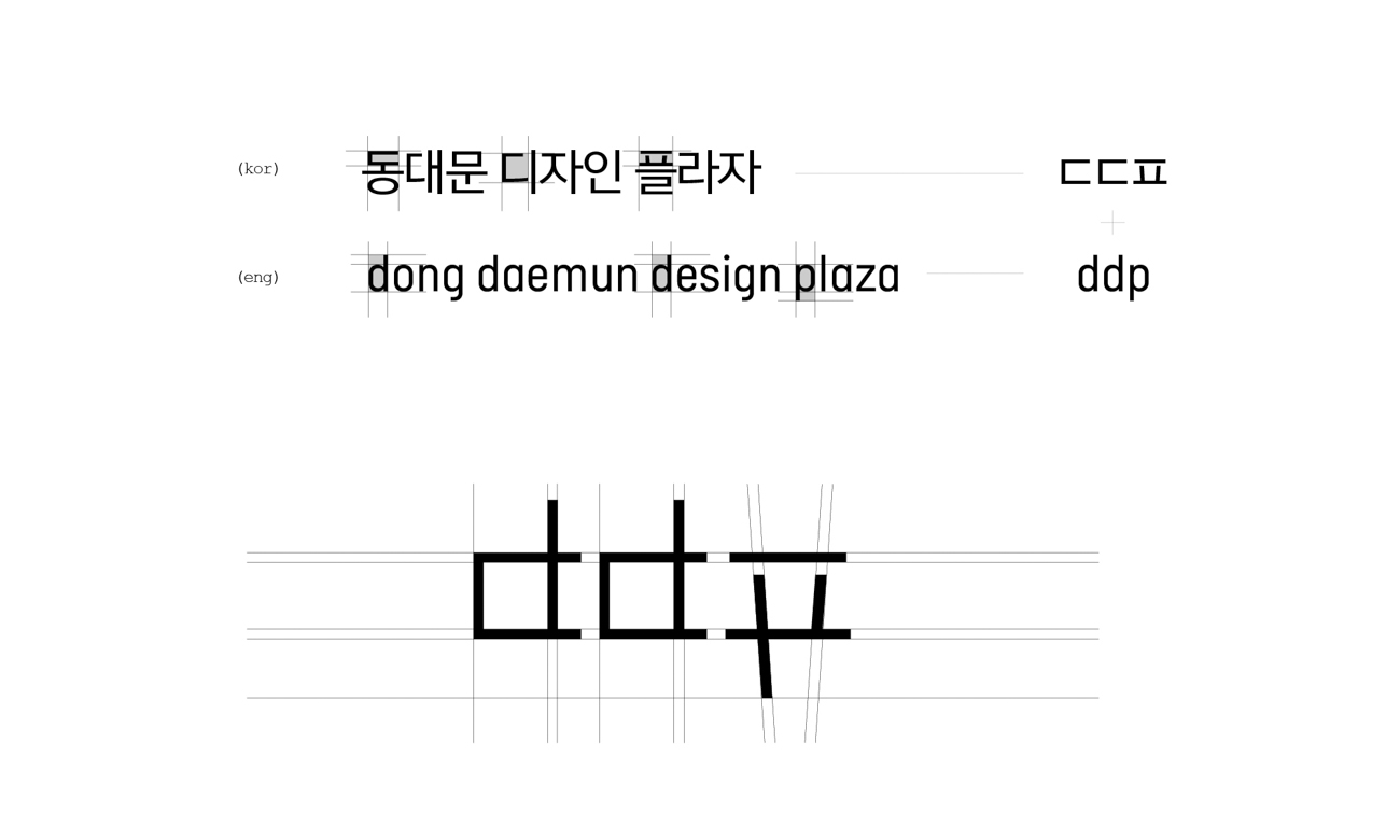
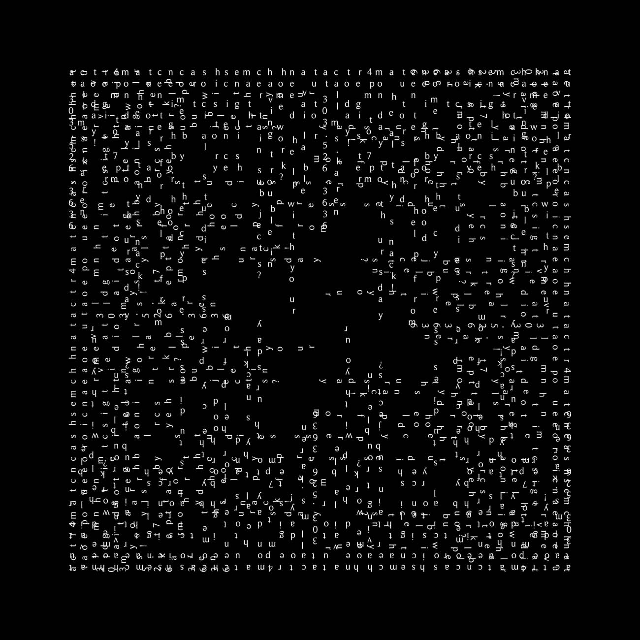
This design applies the Korean writing structure of right to left and top to bottom to the English alphabet. This shows that structure is culturally subjective and by breaking convention, this piece suggests a new norm for the English written form.
Principal Type
Roman Serif
Dimensions
24 x 24 in.
(61 x 61 cm)
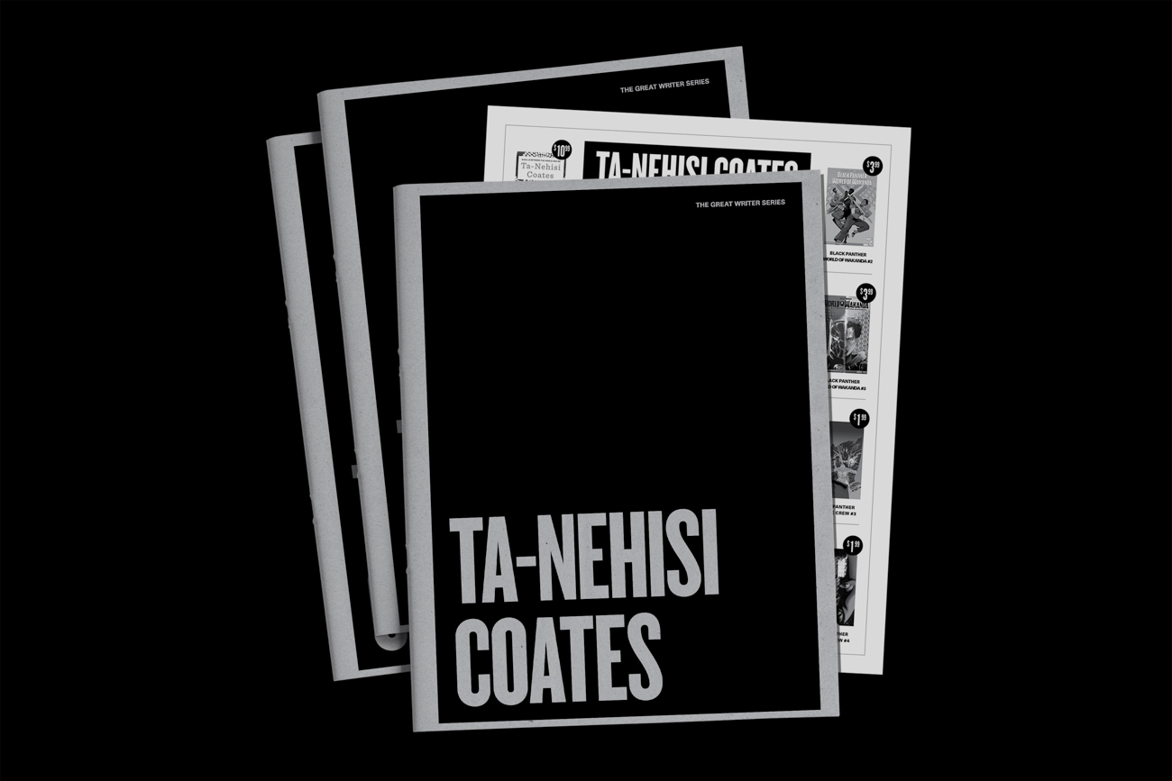
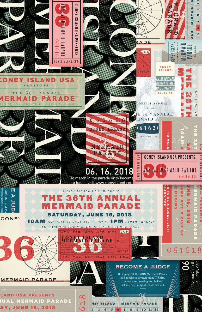
This is a poster designed for the Coney Island Mermaid Parade. Inspired by the diversity of parade attendants and how they dress up to express their individuality, I chose a maximalist approach to celebrate the event. The poster is made up of individual tickets designed to hold information about the parade as well as to represent the vibrant and wild event. This project was produced in Peter Ahlberg’s type design class.
Design
Darius Dazhi Wang
New York
URL
dariuswang.com
Instagram
@dariusssdesign
Instructor
Peter Ahlberg
School
School of Visual Arts, New York
Principal Type
FF DIN Bold
Gotham Black
Gotham Ultra
Dimensions
11 x 17 in.
(27.9 x 43.2 cm)
In a project for my branding portfolio class, I was tasked with creating a new identity for The Neon Museum in Las Vegas. To get a fuller understanding of neon signs, I visited a neon shop in SoHo and got up close and personal with the sign-bending process. This inspired me to make the physical beauty of neon’s Bézier curves a key part of the identity. Brought to life through both print and digital touch points, the identity features a custom logotype and font that embody the same technical structure of neon signage and serve to unite The Neon Museum’s vintage and modern works.
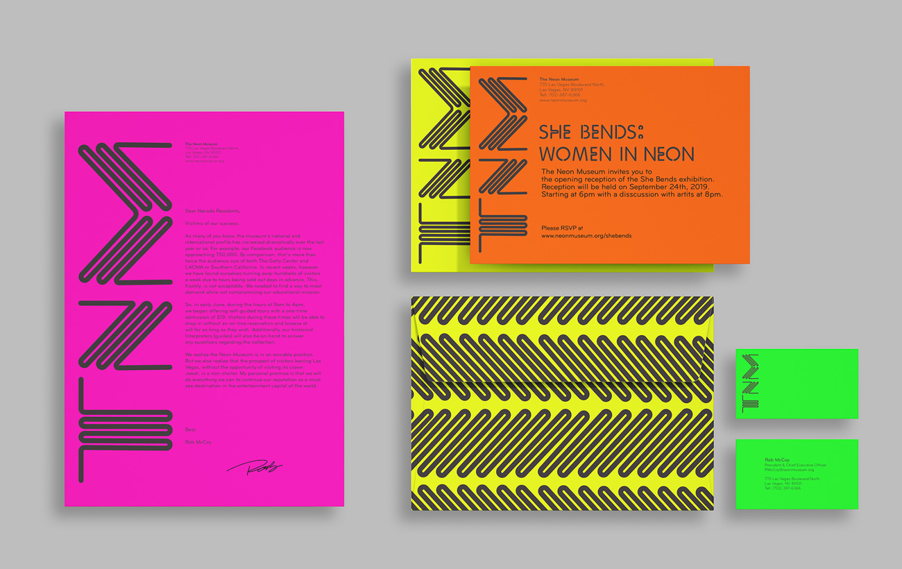

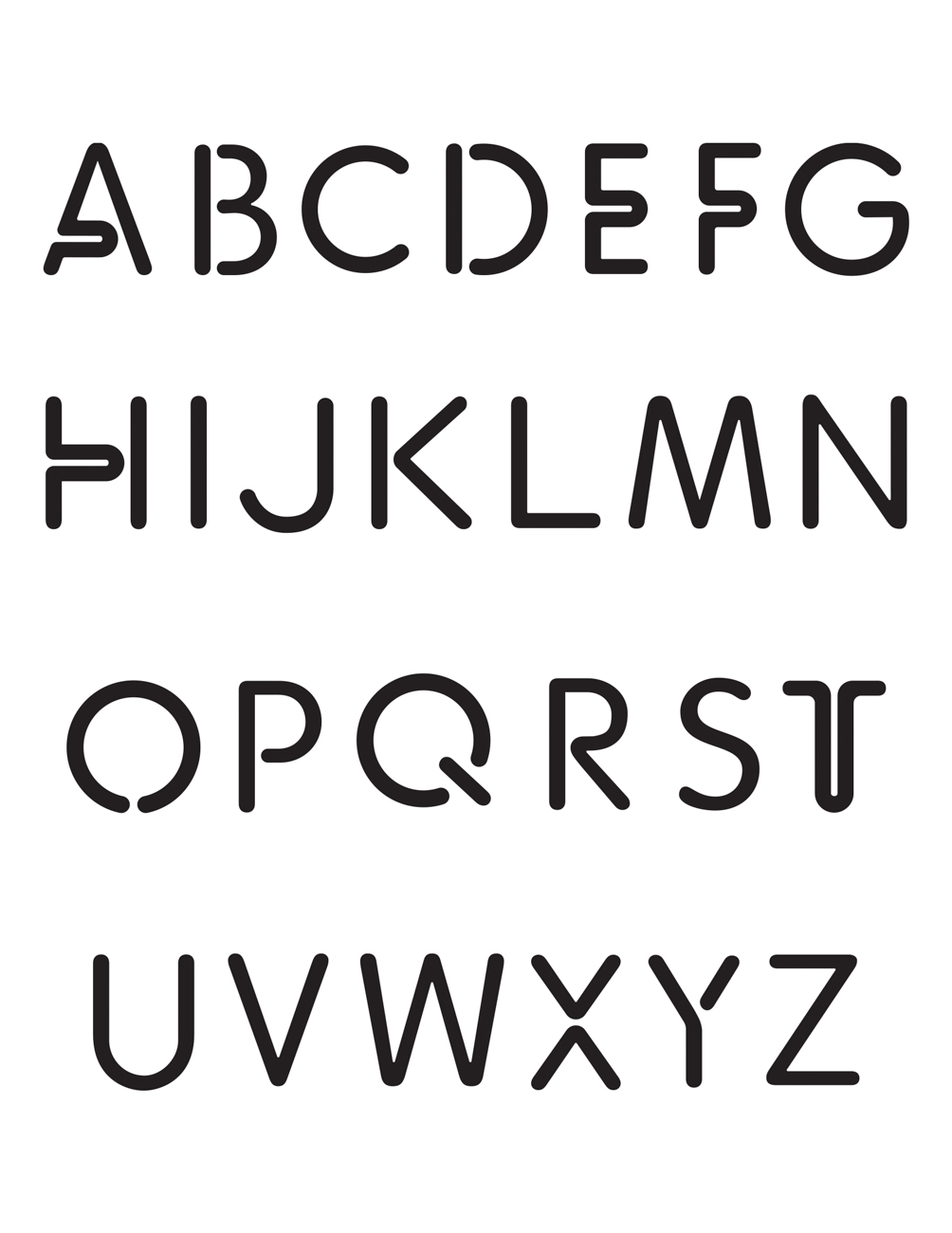
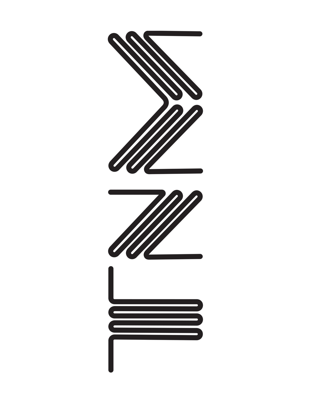
School
School of Visual Arts, New York
Principal Type
Custom, inspired by neon signage
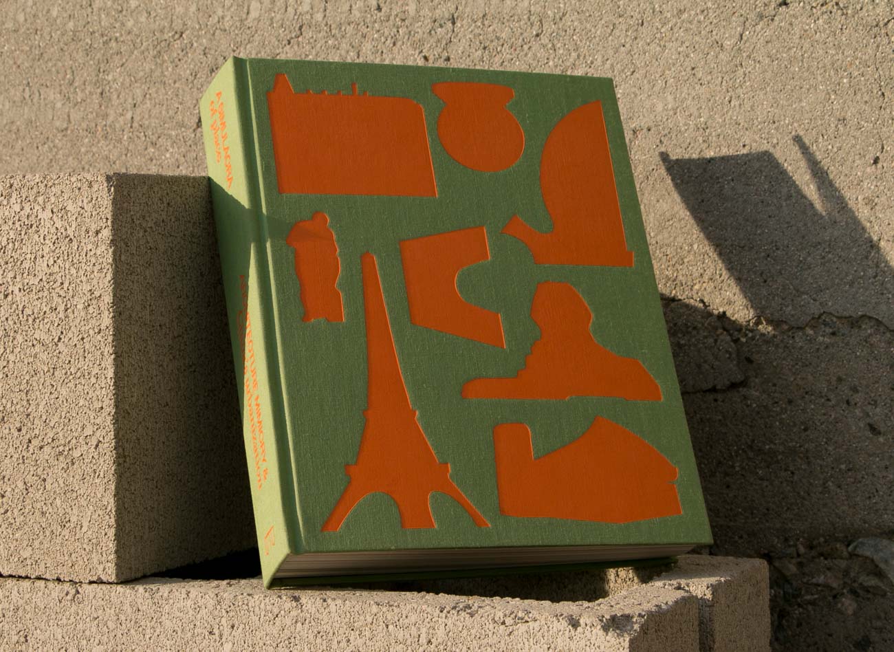
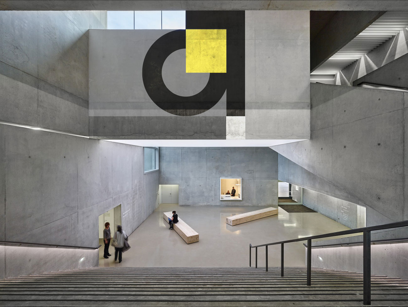
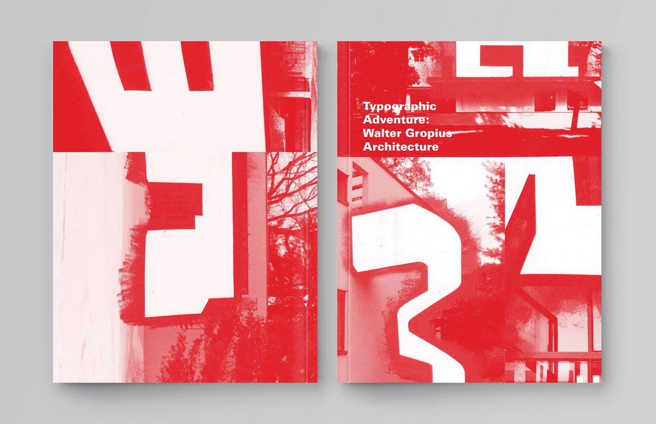
I created this book as a vehicle for my exploration in an unconventional typeface design through spontaneity. In the images of the famous Bauhaus architecture in Berlin, Germany, designed by Walter Gropius, I discovered the shapes of the English alphabet.
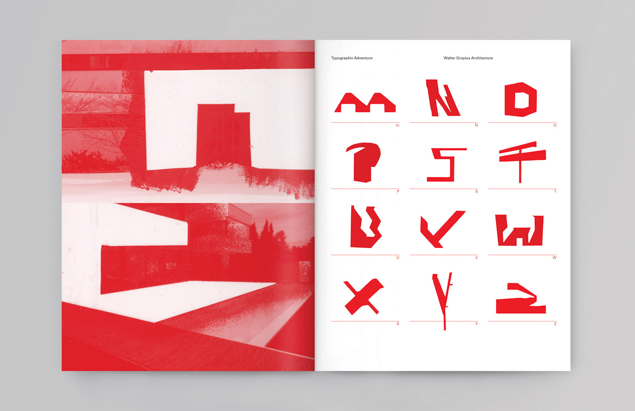
School
School of Visual Arts, New York
Principal Type
Bespoke Univers
Dimensions
8.5 x 11 in.
(21.6 x 27.9 cm)
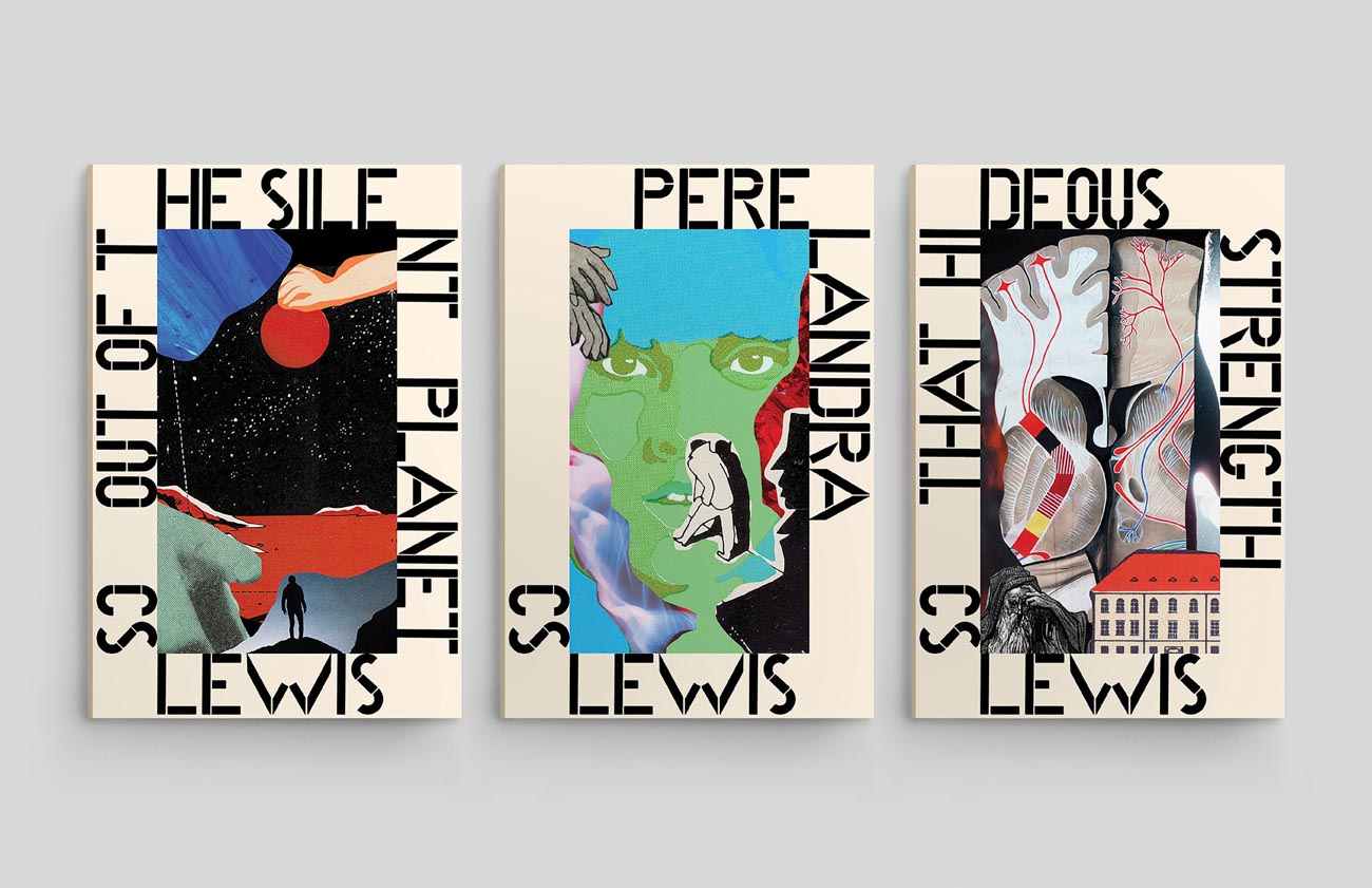
The Space Trilogy is a series of fantastical books by C. S. Lewis that deserved equally as colorful and mystical covers. Individual collages were crafted using found material with the intention of layering key aspects of the story into a cohesive illustration. The found vintage typeface contrasts the collages as a way of honoring the science fiction theme of the series.
School
School of Visual Arts, New York
Principal Type
Alphabo
Times New Roman
Dimensions
Box Set: 6 x 9.5 x 4 in.
(15.2 x 24.1 x 10.2 cm)
Individual Book: 6 x 9 in.
(15.2 x 22.9 cm)
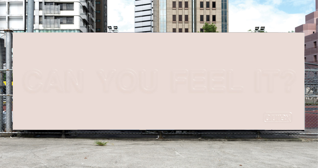
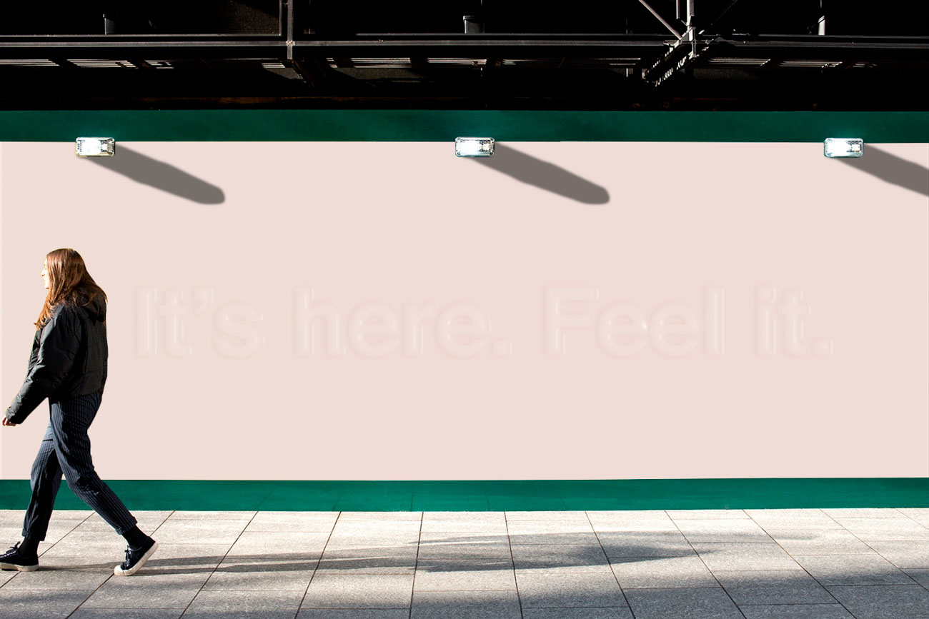
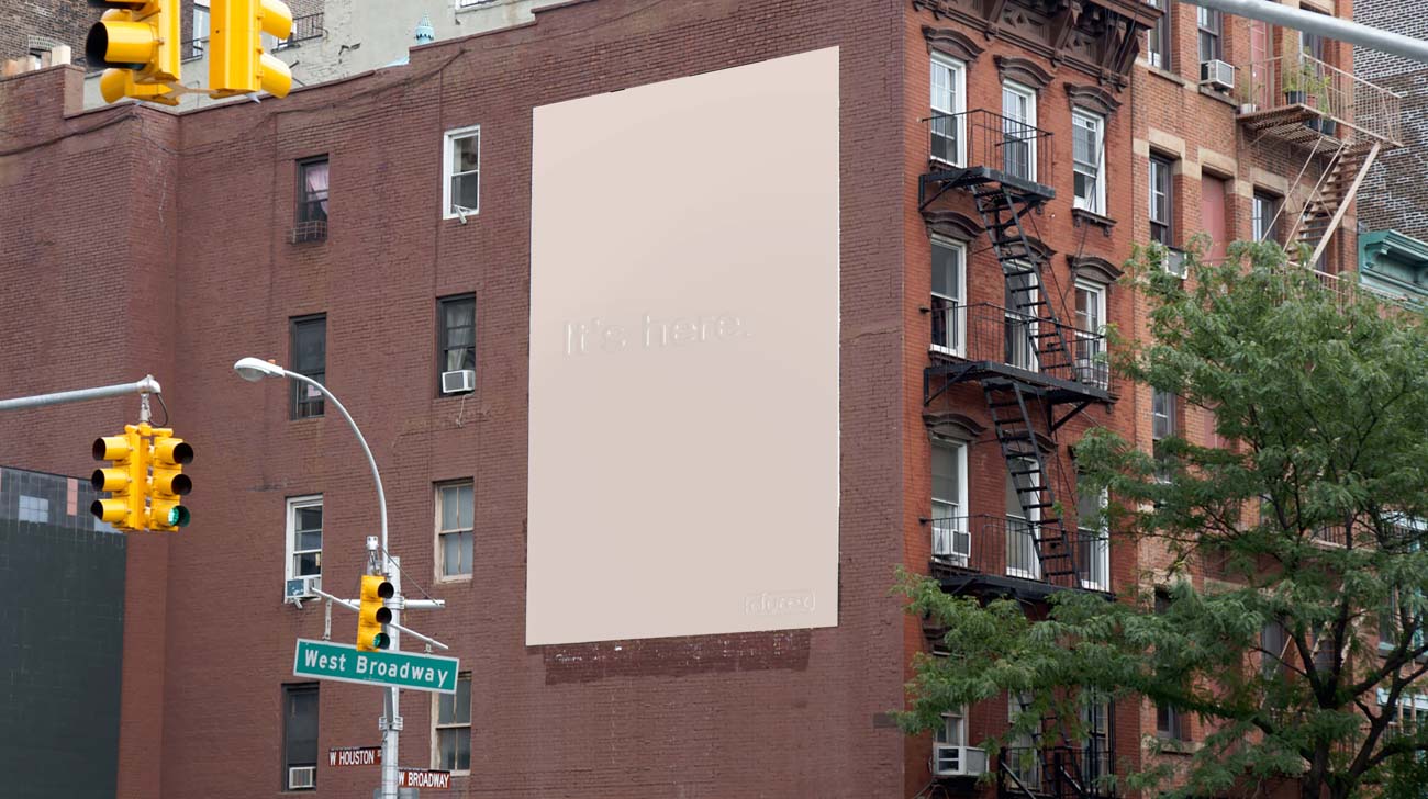
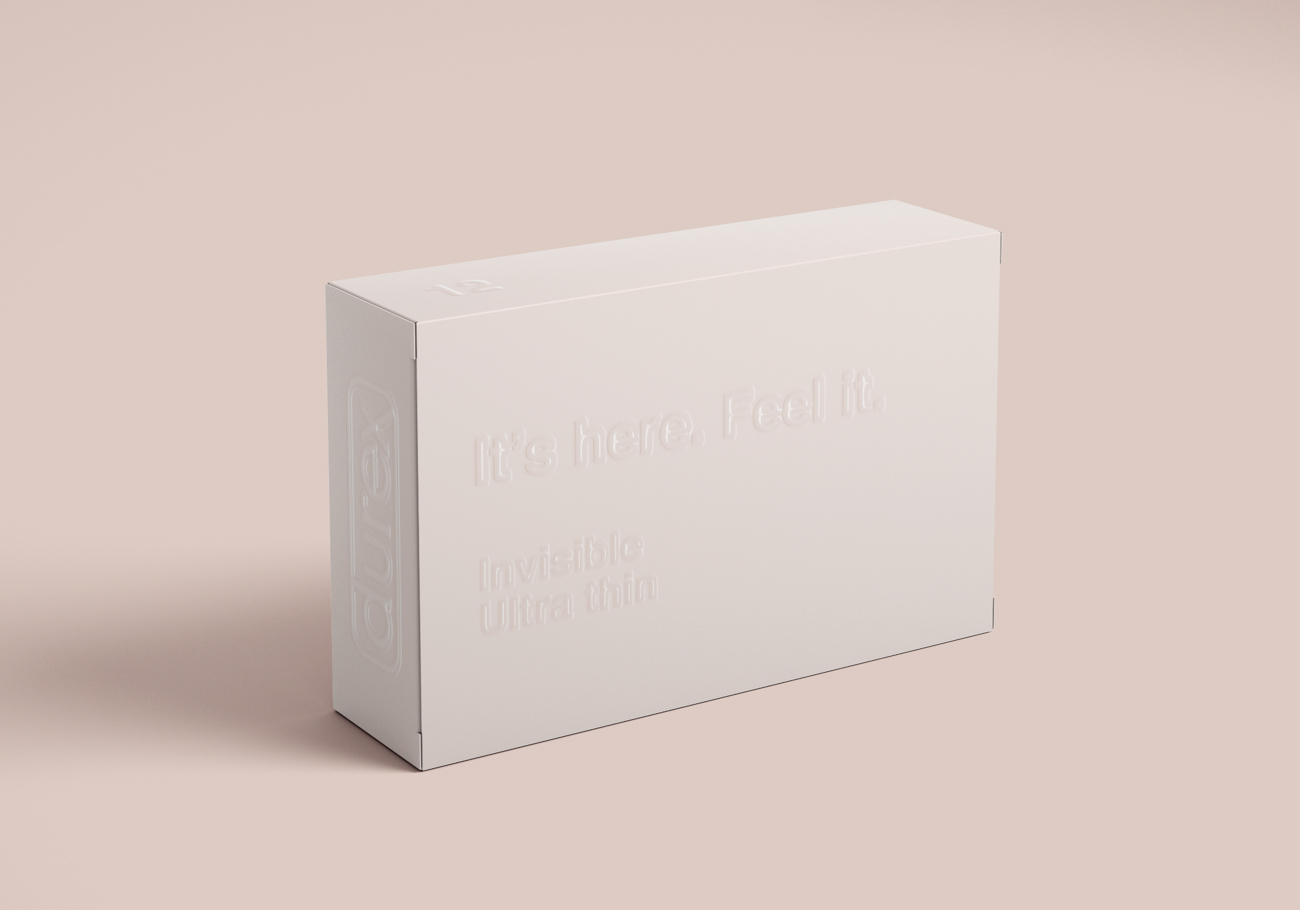
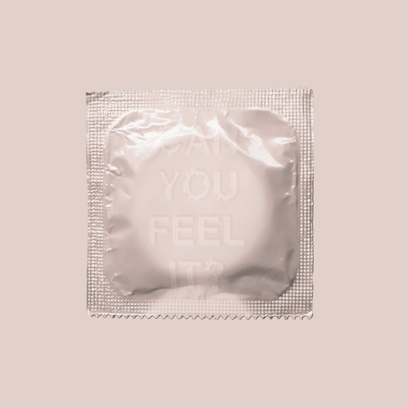
Sex is interesting, but condoms are not. I designed advertisement and packaging for Durex “Invisible” condoms with textured and illegible typography. I was inspired by the material and thinness of condoms. I used copy like “It’s here. Feel it” and “Can you feel it?” to emphasize this concept of thinness and invisibility. This is to invite people to touch and feel the words so they can experience the product before buying. The feeling of the text can also help people imagine what they will feel sexually when using the product.
School
School of Visual Arts, New York
Principal Type
Helvetica
Dimensions
Various
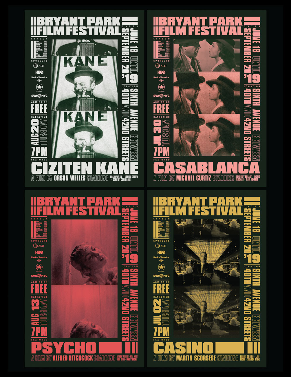
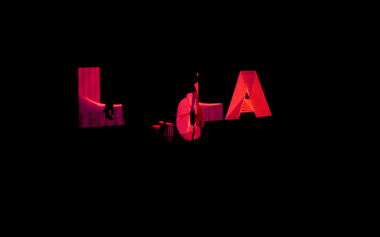
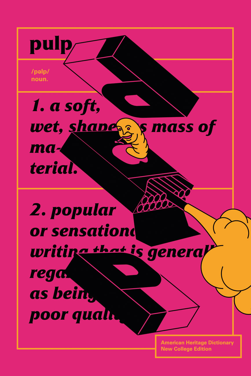
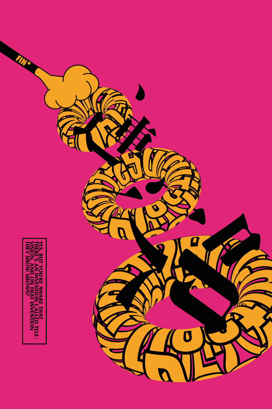
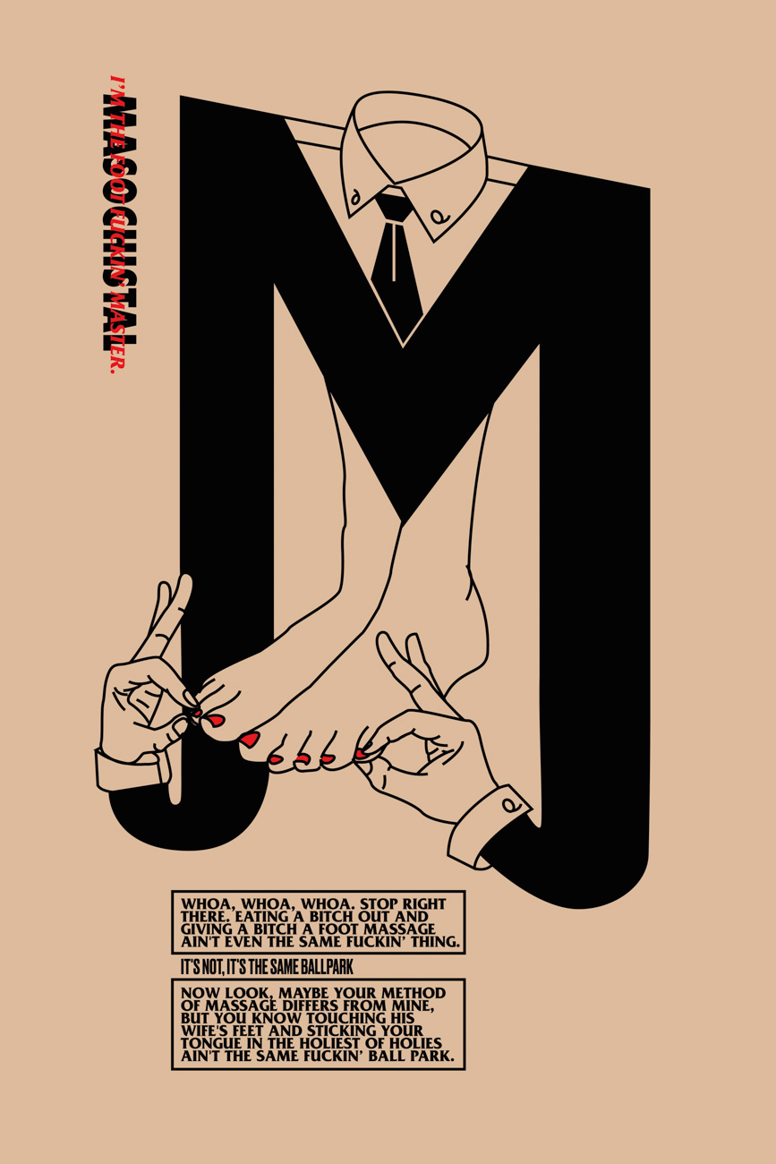
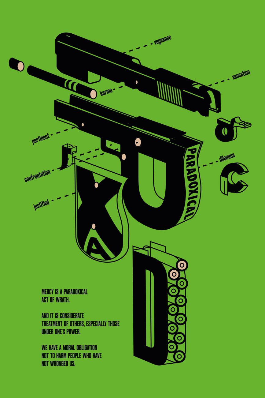
This was a typography experiment to see how Quentin Tarantino’s narrative method could be expressed using print media. The project used neon colors provided by screen printing to create an unexpected visual sequence.
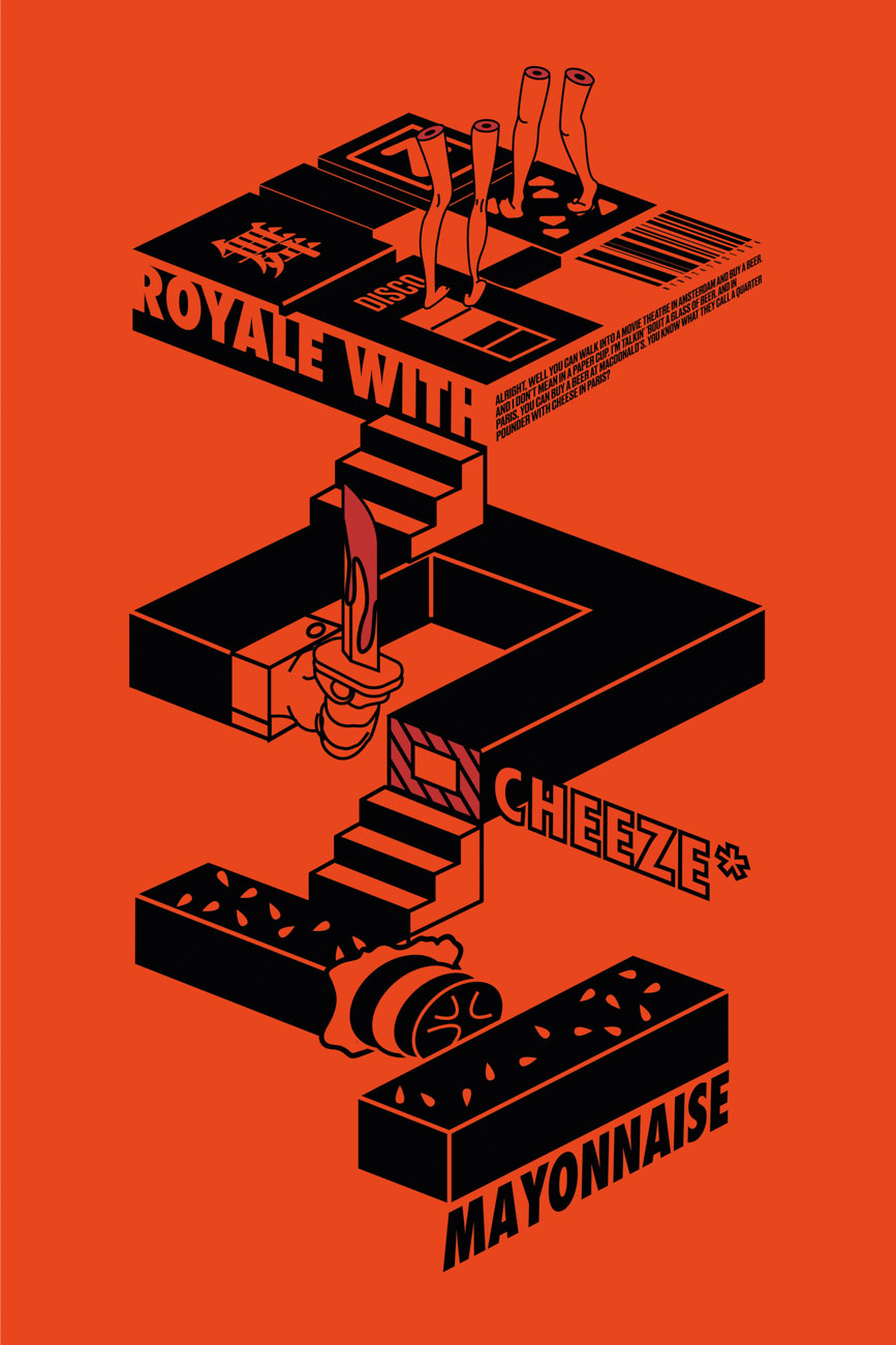
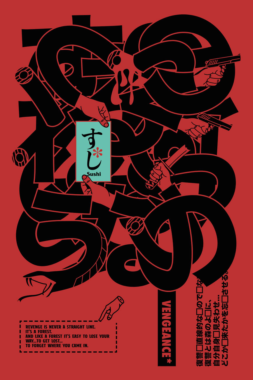
Design
Guocheng Xin (Shin)
Pasadena, California
Printer
Press friends, DTLA
Instructor
Tyrone Drake
School
ArtCenter College of Design
Principal Type
Druk Condensed Super
Friz Quadrata
Futura Condensed
Dimensions
24 x 36 in.
(61 x 91.4 cm)
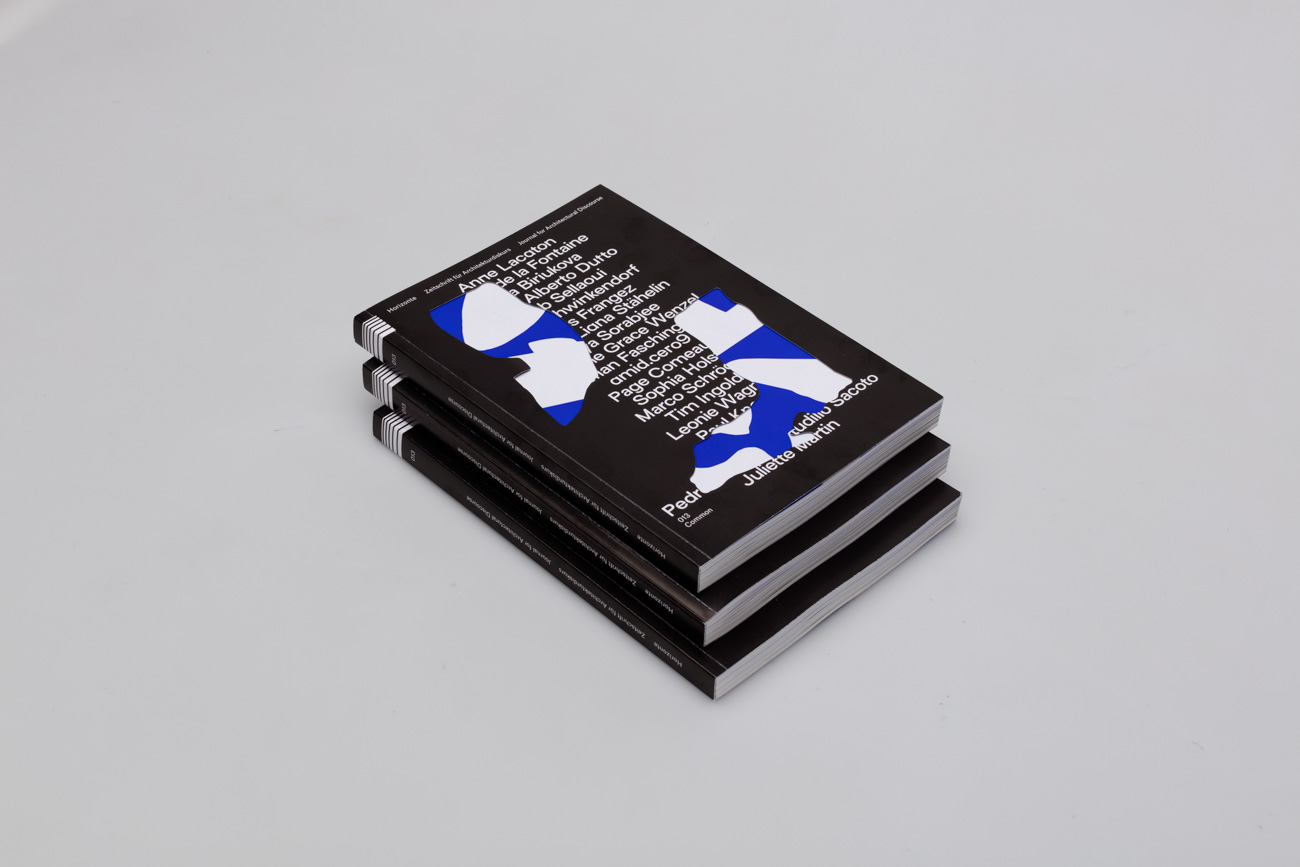
The thirteenth issue of HORIZONTE—Journal for Architectural Discourse focuses on the common as it pertains to architecture. Therefore, our concept was inspired by communal spaces. We wanted to adapt how society occupies those spaces into a visual language. Inspired by public transport, parking facilities, and suburban neighborhoods, we created moments where things came together as well as moments of isolation and divide. We achieved these by thoroughly planning how we used white space, where to dissolve natural grid borders, and how to diversify the typography using open type features and a high-contrast typeface selection.
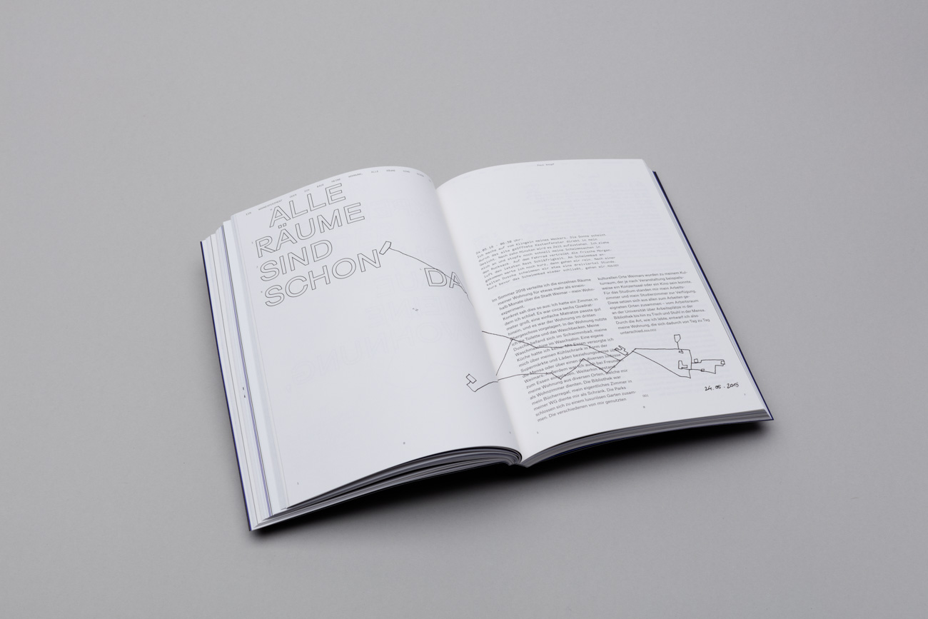
Design
Antonia Dieti
Lina Gräf
Nora Keilig
Jana Schwinkendorf
Weimar, Germany
School
Bauhaus-Universität Weimar
Client
HORIZONTE—Journal for Architectural Discourse
Principal Type
Atlas Grotesk
Parse Grotesk Mono
Surt
Dimensions
6.5 x 9 in.
(16.5 x 23 cm)
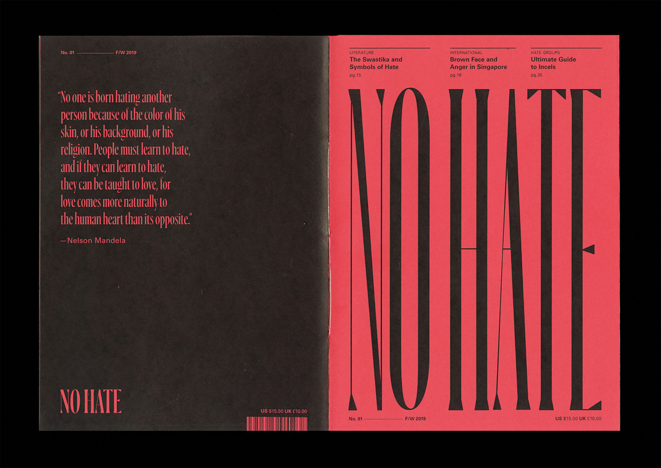
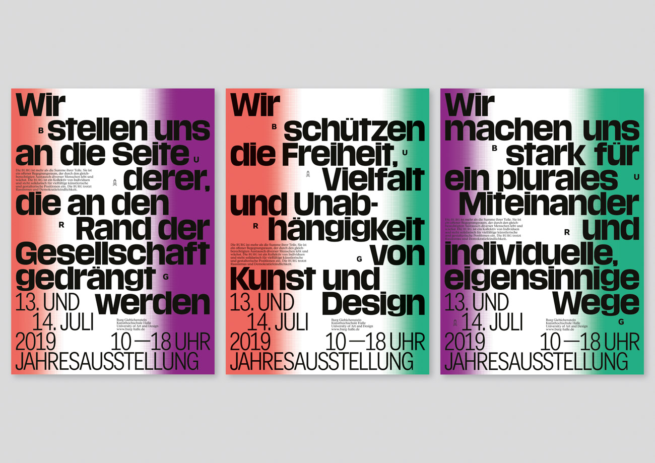
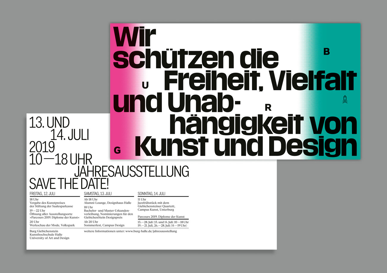
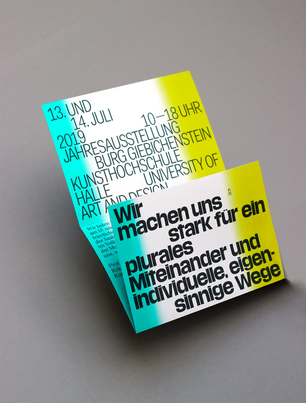
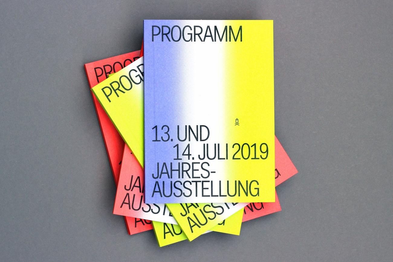
As a result of the recent political climate in Germany, where antidemocratic forces have tried to disrupt our diverse living, we took a stand as diverse personalities and as an art institution with three political statements for the 2019 annual exhibition at BURG. We developed a visual identity that is based upon these statements: “We protect the freedom, diversity, and independence of art and design”; “We stand at the side of those who are pushed to the edge of society”; and “We commit ourselves to a plural togetherness and individual, willful ways.” The aim was to show our common action against discrimination, racism, and antidemocracy.
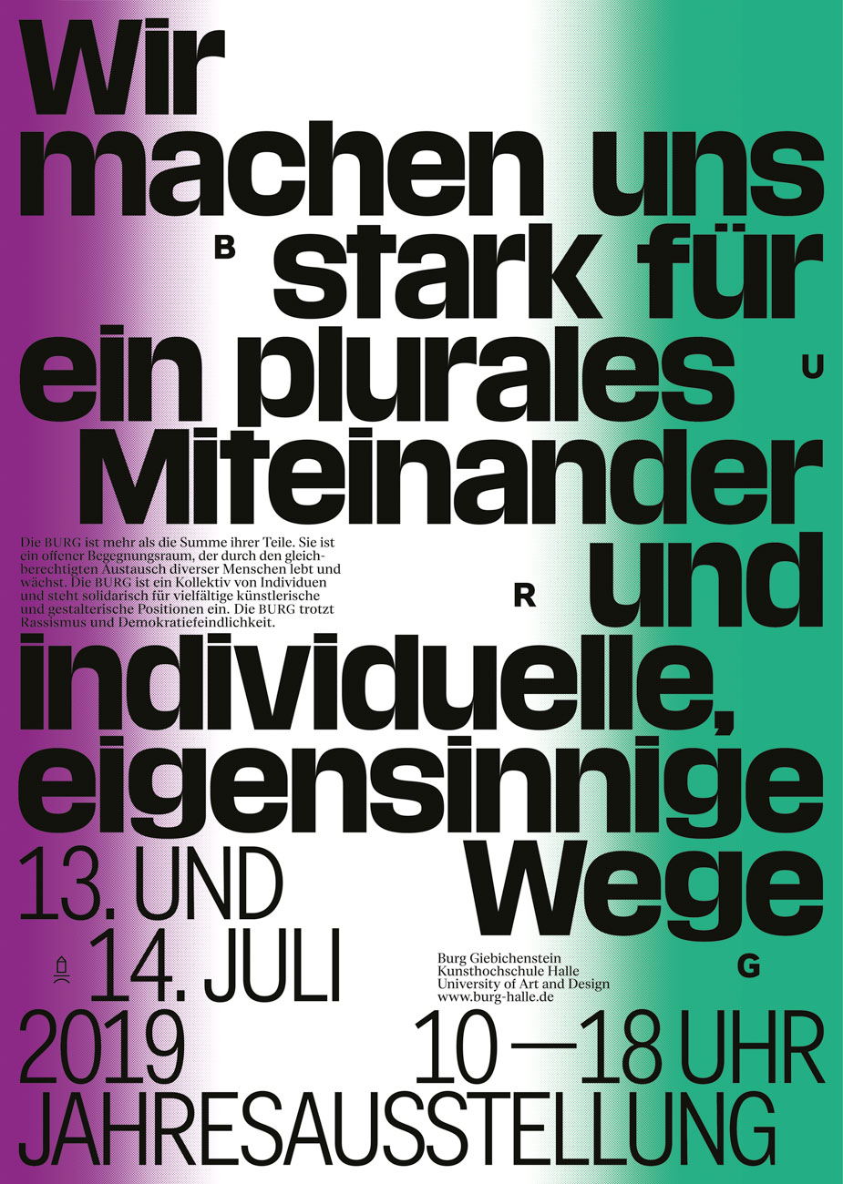
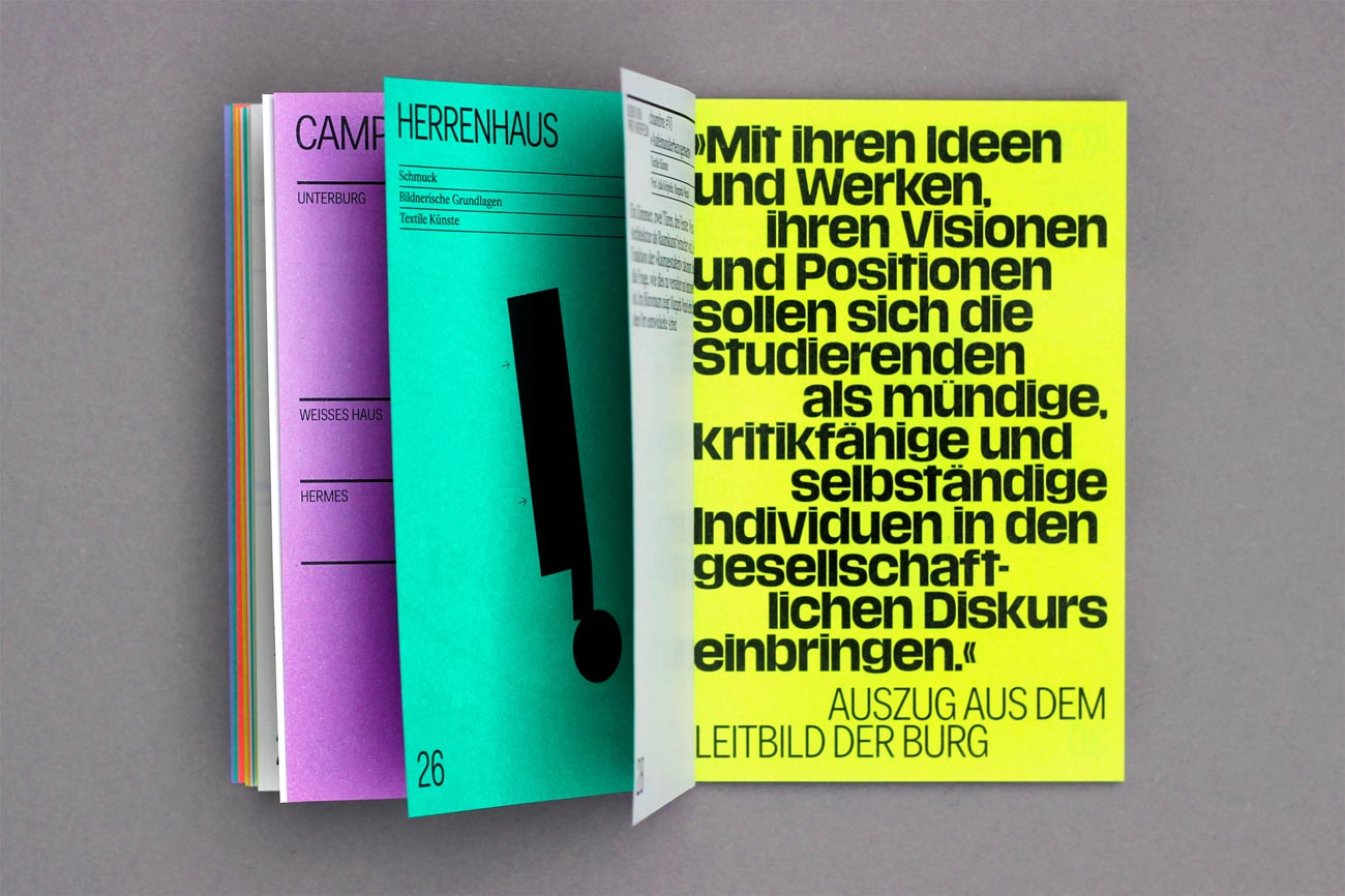
Design
Lisa Linz Maja Redlin Halle, Germany
Instagram
@lisa.li.nz
@maja_redlin
Professors
Pierre Pané-Farré
Andrea Tinnes
University
Burg Giebichenstein Kunsthochschule Halle University of Art and Design
Principal Type
Eliza
Fakt
Media Sans
Dimensions
Various