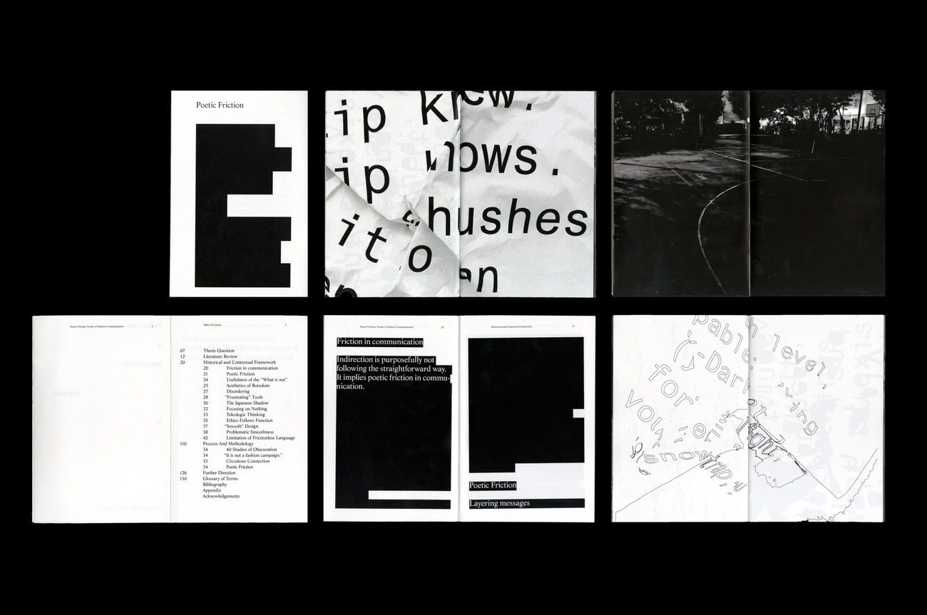
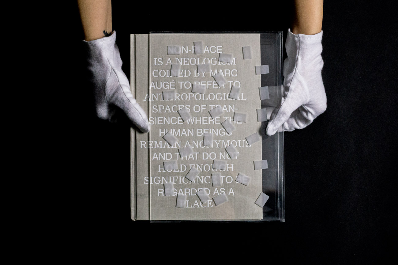
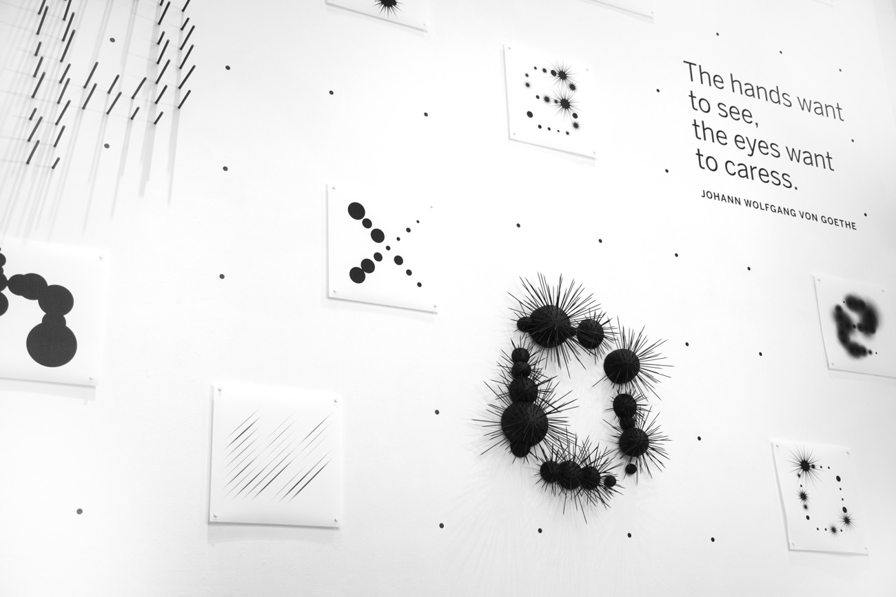
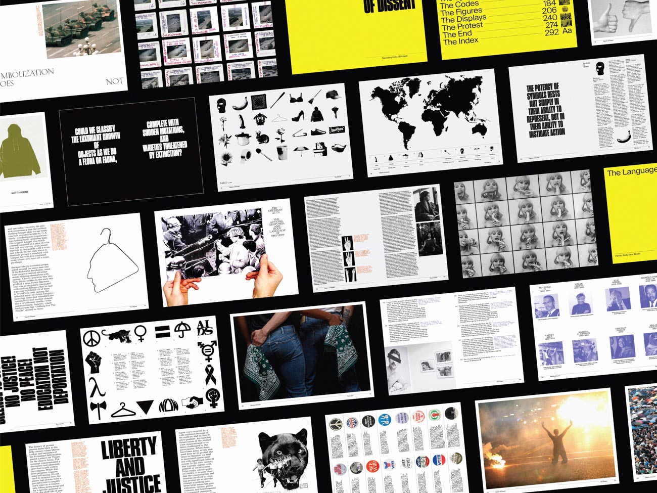
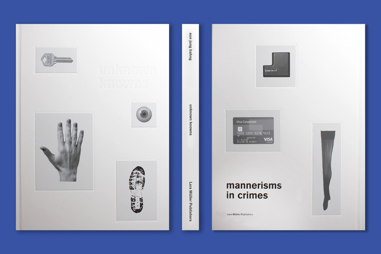
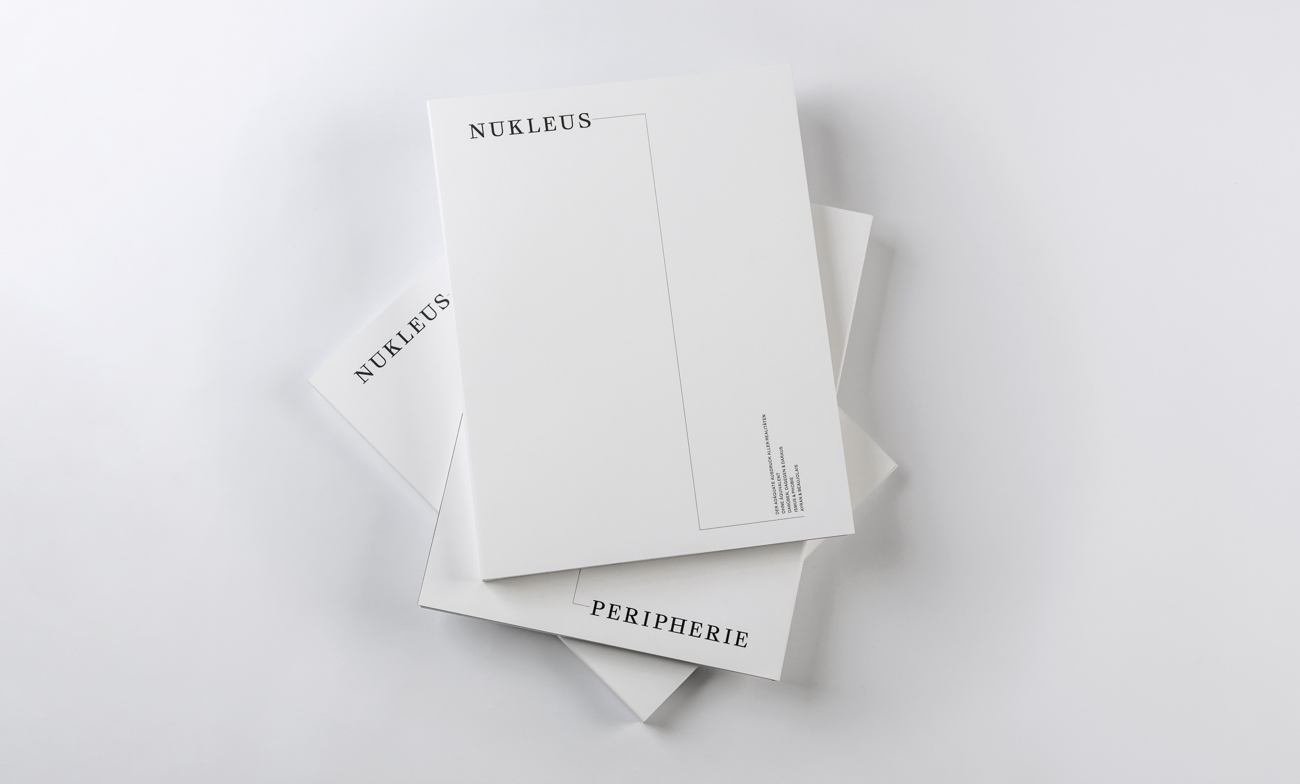
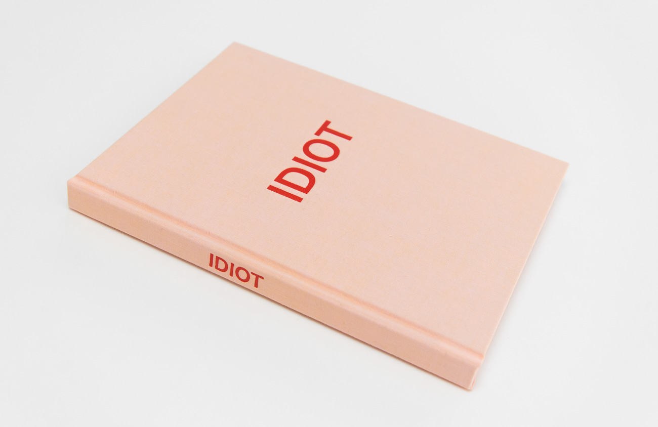
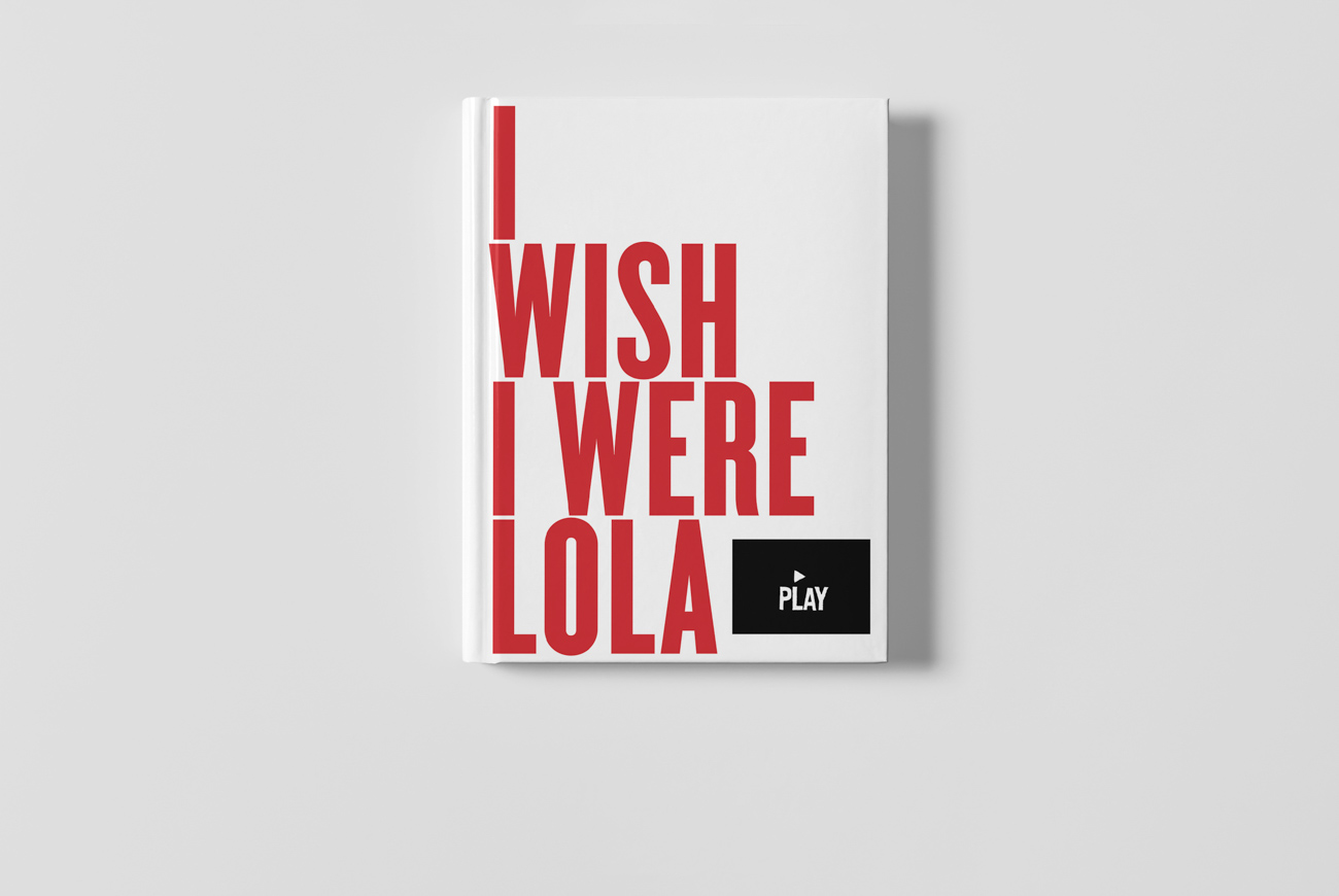
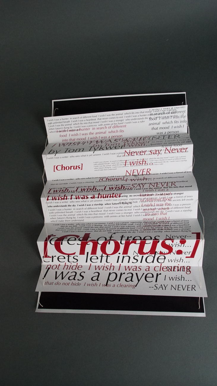
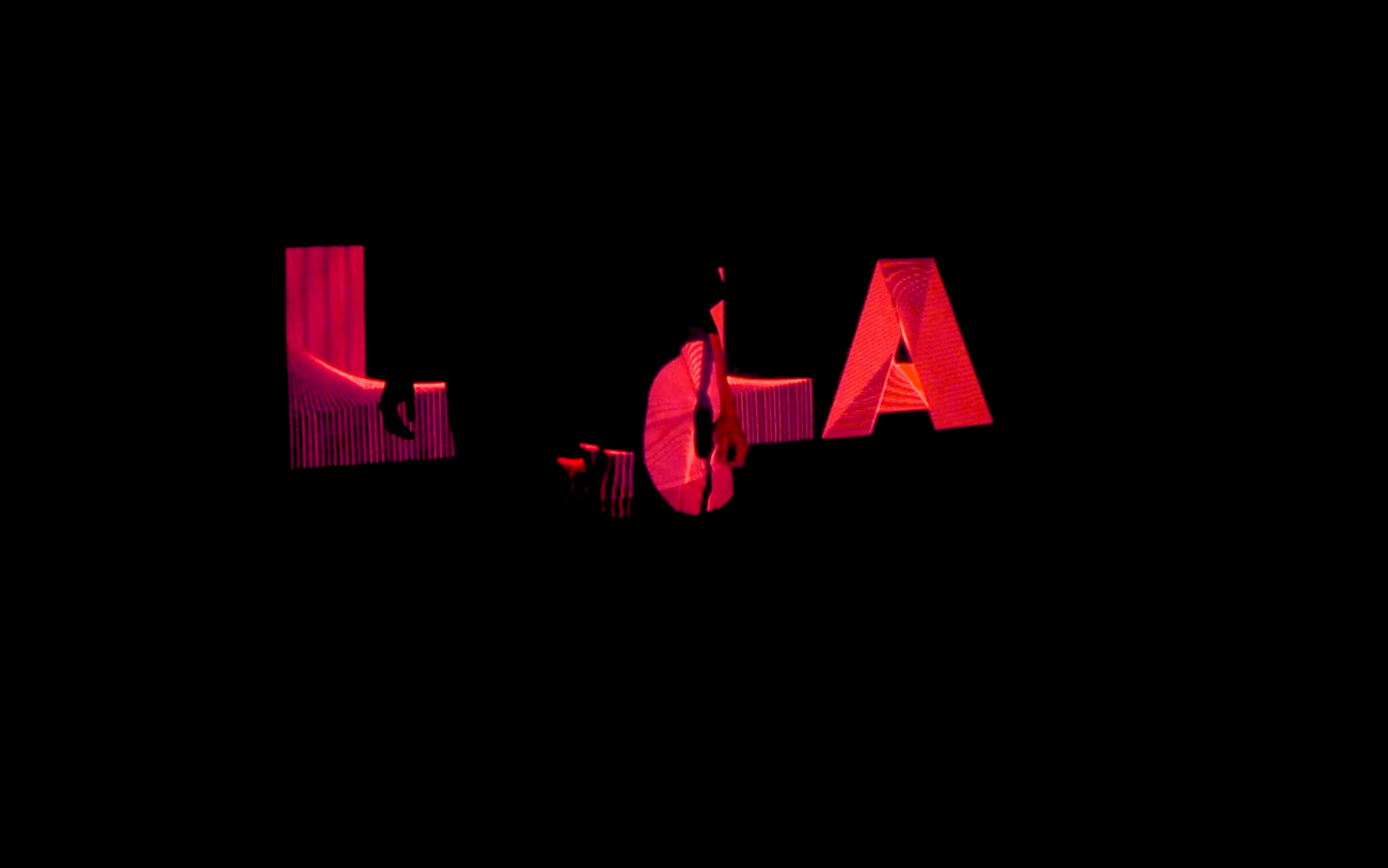
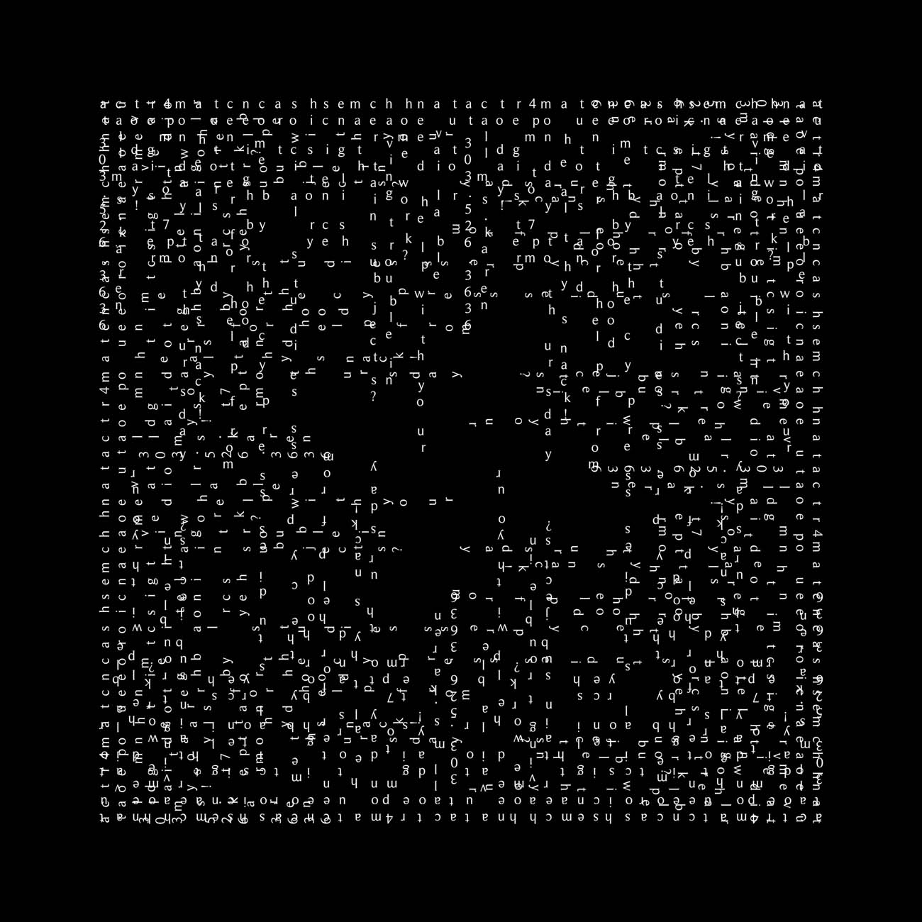
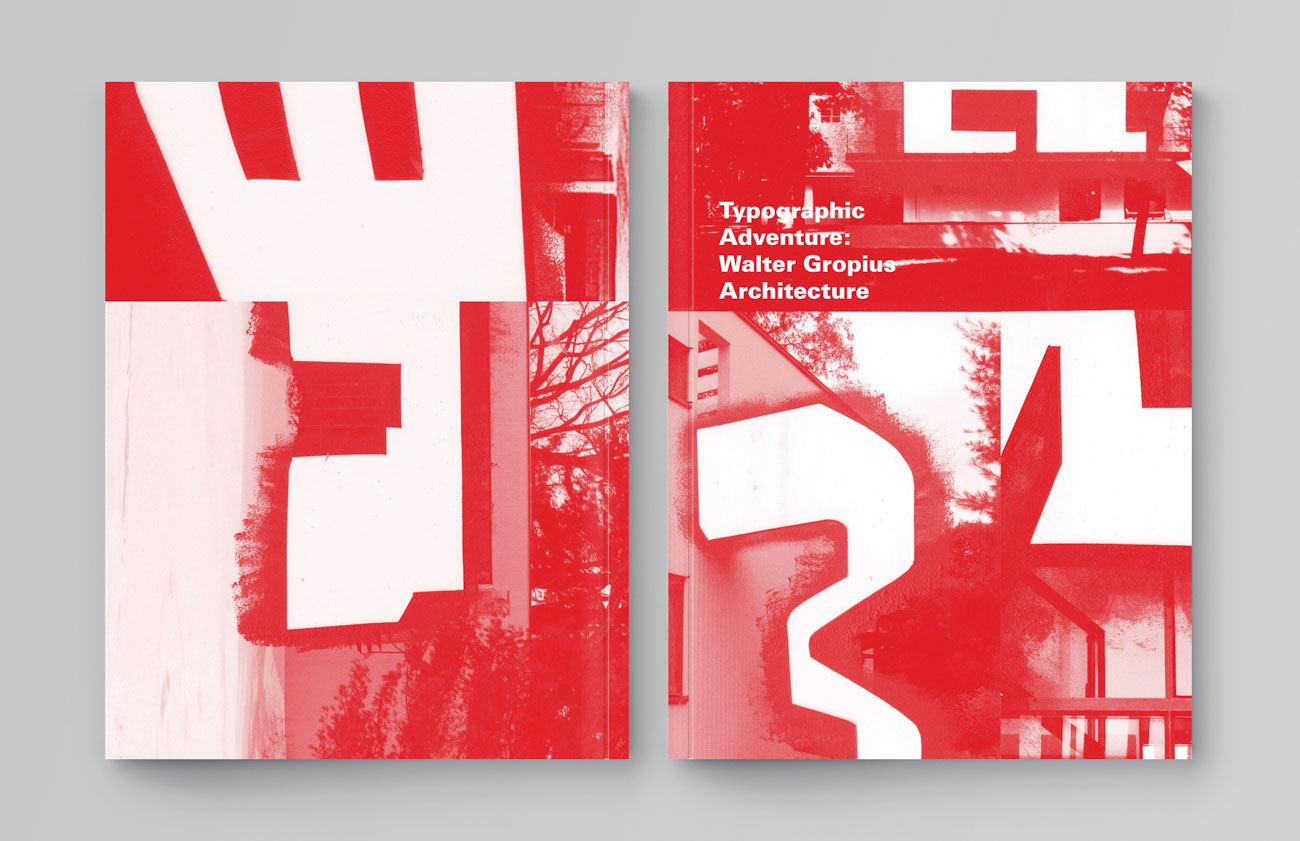
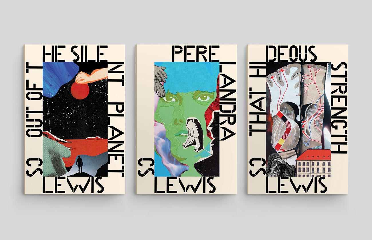
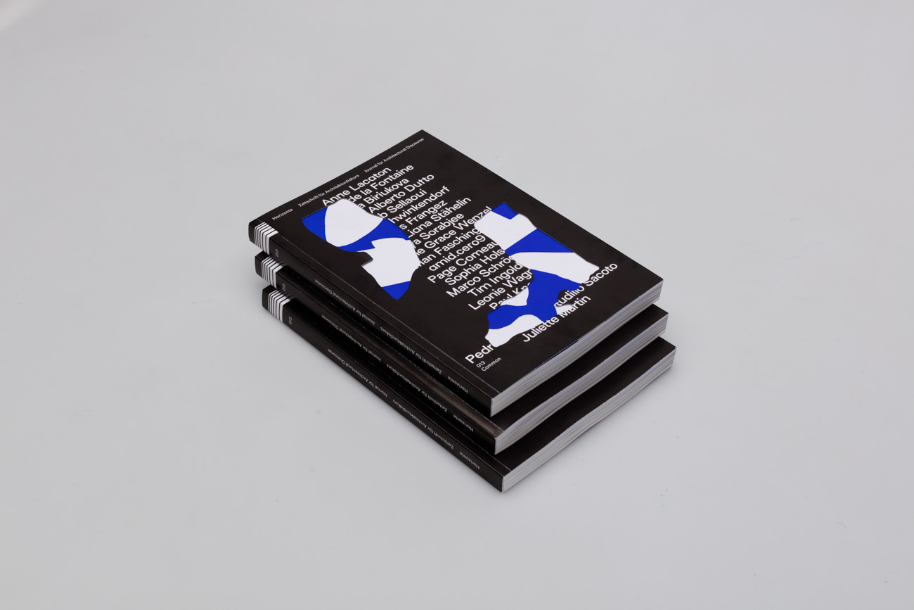
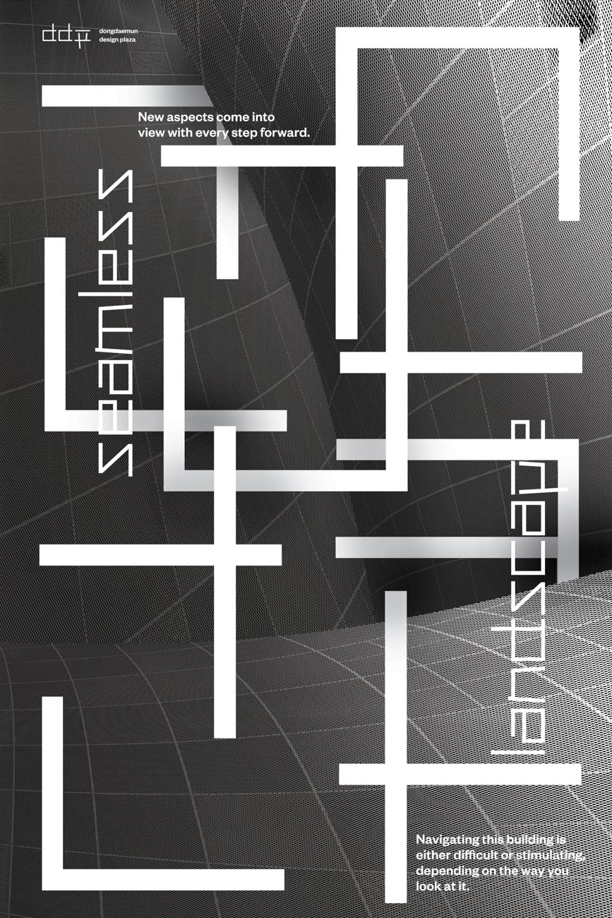
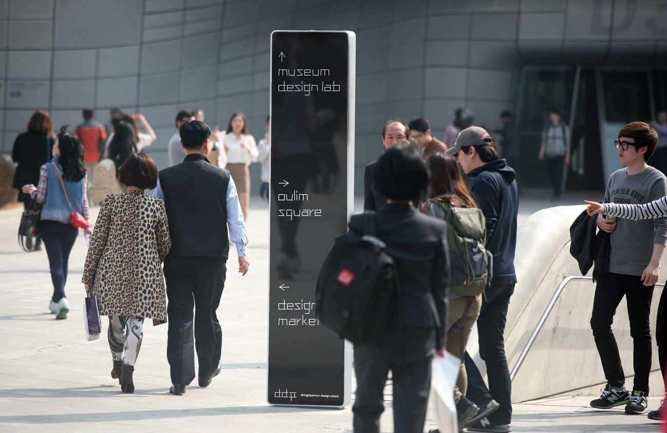
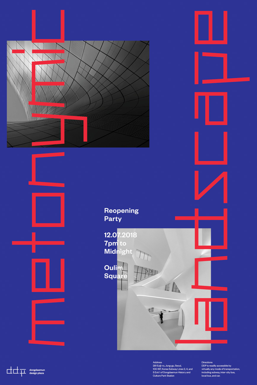
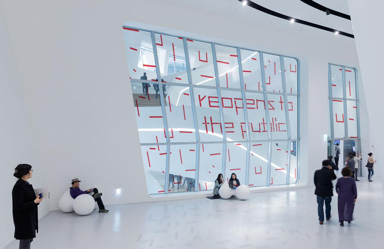
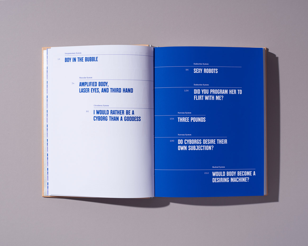
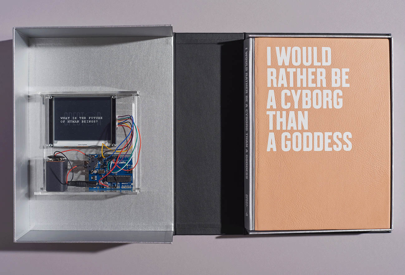
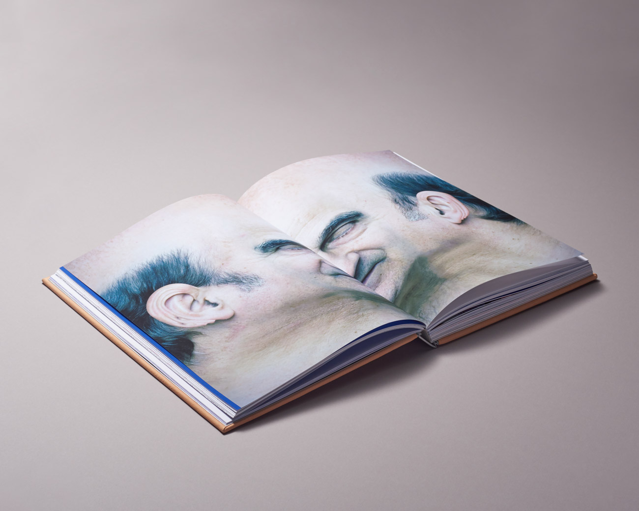
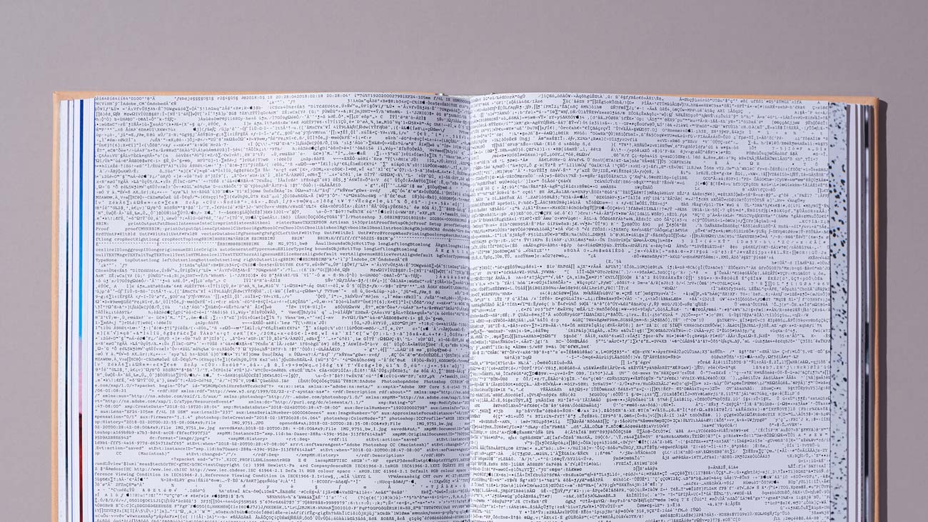
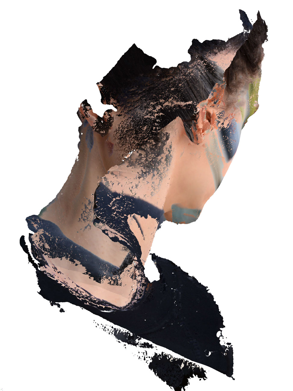
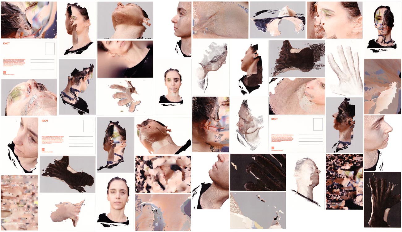
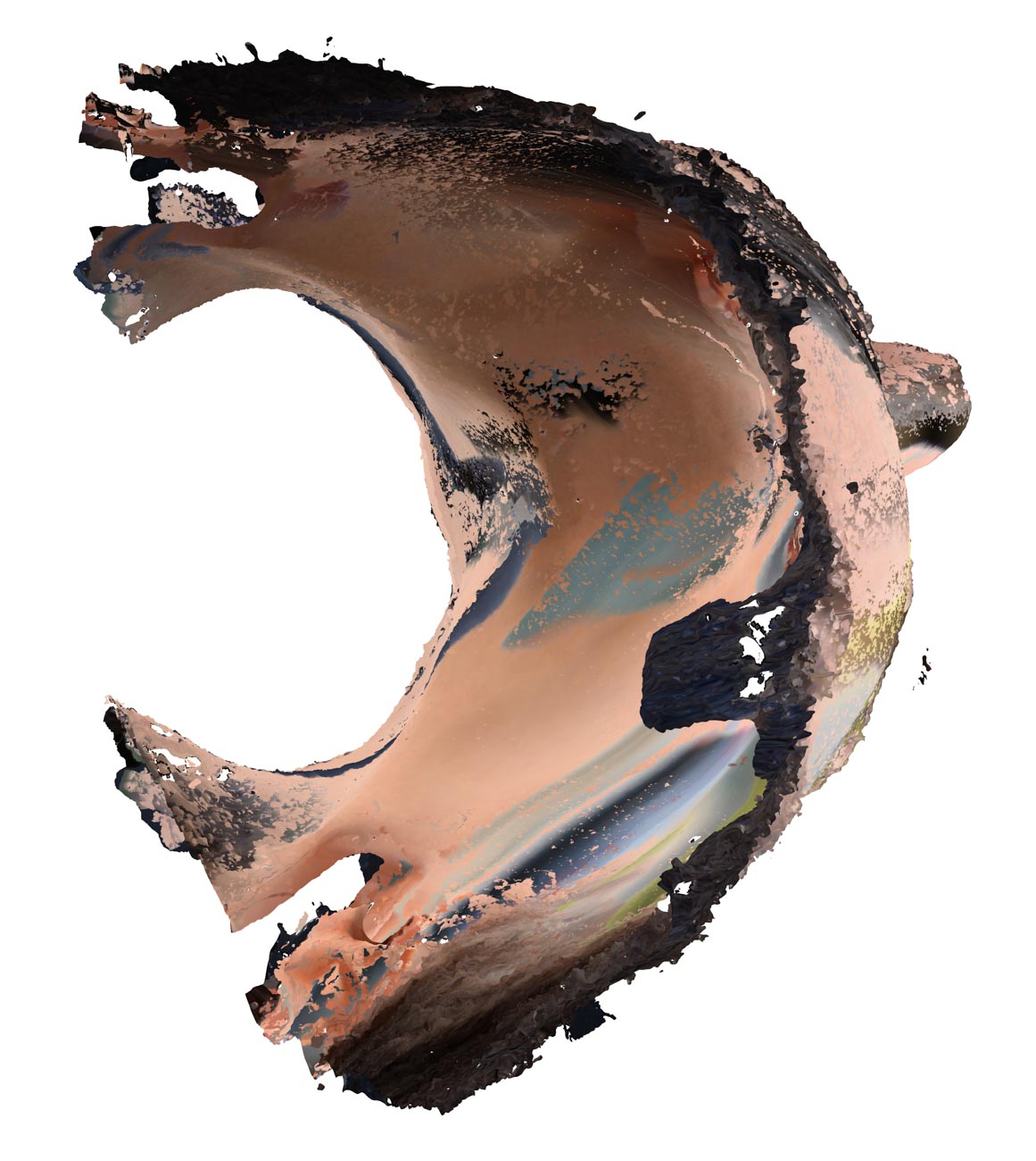
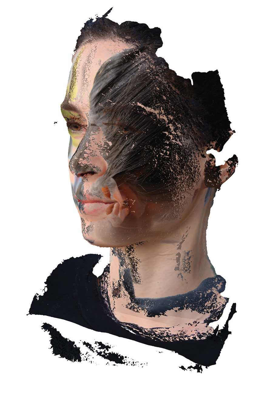
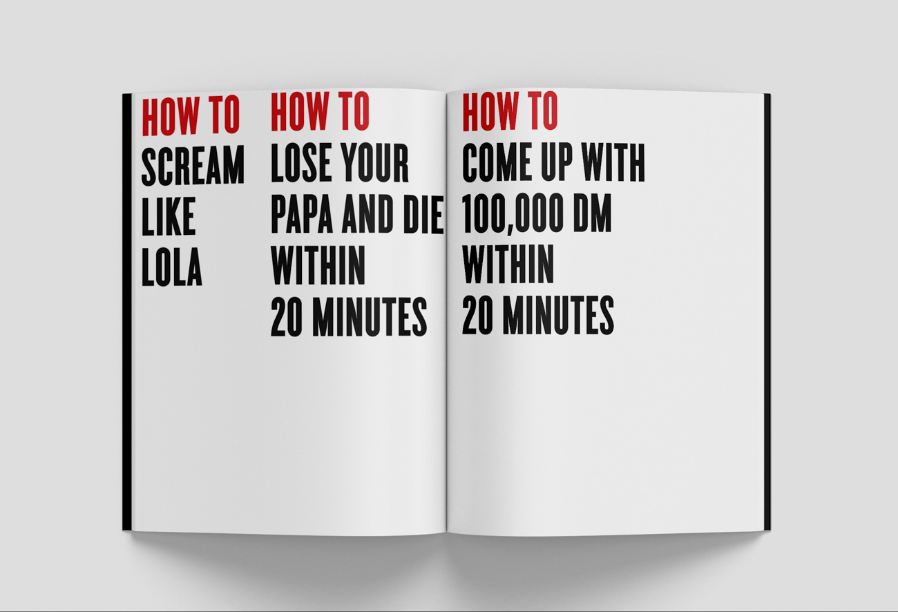
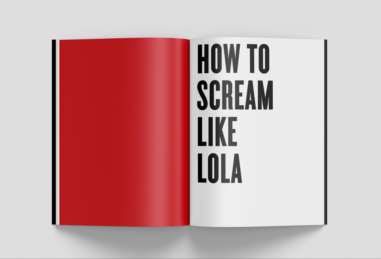
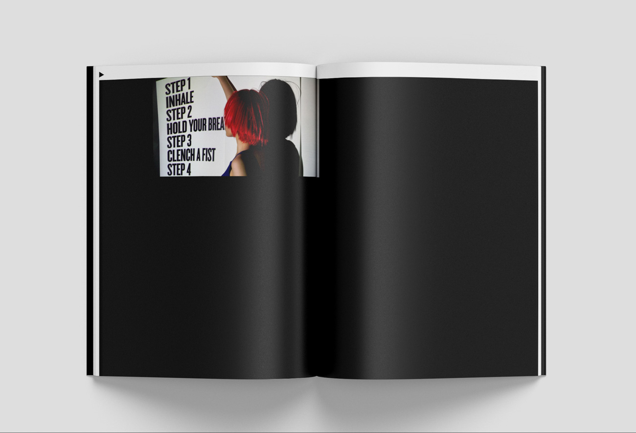
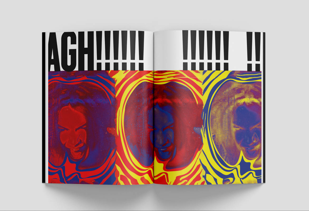
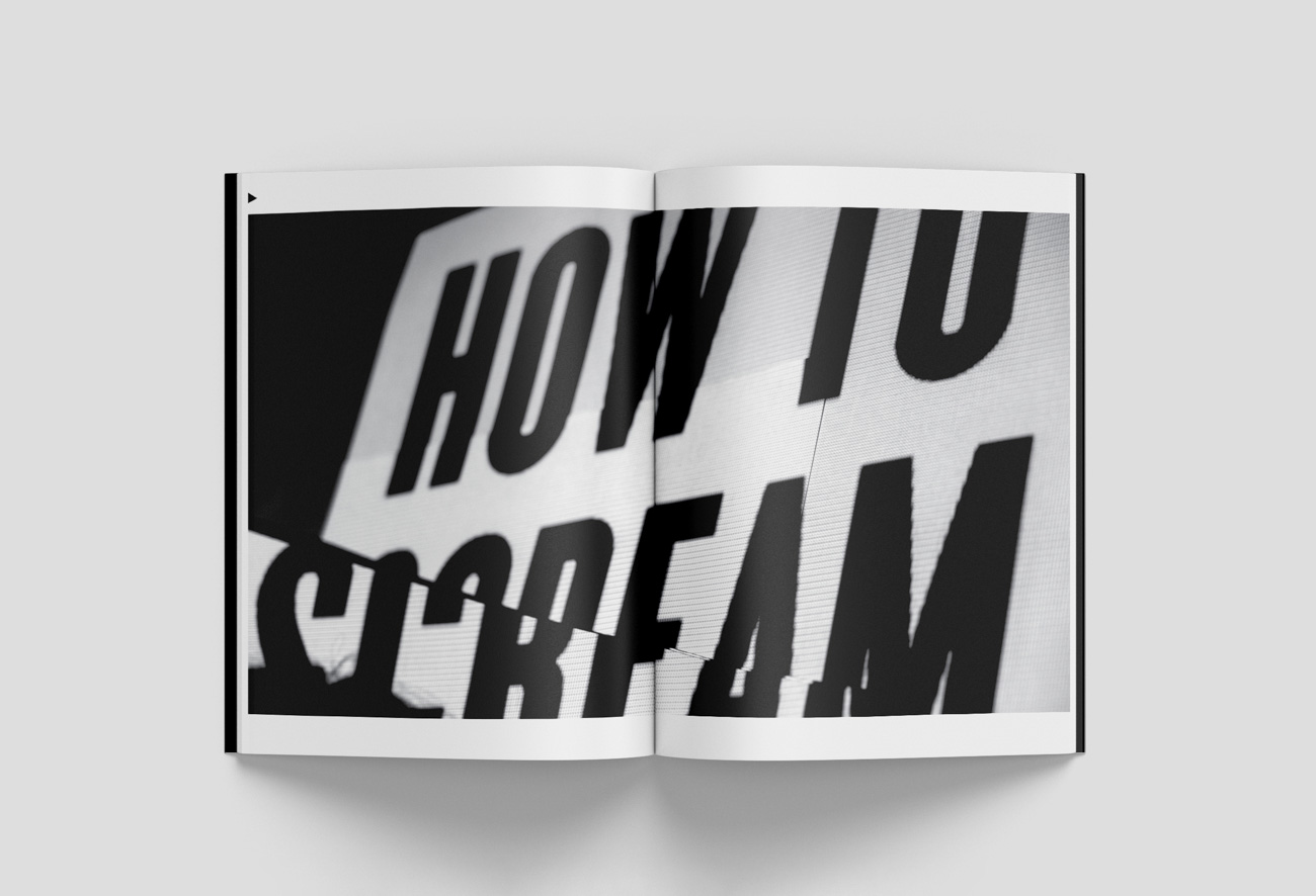
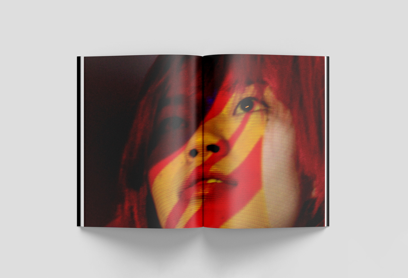
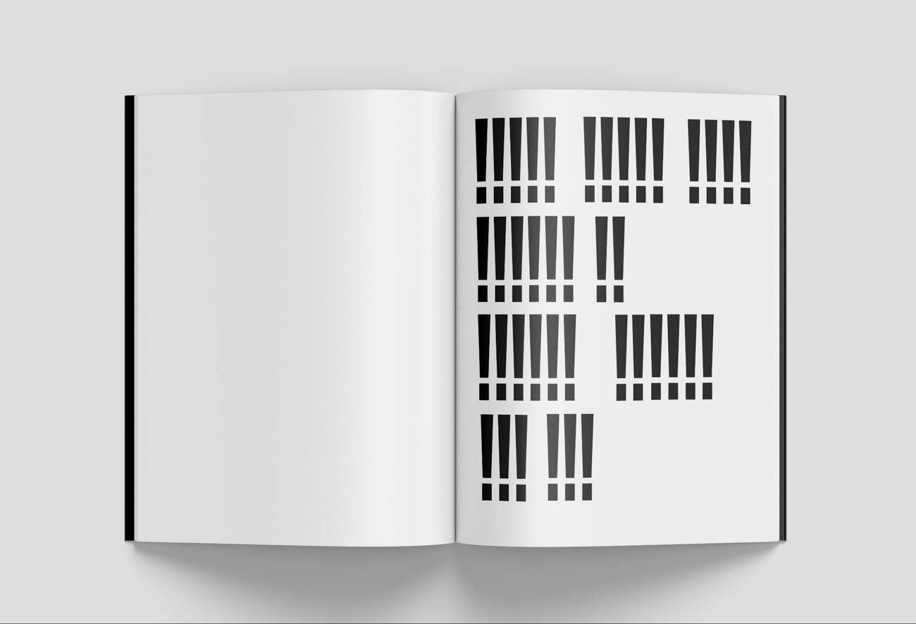
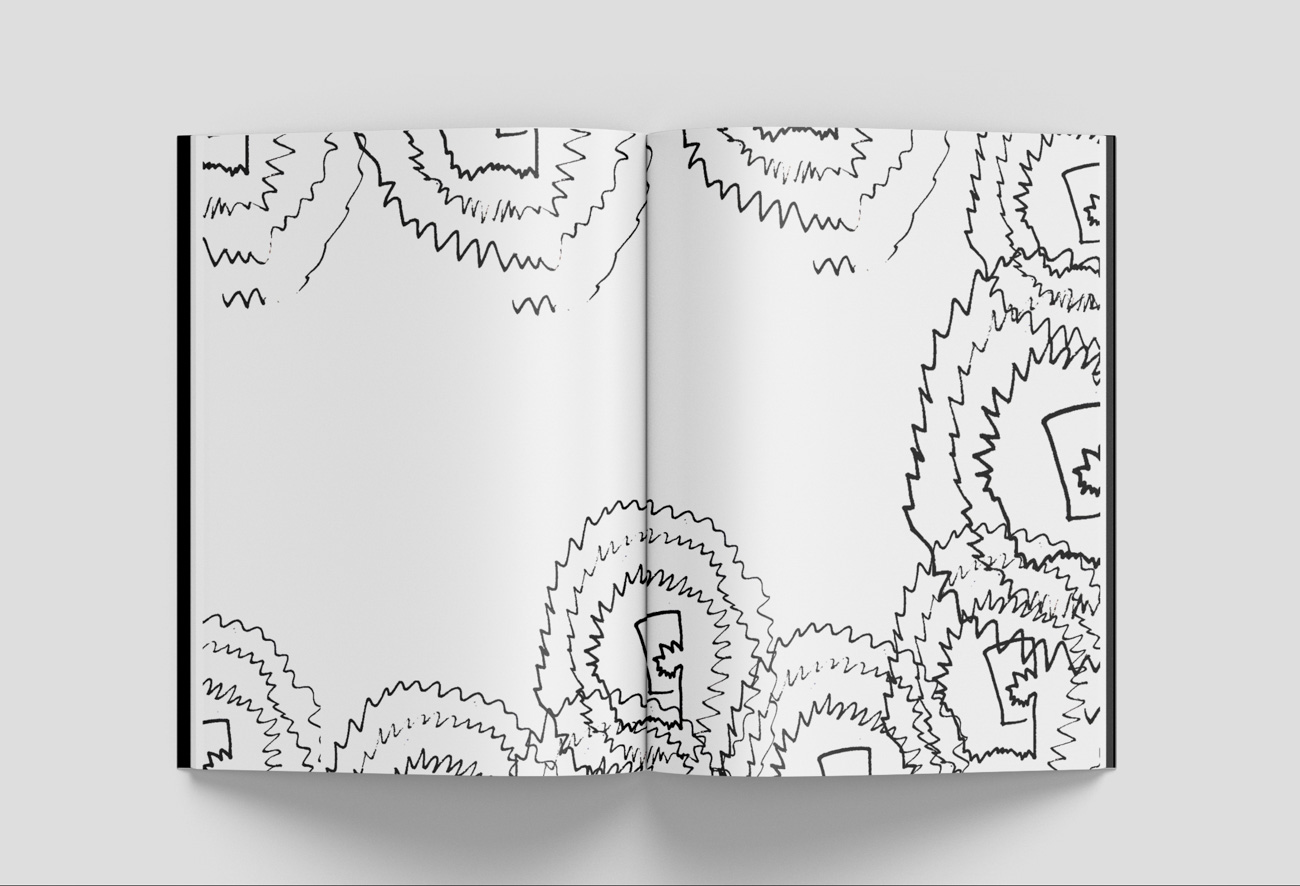
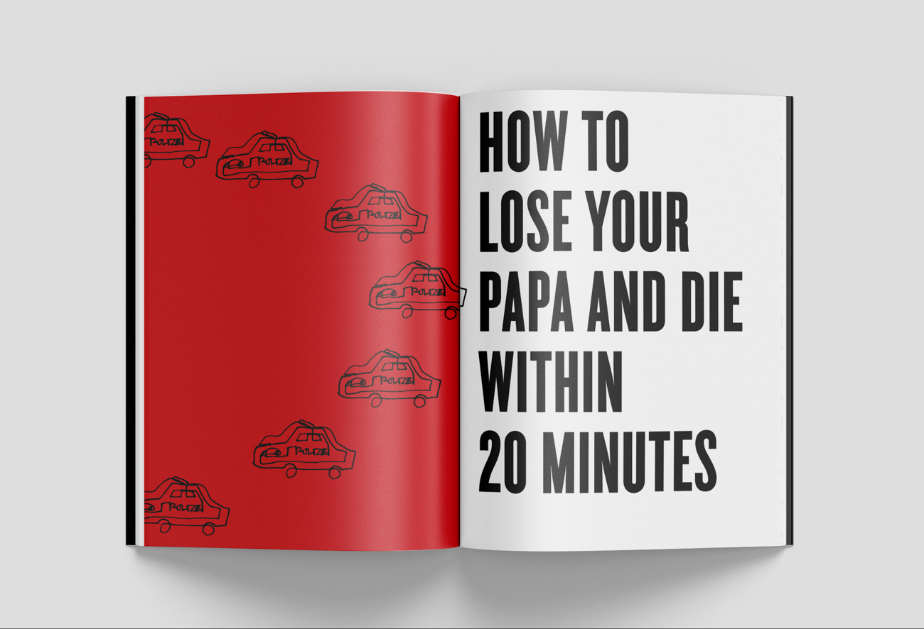
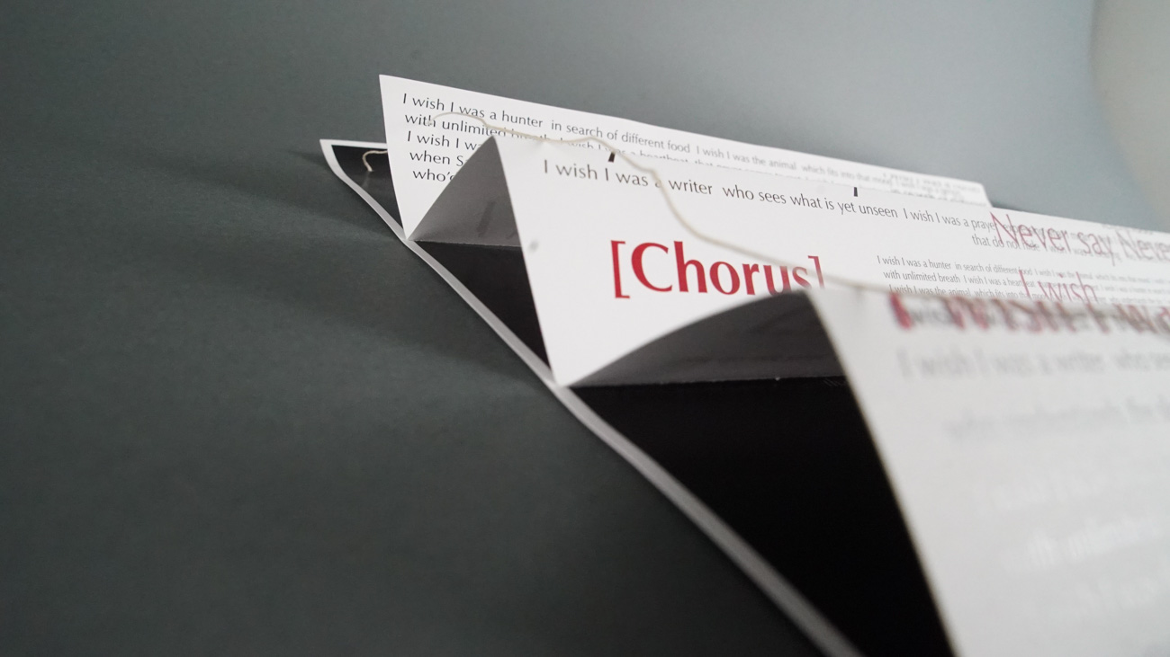
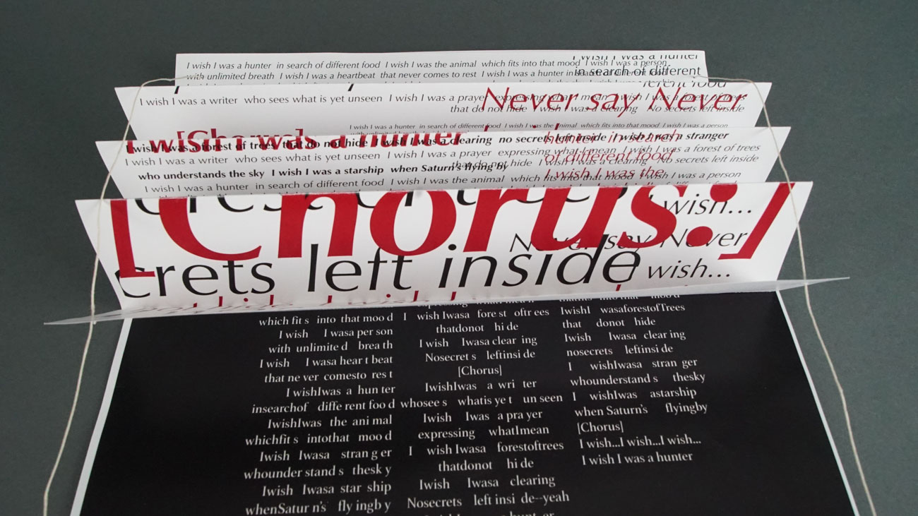
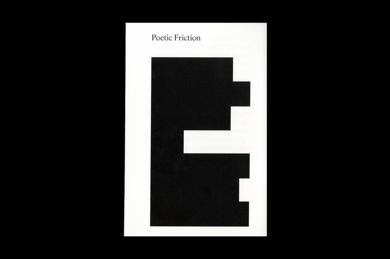
type directors club - exposition typographique internationale - 15 mars > 26 avril - type directors club - exposition typographique internationale - 15 mars > 26 avril - type directors club - exposition typographique internationale - 15 mars > 26 avril -
retour catégorie page accueil TDC Type Directors Club

Poetic Fiction

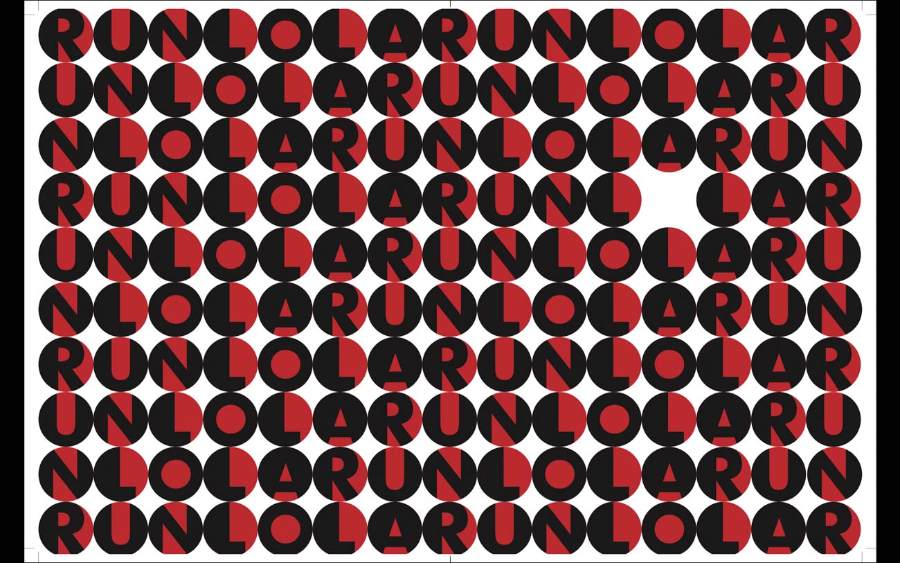
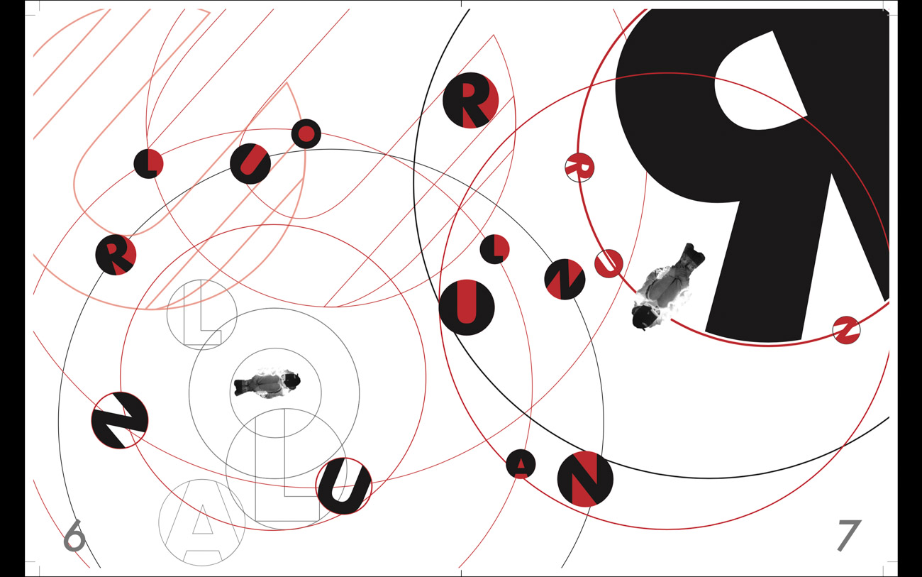
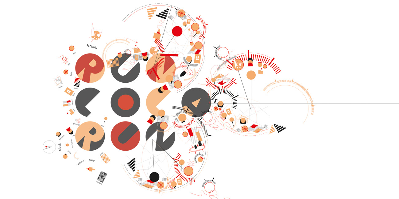
The book contains my design exploration of indirection as a design methodology in various forms. The writing is abbreviated by blocking out paragraphs. The abstract silhouette echoes the book title as poetic visual “friction.” The editorial design examines how to communicate subtlety to elicit mindful interpretations of the content.

Design
Dian Jiao
Brooklyn, New York

Photography
Dian Jiao
Chengyou Xue

Instagram
@dianjiaoo

Instructors
Ramon Tejeda
Scott Vander Zee

School
Pratt Institute

Principal Type
Life Roman Regular

Dimensions
6 x 9 in.
(15 x 22.8 cm)

Voir aussi dans la même catégorie

retour catégorie page accueil TDC Type Directors Club

No Hate

No Hate is a (fictional) quarterly journal dedicated to combating the global proliferation of hate. It’s my response to the current rise of populism, xenophobia, and misogyny. I aimed for this to be an outlet for millennial frustrations while highlighting resistance efforts in the arts and literature. Typeface Designers: Miguel Reyes, Adrian Frutiger, Robert Slimbach.

Design
Tiffany Pai
New York

URL
tiffany-pai.com

Instructors
Justin Colt
Jose Fresneda

School
School of Visual Arts, New York°

Principal Type
Ayer
Adobe Garamond Pro
Univers

Dimensions
6.5 x 9 in.
(16.5 x 22.9 cm)

Voir aussi dans la même catégorie

retour catégorie page accueil TDC Type Directors Club

Dongdaemun Design Plaza (DDP)

DDP is a multicultural complex. Since its founding on March 21, 2014, DDP has staged diverse cultural events, including exhibitions, fashion shows, product launch shows, forums, conferences, and various cultural events. It is a venue that introduces new products and fashion trends, that shares knowledge through exhibitions, and that offers diverse contents to experience new design. The new identity system was inspired by the straightness of Korean letters and also the openness of the architecture. Full logotype can be read as acronyms of Korean letters and English acronyms at the same time to acknowledge the international recognition of the organization.

Design
Yura Park°
San Francisco

URL
yurapark.com

Instructor
Brad Bartlett

School
ArtCenter College of Design

Principal Type
DDP Che
Founders Grotesk

Dimensions
Various

Voir aussi dans la même catégorie

retour catégorie page accueil TDC Type Directors Club

I Would Rather Be a Cyborg Than a Goddess

This project uses post-humanist thinking to speculate about the changing human relationships with technology. Through the history of cybernetics, feminism, postmodernist thinking, and conversations in the popular press, the book investigates the meaning of a cyborg and what it means to be a human. Postmodernism’s uncertainty leaves our future open to question or contemplate upon.

Design
Yura Park
San Francisco

URL
yurapark.com

Photography
Kevin Martin

Instructor
Brad Bartlett

School
ArtCenter College of Design

Principal Type
Dada Grotesk
Montefiore
Pitch

Dimensions
8.25 x 11 in.
(21 x 27.9 cm)

Voir aussi dans la même catégorie

retour catégorie page accueil TDC Type Directors Club

Ta-Nehisi Coates

Ta-Nehisi Coates is an American author, journalist, comic book writer, and educator. He was a national correspondent at the Atlantic, where he wrote about cultural, social, and political issues, particularly regarding African Americans and white supremacy. Newsprint paper was chosen to reflect Coates’s characteristic writing style—which is realistic and bold.

Design
Eun Jung Bahng
Pasadena, California

URL
jenniferbahng.com

Instructor
River Jukes-Hudson

School
ArtCenter College of Design

Principal Type
Knockout
New Century Schoolbook
Univers

Dimensions
8.5 x 11 in.
(21.6 x 27.9 cm)

Voir aussi dans la même catégorie

retour catégorie page accueil TDC Type Directors Club

UNKNOWN KNOWNS

According to cognitive neuroscientists, we are conscious of only about five percent of our cognitive activity, so most of our decisions, actions, emotions, and behavior depends on the ninety-five percent of brain activity that goes beyond our conscious awareness. This book is not created to tediously arrange a list of dreadful crimes. It is a book created to help people identify criminals by observing their behaviors.

Design
Eun Jung Bahng
Pasadena, California

URL
jenniferbahng.com

Instructor
Tracey Shiffman

School
ArtCenter College of Design

Principal Type
Akzidenz-Grotesk
Courier

Dimensions
7.5 x 10 in.
(19.1 x 25.4 cm)

Voir aussi dans la même catégorie

retour catégorie page accueil TDC Type Directors Club

Diploma Project: Nukleus & Peripherie

A duo diploma project, “Nukleus & Peripherie” asks and aims to answer questions on the relation between semiotic language(s) and our understanding of the world, by presenting Sarah Kral and Erika Mai’s own reflections and comments by renowned contributors (such as Uwe Wirth, Daniel Martin Feige, and Andreas Gardt) as two conversation partners (each bound individually) in a shared cover that unites them when folded.

Graphic Design Graduates
Sarah Kral
Erika Mai
Stuttgart

URL
sarah-kral.com

Instagram
@erika.april

Professor
Uli Cluss

School
State Academy of Art and Design, Stuttgart

Principal Type
Grafier Medium
Grafier Regular
Neue Montreal Bold
Neue Montreal Italic
Neue Montreal Regular

Dimensions
Various

Voir aussi dans la même catégorie

retour catégorie page accueil TDC Type Directors Club

IDIOT

A study on contemporary privacy and camouflage, “IDIOT” approaches the notion of concealment and protection through ubiquity. I blurred the boundaries of my own identity by creating a plurality of simulated and simultaneous presences. I gave myself over and surrendered my privacy to reinstate it. “I’m losing my idiot state steadily, I’d much rather be an idiot,” stated Marshal McLuhan. He refers to the original meaning of the word idiot, which derives from the Greek idiōtēs, meaning a very private individual or citizen. The project embraces the word as an ironic reference to its original meaning.

Design
Lavinia Lascaris
Pasadena, California

URL
lavinialascaris.com

Twitter
@lavinialascaris

Advisors
Simon Johnston
Carolina Trigo

School
ArtCenter College of Design

Principal Type
Linux Libertine Display
Suisse Int’l
Suisse Works

Voir aussi dans la même catégorie

retour catégorie page accueil TDC Type Directors Club

Run Lola Run

I Wish I Were Lola is a “how to” book as a humorous response to the 1998 thriller film Run Lola Run, directed by Tom Tykwer. Among the elements of big, bold, red headline-style typography and hyper images, the re-edits of the storyline in the book intends to, in the language of the graphic and typographic, maintain and deliver the stream of explosive energy the iconic original movie conveys. The design style is also referencing the chaotic yet drastic ’90s Berlin street art and music, with great emphasis on freedom and opportunities.

Design
Yaxi Xiao
New York

URL
yaxixiao.com

Instructor
Olga Mezhibovskaya°
Nada Ray

School
School of Visual Arts, New York°

Principal Type
Cyclone Layers Background
Flyerfonts-Hardcore

Dimensions
9 x 12 in.
(23 x 30.5 cm)

Voir aussi dans la même catégorie

retour catégorie page accueil TDC Type Directors Club

Run Lola Run

In the film, Lola gets the money at the end of each event. The money is a must. What affects the result is how she achieves this goal. The design’s circle represents the “life path” we can never get rid of. I played around with the typeface to present those decisions we make to “fill up” our life goal. The “type form” represents our efforts. We cannot change the life path (the circle), but we can choose how to live in a way we love.

Design
Vivian Kong
New York

Instructors
Olga Mezhibovskaya
Nada Ray

School
School of Visual Arts, New York

Principal Type
Futura

Dimensions
11 x 17 in.
(27.9 x 43.2 cm)

Voir aussi dans la même catégorie