type directors club - exposition typographique internationale - 15 mars > 26 avril - type directors club - exposition typographique internationale - 15 mars > 26 avril - type directors club - exposition typographique internationale - 15 mars > 26 avril -
retour catégorie page accueil TDC Type Directors Club

Bonsai Beer

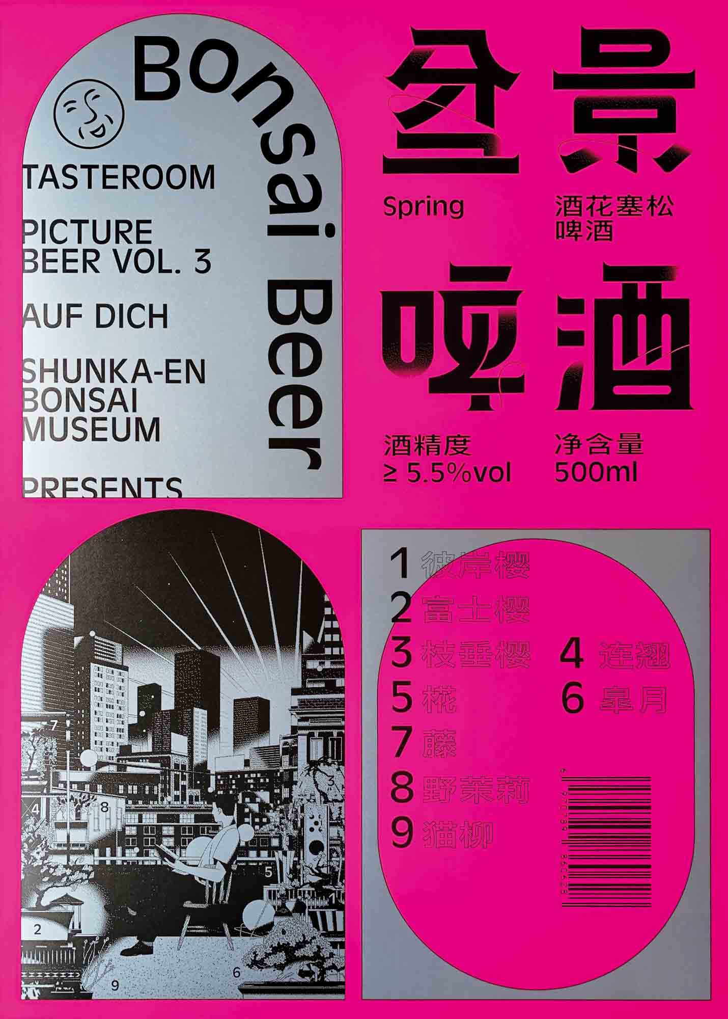
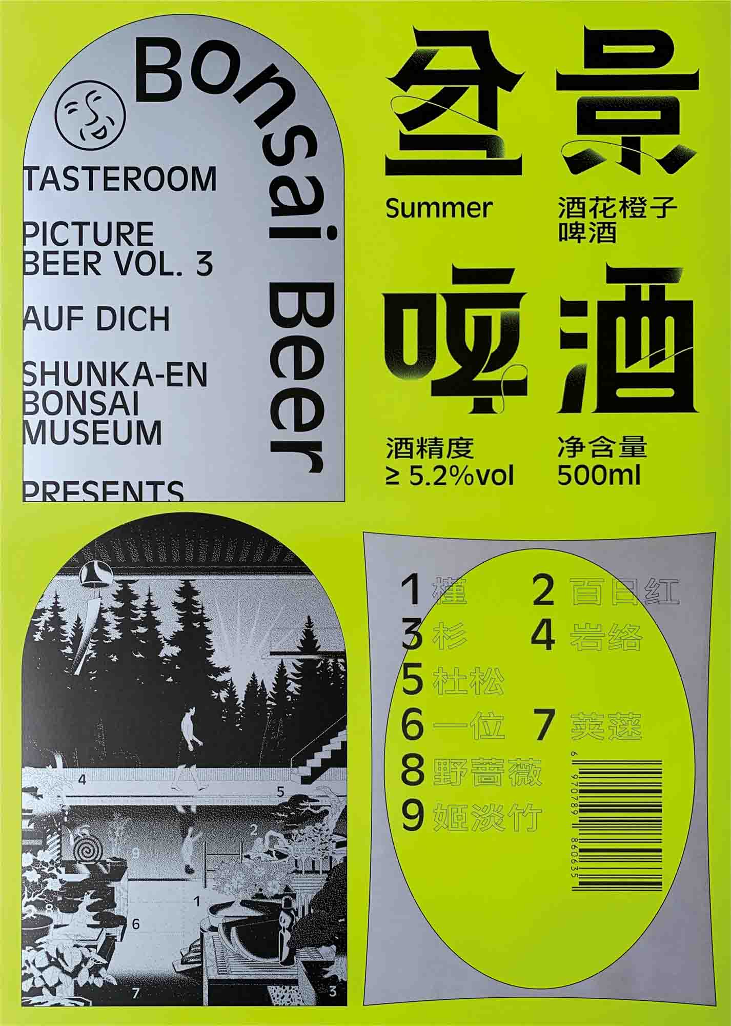
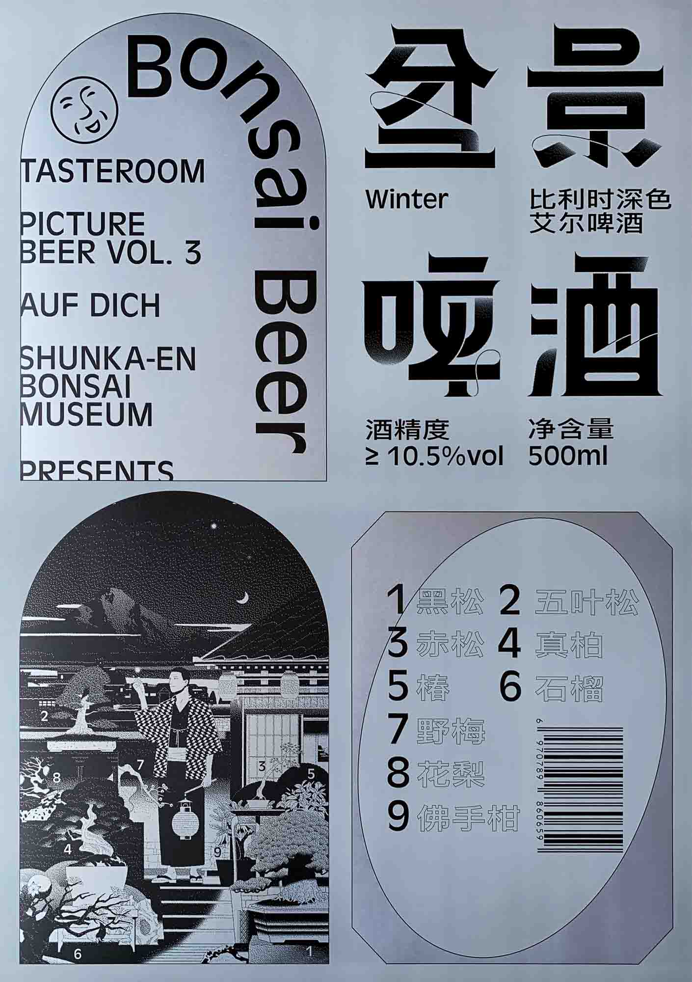
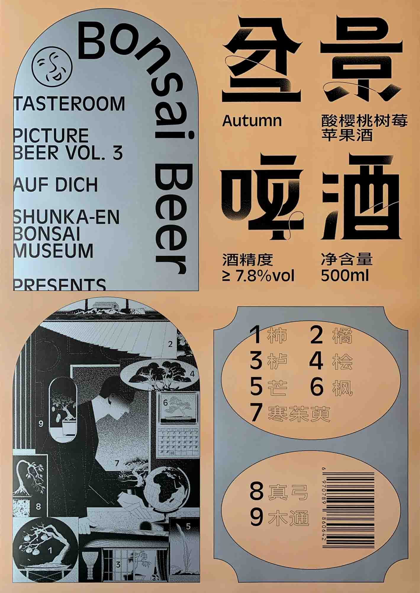
With support from the Shunkaen Bonsai Museum, Bad Preacher and Wang Yuan selected nine bonsai for each season and artistically integrated them into sceneries. The font of the brand’s Chinese name is also designed by borrowing the form of the bonsai. The poster design takes a bold approach to introduce the idea of a label, which prioritizes the purpose of branding by enlarging the basic information of the product. Pictorial and literal information, after being embedded into abstracted geometrical shapes, is reasonably categorized for people to read and digest while it delivers a sense of beauty in both function and form.

Bonsai Beer TDC ECV
Bonsai Beer TDC ECV
Bonsai Beer TDC ECV

Design and Art Direction
Bad Preacher
Wang Yuan
Shanghai

URLs
studioyuan.com
badpreacher.co

Design Firm
Auf Dich

Client
Tasteroom

Principal Type
Antique Olive Regular
Custom Chinese Typeface

Dimensions
22.8 x 32.2 in.
(58 x 81.8 cm)

Voir aussi dans la même catégorie

retour catégorie page accueil TDC Type Directors Club

Poster Series for Type of Yuyuan Road

The project is about how we study the data of vernacular typography on Yuyuan Road in Shanghai that is then translated into visuals. Our client, Creater Shanghai, is a company located on Yuyuan Road, a historical street in Shanghai. It commissioned us to design this poster series as the key visual for the project. The intention was to show the cultural diversity of Yuyuan Road and bring the attention back to the vernacular typography.

Poster Series for Type of Yuyuan Road

Art Direction
Kekfeng Lee
Shanghai

Creative Direction
Zifei Li

Design Studio
KAUKAU

Client
Creater Shanghai

Principal Type
Yuyuan Typeface

Dimensions
33.1 x 46.8 in.
(84.1 x 118.9 cm)

Voir aussi dans la même catégorie

retour catégorie page accueil TDC Type Directors Club

Strange Sounds From Beyond

Strange Sounds From Beyond (SSFB) is an Amsterdam-based festival and platform for cross-spectrum music. The work is based upon Suprematism, the Russian art movement emphasizing “the supremacy of pure artistic feeling.” Shapes are excerpted from Malevich works; type is in “dialogue” with the shapes, connected via the diagonal lines that create a sense of gradient movement. A custom typeface from GT America—combining American Gothic and European Grotesque faces—was used to create the triangular shapes as a typographic tool, thus achieving a ponderous feeling that translates SSFB into a 2D layer.

Creative Direction
Edwin van Gelder
Amsterdam

URL
mainstudio.com

Design Firm
Mainstudio

Client
Strange Sounds From Beyond

Principal Typeface
GT America (custom)

Dimensions
33.1 x 46.8 in.
(84.1 x 118.9 cm)

Voir aussi dans la même catégorie

retour catégorie page accueil TDC Type Directors Club

INCL

The identity of INCL is an ellipsis, and the underlying visual element is a circle. The purpose of the poster is to increase the tension and latitude of the brand, to let the brand show the possibility of diversity. The poster was designed as a visual extension of the logo but was also necessary to achieve continuity in content. Expressing an ellipsis as a sign allows endless variability.

INCL TDC ECV
INCL TDC ECV
INCL TDC ECV
INCL TDC ECV
INCL TDC ECV
INCL TDC ECV

Art Direction
Yi Dong Cai
Shanghai

Creative Direction
Yi Dong Cai
Lve Wang

URLs
caiyidong.com
lvewong.com

Studio
YD/L Studio

Client
BGAD

Principal Type
Foundertype

Dimensions
33.1 x 22.4 in.
(84 x 57 cm)

Voir aussi dans la même catégorie

retour catégorie page accueil TDC Type Directors Club

Supersaturated, Girl on Girl

The order of the graphical system is based on the titles of the exhibitions.The order of the graphical system is based on the titles of the exhibitions.

Supersaturated, Girl on Girl TDC ECV

Creative Direction
Verena Panholzer
Vienna

URL
studio-es.at

Design Firm
Studio Es

Client
Helmuts Art Club

Principal Type
Helvetica Narrow
TR Mono

Dimensions
33.1 x 46.8 in.
(84.1 x 118.9 cm)

Voir aussi dans la même catégorie

retour catégorie page accueil TDC Type Directors Club

October.17

“If, one day, people desire to live, then fate will answer their call.” That is a quote from the poet Aboul-Qacem Ecchebi (1933). October 17 is the day that the flame of the Lebanese revolution began. For the first time, I witnessed my people, united through their pain, as they demanded the right to live with dignity and without corruption and poverty. I created this Arabic lettering poster to celebrate my people’s strength and their willingness to create a better home.

Design
Sally Mallat
Dubai

URL
sallymallat.com

Instagram
@sallymal19

Principal Type
Handlettering, then digitized

Dimensions
23.4 x 33.1 in.
(59.4 x 84.1 cm)

Voir aussi dans la même catégorie

retour catégorie page accueil TDC Type Directors Club

Organized Depiction Exhibition

This poster was created for the announcement of the Organized Depiction exhibition, which showed various situations in a structured way over a specific period of time. All the information used in the exhibition was organized by a certain system, and the poster represents the nature of the exhibition in a contemplative manner.

Design and Art Direction
Choong Ho Lee
Ulsan, South Korea

Client
University of Ulsan

Principal Type
Avenir

Dimensions
20 x 28.8 in.
(51 x 73.3 cm)

Voir aussi dans la même catégorie

retour catégorie page accueil TDC Type Directors Club

commUNITY

There has been an almost nonstop parroting of how technology—and, by extension, design—has better connected us all and built stronger, communal bonds. Yet when we walk on the streets with our faces buried in our phones to check Instagram likes, when we eschew public transportation or biking for the insulation and convenience of ride-sharing, when we protest the building of new, affordable housing or homeless shelters in NIMBY fits of rage … well, it feels a lot more like “I” than “WE.”

Design
Giorgia Sage
San Francisco

Lead Designer
Eric Heiman

Creative Direction
Adam Brodsley
Eric Heiman

Printer
Plotnet Prints

URL
volumesf.com

Twitter
@volumesf

Design Firm
Volume Inc.

Client
San Francisco Design Week

Principal Type
Custom

Dimensions
24 x 36 in.
(61 x 91.4 cm)

Voir aussi dans la même catégorie

retour catégorie page accueil TDC Type Directors Club

Type Thursday Bucharest—October

Type Thursday Bucharest is part of the Type Thursday organization, with chapters in eleven cities all over the world. It focuses on showcasing type-related projects and engaging the audience in a constructive conversation based on them. The poster I designed for October’s edition emphasizes two playful and intricate T’s, both drawing inspiration from the Engrosser’s Script but with a twist. The process was mostly based on doodling with four pencils taped together in a rectangular shape, thus extrapolating the classical calligraphic feel into a 3D image that was finally rendered in Adobe Illustrator.

Design and Lettering
Traistaru Sorin Andrei
Bucharest

URL
sorintraistaru.com

Instagram
@sorintraistaru

Studio
Sorin Traistaru

Client
Type Thursday Bucharest

Principal Type
Obviously
Vulf

Dimensions
19.7 x 56 in.
(50 x 70 cm)

Voir aussi dans la même catégorie

retour catégorie page accueil TDC Type Directors Club

Off the 405

Off the 405 is the Getty Center’s outdoor concert series, a unique opportunity for the Getty to connect with diverse and spontaneous L.A. communities. By using the aerial view of the 405 freeway and the 10 interchange as the base grid, a series of typographic posters was created. The poster layouts and the rhythmic animation of the event info are similar to a frustrating bumper-to-bumper driving experience. After all, what’s more Los Angeles than being stuck in traffic? We hope these posters provided drivers in heavy traffic a moment of relief, joy, and curiosity.

Off the 405 TDC ECV
Off the 405 TDC ECV

Design, Art Direction, and Animation
Karen Nakada
Masato Nakada
Los Angeles
Tokyo

URL
thehappening.us

Studio
Happening Studio

Client
J. Paul Getty Museum

Principal Type
Knockout

Dimensions
24 x 36 in.
(61 x 91.4 cm)

Voir aussi dans la même catégorie