type directors club - exposition typographique internationale - 15 mars > 26 avril - type directors club - exposition typographique internationale - 15 mars > 26 avril - type directors club - exposition typographique internationale - 15 mars > 26 avril -
retour catégorie page accueil TDC Type Directors Club

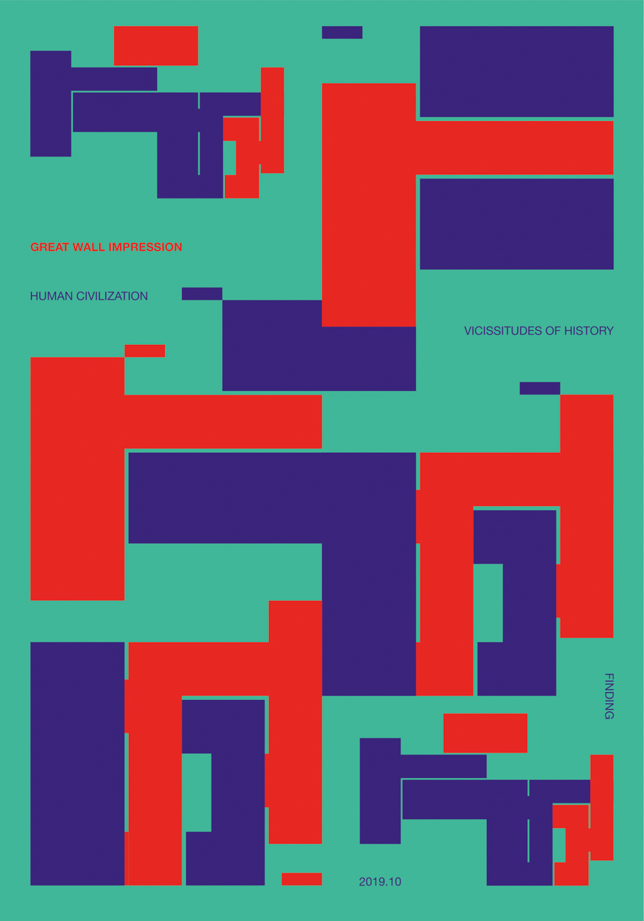
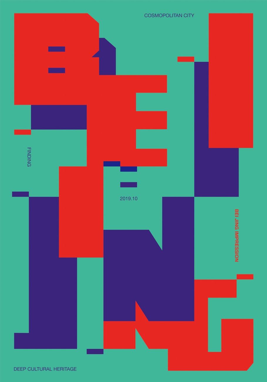
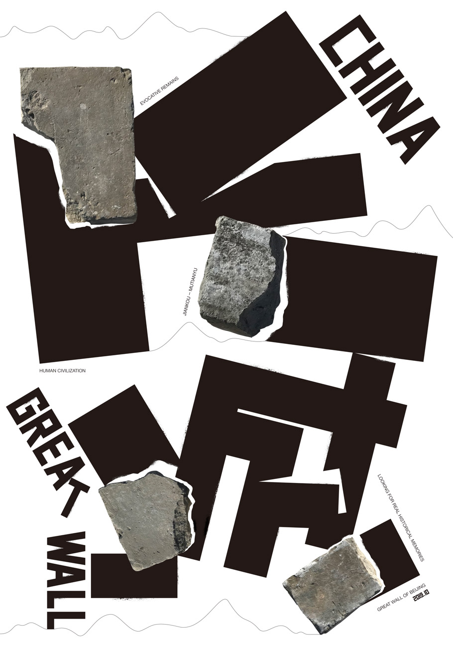
Great Wall Impression

The Great Wall is China’s business card. It is not only magnificent but also the embodiment of the ancient wisdom of Chinese civilization and the cultural heritage of the world. The work was created based on the concept of the Chinese characters “Great Wall” and “bricks” of the city wall for graphic creativity. It is composed of realistically photographed bricks of the ancient Great Wall. The brick’s real colors are preserved to show respect for the history of the Great Wall. The heavy visuals help illustrate this broken wall, making apparent the vicissitudes of history and severe wind erosion, leaving viewers with not only a sense of admiration for the wisdom of our ancestors but also regret that Chinese cultural relics are slowly being destroyed. This work shows that the wall is not well protected and is slowly eroding away.

Senior Graphic Design and Creative Direction
Yuan Liu
Beijing

URL
cargocollective.com/yuan

Design Firm
Liuyuandesign

Client
Beijing Cultural Office

Dimensions
27.6 x 39.4 in.
(70 x 100 cm)

Voir aussi dans la même catégorie

retour catégorie page accueil TDC Type Directors Club

Beijing Impression

Beijing is not only a city with a long history and culture, but it is also a modern international metropolis. I am deeply impressed by this city with its blend of history and modern culture. The whole city of Beijing has a regular layout in the four directions of southeast and northwest. The city center is reserved for old hutong buildings, while modern high-rises surround them. Hutong green brick buildings can be seen everywhere in the center of Beijing, preserving the continuity of Ming and Qing culture. The work uses the abstract modeling of bricks as the design concept, along with two different fonts for “Beijing” and “BEIJING,” both of which are composed of brick cuboid shapes. The direct interleaving of bricks is also shown in the interleaving of fonts and graphics, to give the feeling of walking around Beijing. The palette is bright and thick, with Beijing’s blue and red as the main colors. The overall feeling is both traditional and fashionable.

Beijing Impression TDC ECV

Senior Graphic Design and Creative Direction
Yuan Liu
Beijing

URL
cargocollective.com/yuan

Design Firm
Liuyuandesign

Client
Beijing Cultural Office

Dimensions
27.6 x 39.4 in.
(70 x 100 cm)

Voir aussi dans la même catégorie

retour catégorie page accueil TDC Type Directors Club

The East Wind Prevails Over the West Wind

This was a poster for the Foundertype Poster Exhibition in Beijing.

Design
Jianping He
Berlin

URL
hesign.com

Design Studio
hesign

Client
FounderType Beijing

Principal Type
FZDaBiaoSong-B06S

Dimensions
39.3 x 55.1 in.
(100 x 140 cm)

Voir aussi dans la même catégorie

retour catégorie page accueil TDC Type Directors Club

Bang Band Education Posters

Each poster exists in three states—printed, motion, and augmented reality—and shows how typography works in different contexts.

Bang Band Education Posters TDC ECV

Art Direction
Nastya Vishnyakova
Svyat Vishnyakov
Moscow

URL
electricred.design

Studio
Electric Red Studio

Client
Bang Bang Education School

Principal Type
Suisse Int’l Book

Dimensions
23 x 33 in.
(84.1 x 58.8 cm)

Voir aussi dans la même catégorie

retour catégorie page accueil TDC Type Directors Club

The Bush 2020

This grow-choice campaign was brought to life through a series of posters inspired by the nostalgia of the heydays of political campaign design. It reappropriates those visual cues, primary colors, and typography to serve a new and modern message of choice and body inclusivity.

The Bush 2020 TDC ECV

Design
Emily Atwood
New York

Design Director
Carla Poirier

Partner-in-Charge and Creative Direction
Paula Scher

Head of Creative
Roxana Zegan

Project Manager
Rusty Van Riper

Freelance Creative
Graham Douglas

Copywriter
Camille Muson

Director of Marketing
Biz Lindsay

Design Firm
Pentagram

Client
Flamingo, New York

URL
shopflamingo.com

Instagram
@meetflamingo

Principal Type
Titling Gothic

Dimensions
24 x 36 in.
(61 x 91.4 cm)

Voir aussi dans la même catégorie

retour catégorie page accueil TDC Type Directors Club

The Origin of Life

The BioClub platform, which aims to promote the biotechnology community, has built a lab/creative work space in FabCafe Tokyo. With the goal of making BioClub more widely recognized, we created a visual symbol through programming and graphic design. The three types of “BIO” typography were inspired by the fact that a protocell, the origin of life, has a simple lipid membrane structure. The design not only derives from the aesthetic sense of the designer, but also explores the possibility of a more organic vision of life by incorporating the laws and dynamics of nature and the physical world.

The Origin of Life TDC ECV

Design
Natsuki Isa
Kazushige Takebayashi
Shuhei Yokota
Tokyo

Art Direction
Natsuki Isa
Kazushige Takebayashi

Programming
Shoya Dozono
Junichiro Horikawa
Ryosuke Nakajima

Photo Retoucher
Miki Kudo

URL
shainc.co.jp

Design Studio
SHA inc.

Client
BioClub

Principal Type
Custom

Dimensions
33.1 x 23.4 in.
(84.1 x 59.4 cm)

Voir aussi dans la même catégorie

retour catégorie page accueil TDC Type Directors Club

Party and Release

The basic idea of the design is the coming together of different artistic positions within the Freie Tanz- und Theaterszene Stuttgart.

Party and Release TDC ECV

Design
Benjamin Kivikoski
Philipp Staege
Stuttgart

URL
bureau-progressiv.com

Studio
Bureau Progressiv

Client
Freie Tanz- und Theaterszene Stuttgart

Principal Type
Euclid Medium
Special glyphs

Dimensions
23.8 x 33.1 in.
(59.4 x 84.1cm)

Voir aussi dans la même catégorie

retour catégorie page accueil TDC Type Directors Club

Parachute

This poster was designed for Parachute.FM, source for eclectic music. To work this out, I decided to combine two very different fonts into one new one. Following the path of the parachute, the letters fall from top to bottom.

Design
Götz Gramlich
Karlshule, Germany

URL
gggrafik.de

Design Firm
gggrafik

Client
émission radio

Principal Type
Rockwell
Custom (Kraft and Rockwell)

Dimensions
27.6 x 30.4 in.
(70 x 100 cm)

Voir aussi dans la même catégorie

retour catégorie page accueil TDC Type Directors Club

X. Mut zur Wut

Poster for the X. edition of the Mut zur Wut poster competition. Just as the posters themselves invite the viewer to stop (and think), the does the X, as it reminds us of a very well-known sign in public transport: dangerous intersection—stop!

Design
Andrew Goldstein
Jeff Goldstein
Götz Gramlich
Karlsruhe, Germany

Design Firms
2xGoldstein and gggrafik

Principal Type
System 85

Dimensions
27.6 x 30.4 in.
(70 x 100 cm)

Voir aussi dans la même catégorie

retour catégorie page accueil TDC Type Directors Club

Enquête Arcane

This exhibition poster took its title inspiration from André Breton’s book Arcane 17, which refers to the seventeenth blade of the tarot, where the emblem of the star appears, and the seventeenth letter of the Hebrew alphabet, which evokes the tongue in the mouth. Playing on the analogy between the arcane and the letter, Breton puts the woman—symbol of the source of life—at the center of a whole series of correspondences and passionate attractions. She pours water out of her hands.

Art Direction
Toan Vu-Huu
Paris

URL
baldingervuhuu.com

Studio
baldinger•vu-huu

Client
DOC!

Principal Type
Handlettering

Dimensions
47 x 69 in.
(120 x 176 cm)

Voir aussi dans la même catégorie