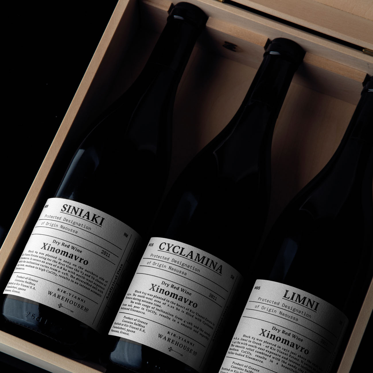
Warehouse 10 Kir-Yianni
The label was created as an index of vintages for all wine lovers and collectors. The series depicts the analytical data of the wine, including essential factors such as the age of vines and information about the soil and the clones. The idea was to communicate the quality and to record all of the unique features in a systemic way. The printing technique used was traditional letterpress. For the typeface we used a contemporary serif font, combining the calligraphy of the broad nip pen with the sharpness of the scalpel. All data are depicted with a monospace typeface, GT America—the missing bridge between nineteenth-century American Gothics and twentieth-century European Neo-Grotesk typefaces. It uses the best design features from both traditions in the widths and weights where they function optimally.