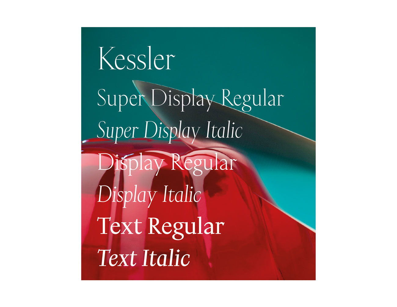
Kessler
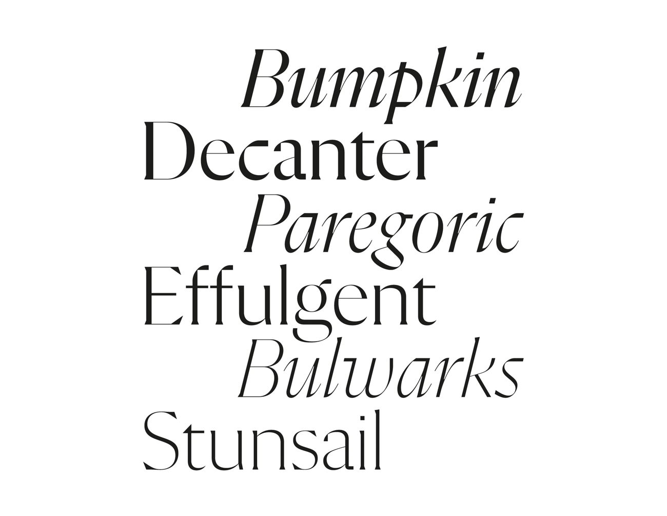
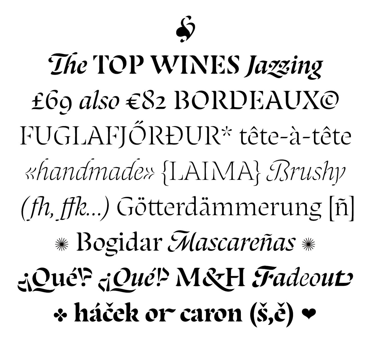
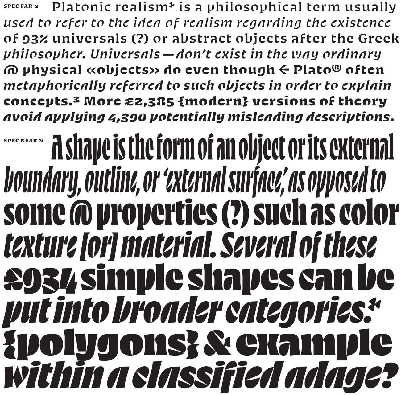
Alaric Garnier’s Kessler achieves a contemporary take on inscriptional serifs. Quirks meet pleasantries throughout the character set while delivering highly readable, optimistic text settings. Classicism comes through in the forms of the lowercase a and g, and tradition is upheld in its slightly more condensed italic. But Kessler is never dull; it takes liberties with every r and sparkles across the page. There is plenty of personality in Kessler Display, and its text is substantive. For a fine serif typeface, it is remarkably sturdy, with a rich typographic color that encourages reading. Its italic swoops through like an Austen plot—smooth and assuming, with charming character.


