Almost
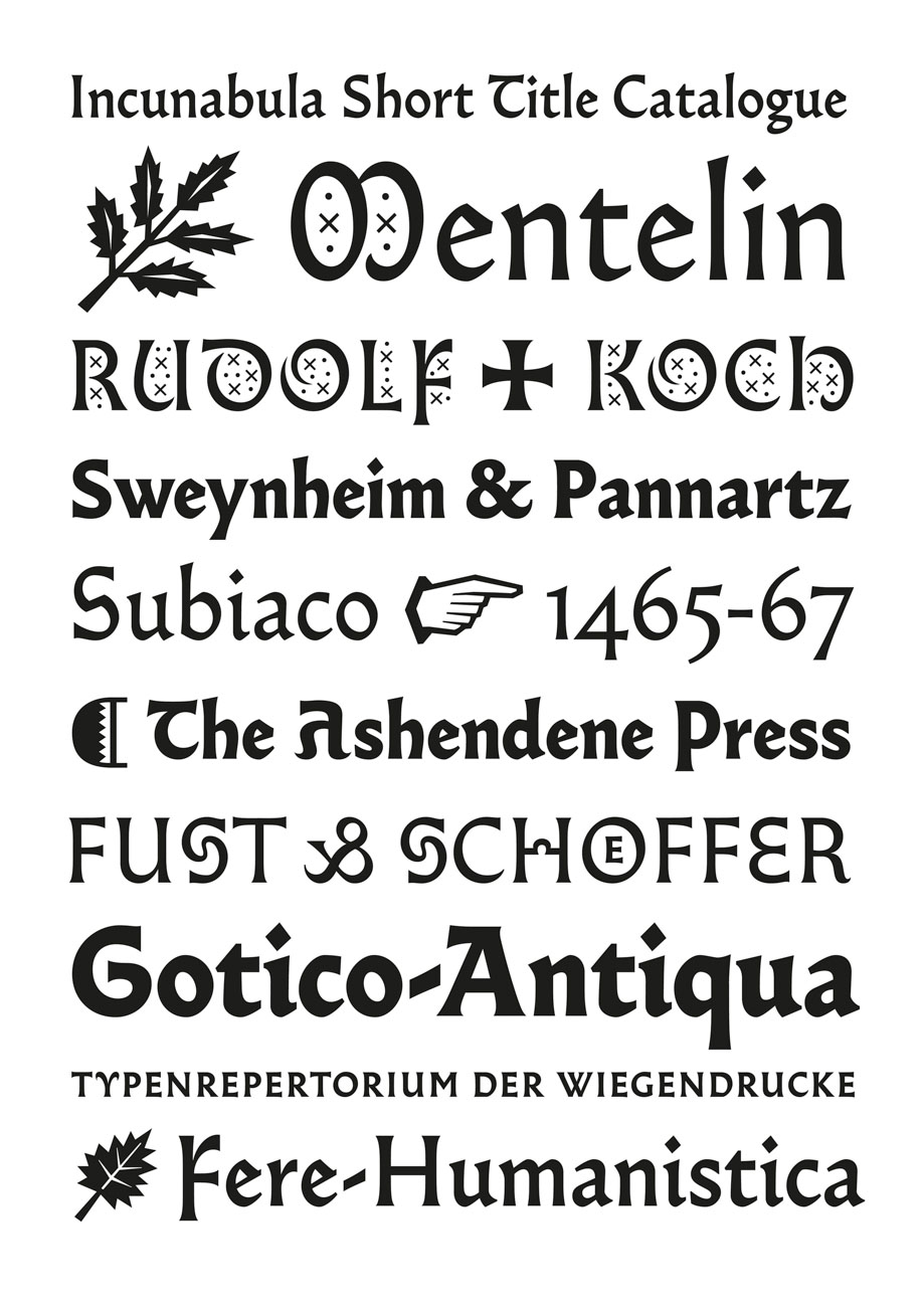
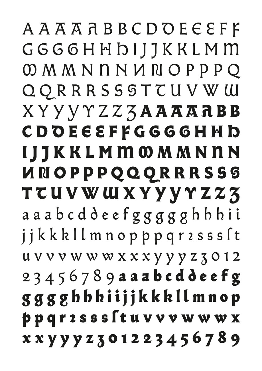
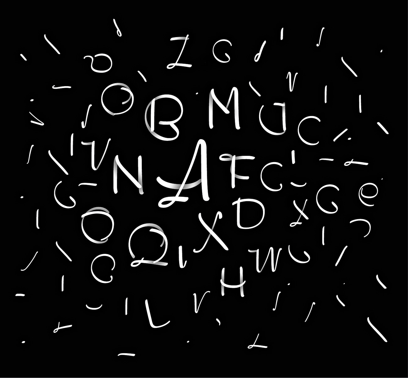
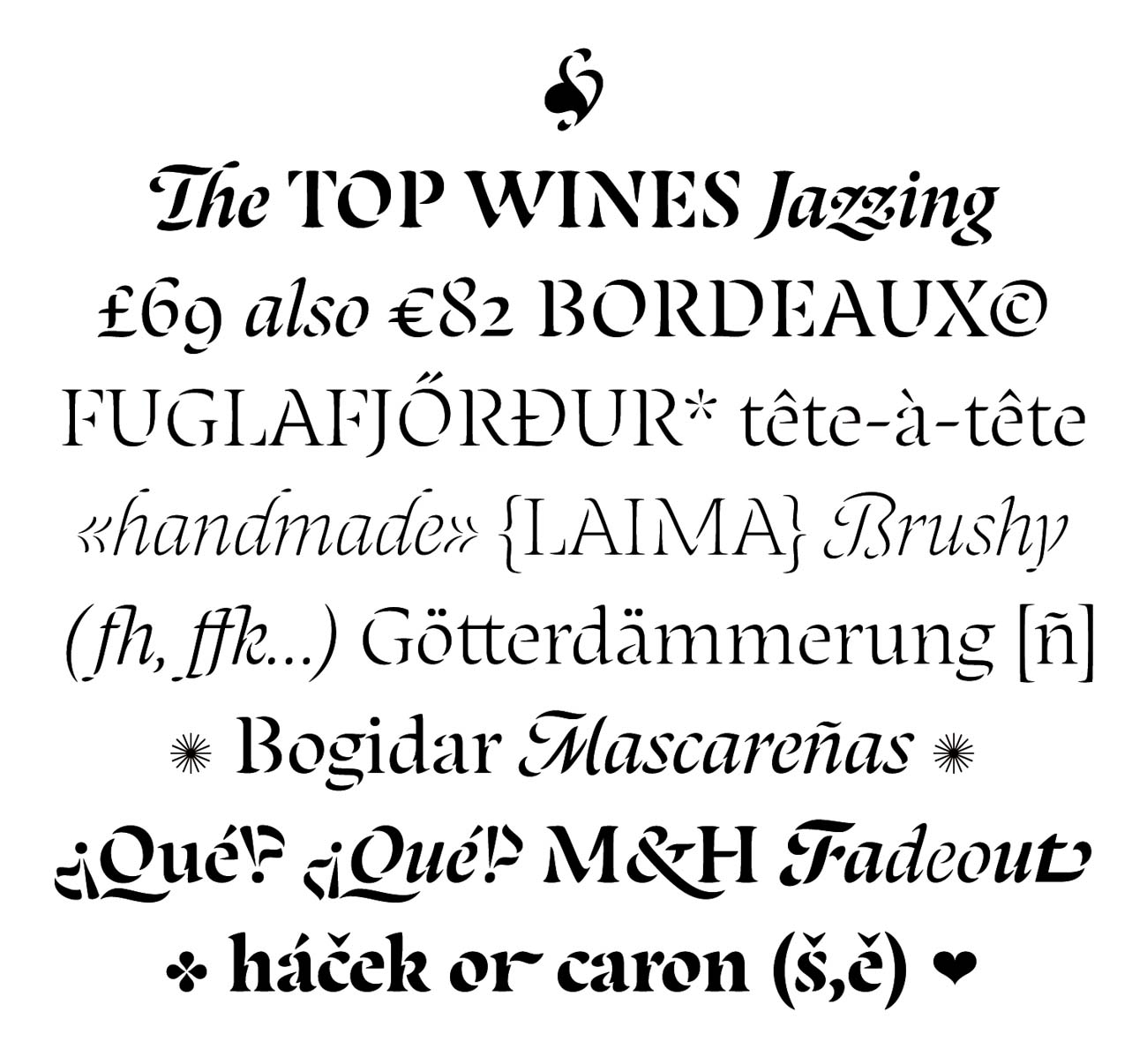
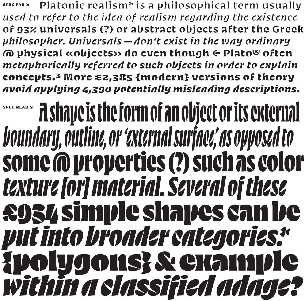
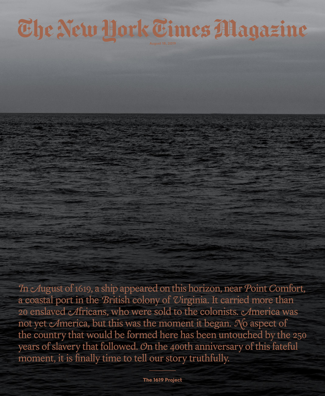
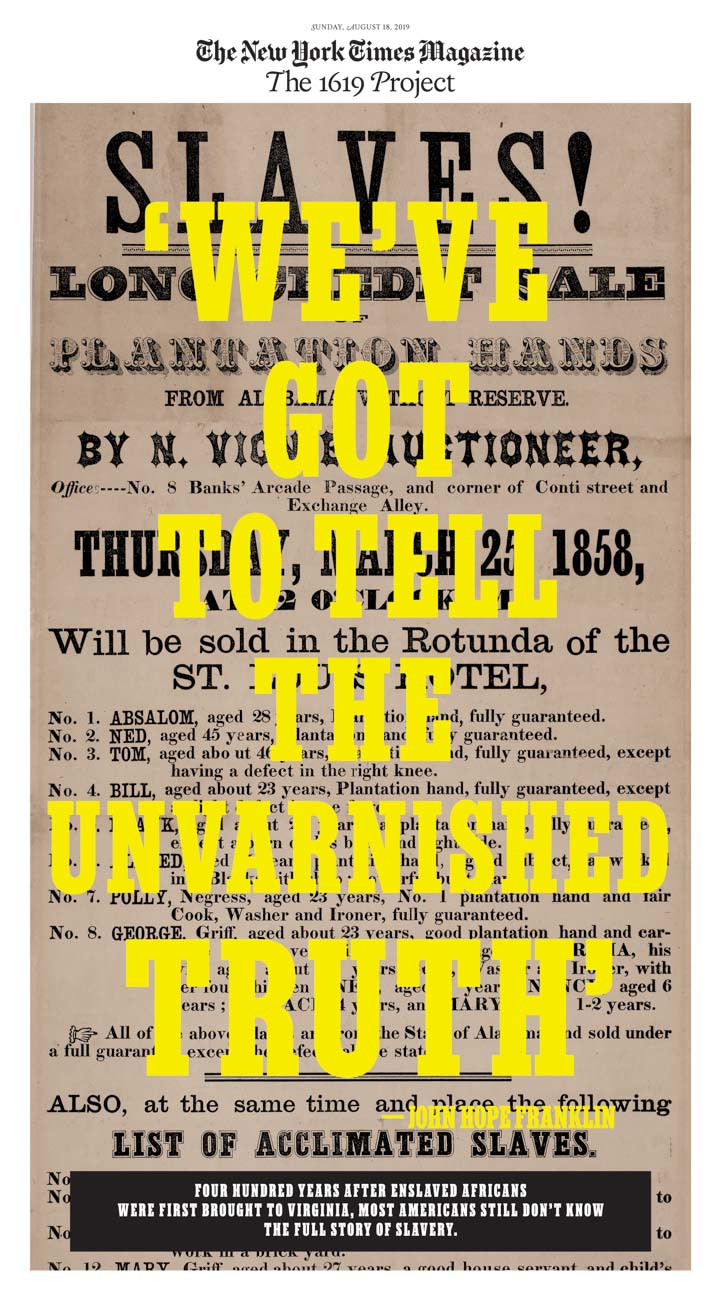
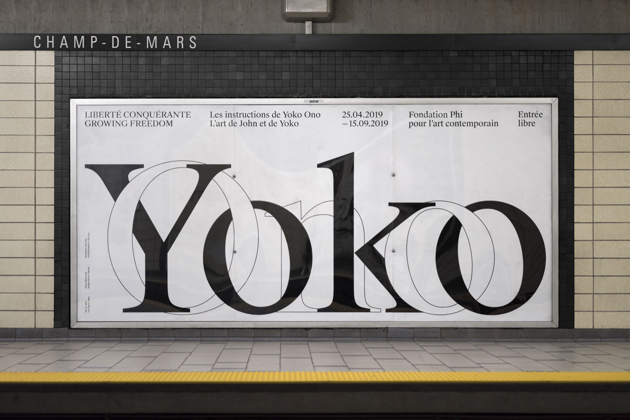
Almost is a typeface between gothic and roman. It was designed by Jérôme Knebusch in five weights and many alternates. They can be endlessly combined, taking either a roman or gothic direction, without falling in a strong, broken script nor becoming a “pure” roman design. Above, uncialesque and bizarre (Byzantine) letterforms and a full set of initials complete the fonts. All take their inspiration in the fifteenth century, specifically in the period of 1459–1482 with Gotico-Antiqua typefaces, like the Durandus of Fust & Schöffer, the first type to present a humanistic tendency. A few years later, Sweynheim & Pannartz used a type in Subiaco that some consider to be the first roman, although gothic influences remain clearly visible. Roman type was finally defined in 1469–1470 in Venice by the de Spira brothers and Nicolas Jenson. But roman did not precipitate the death of gothic forms; mixtures of gothic and roman were tried out and the two coexisted for some time. Almost is an homage to these types, which represent a unique, transitory moment in history of typography.


