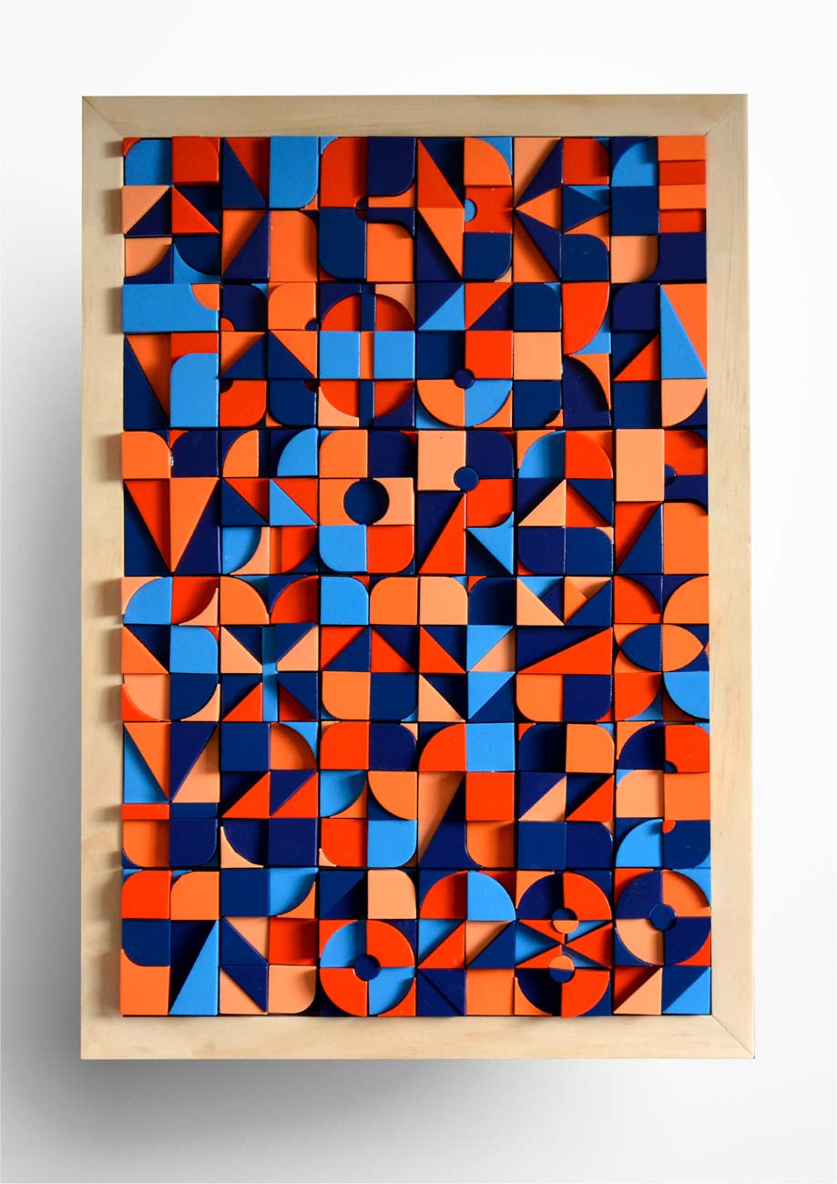
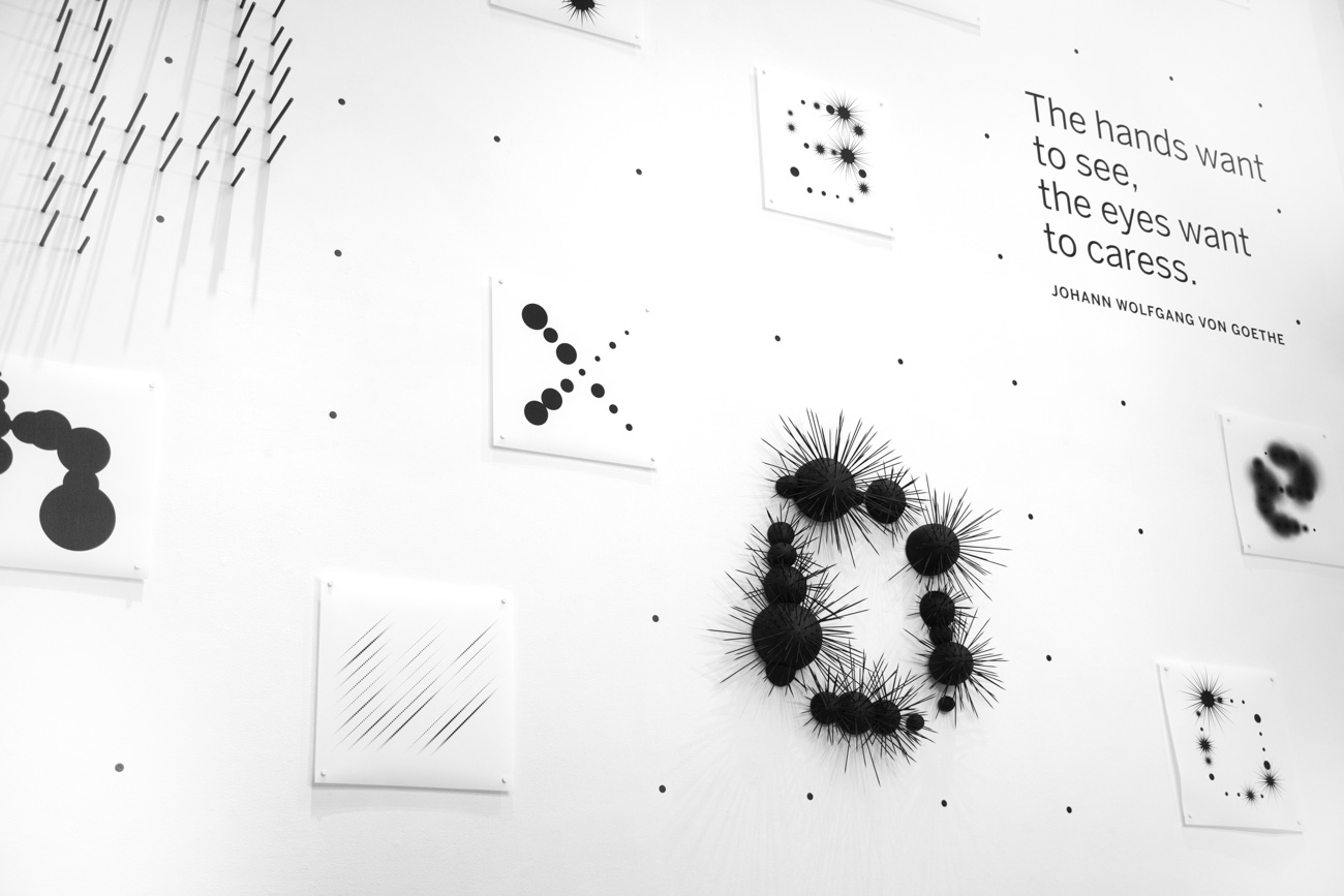
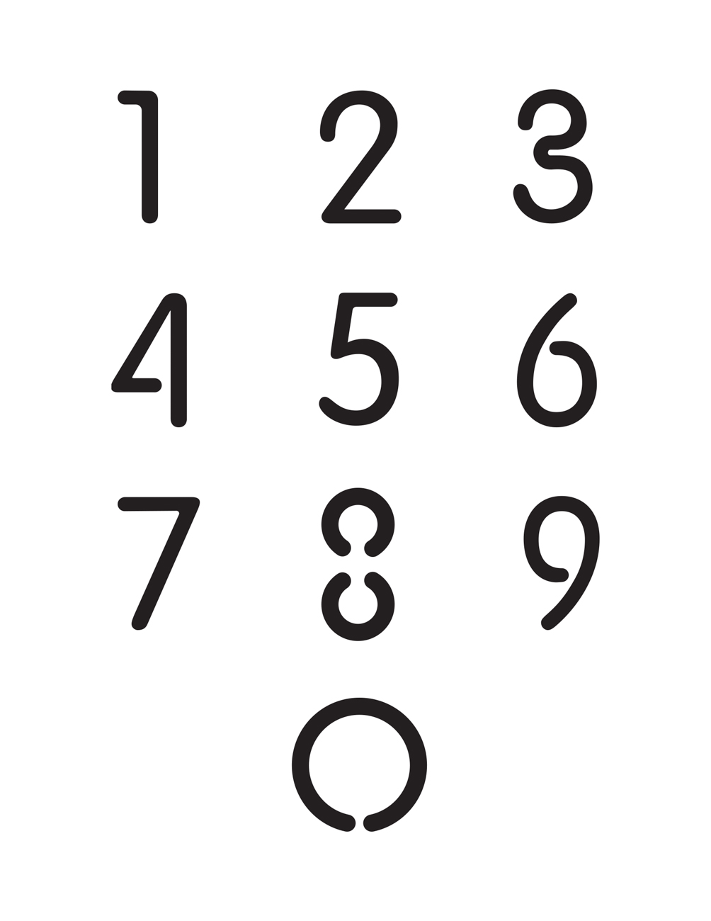
type directors club - exposition typographique internationale - 15 mars > 26 avril - type directors club - exposition typographique internationale - 15 mars > 26 avril - type directors club - exposition typographique internationale - 15 mars > 26 avril -
retour catégorie page accueil TDC Type Directors Club

Tangible Type

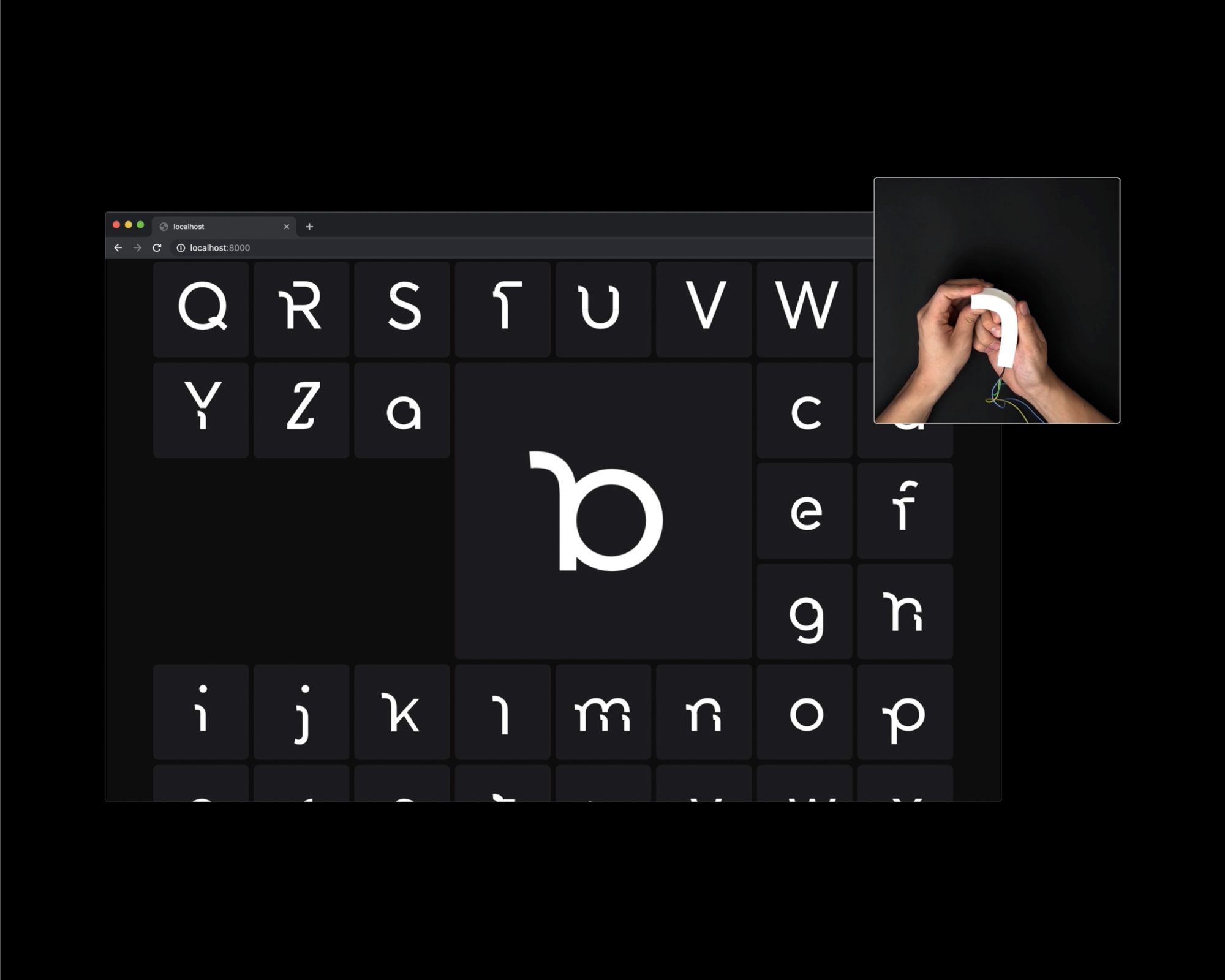
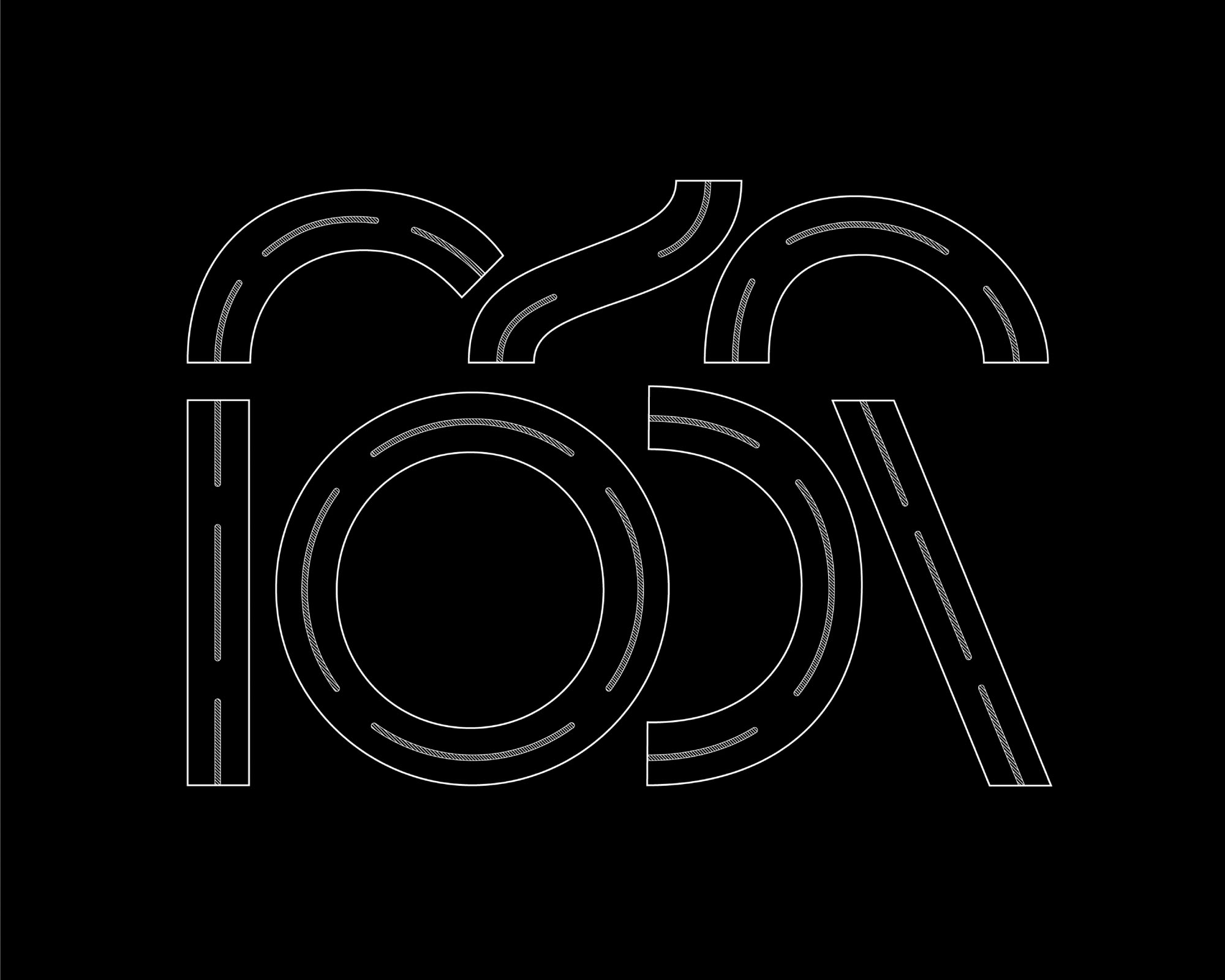
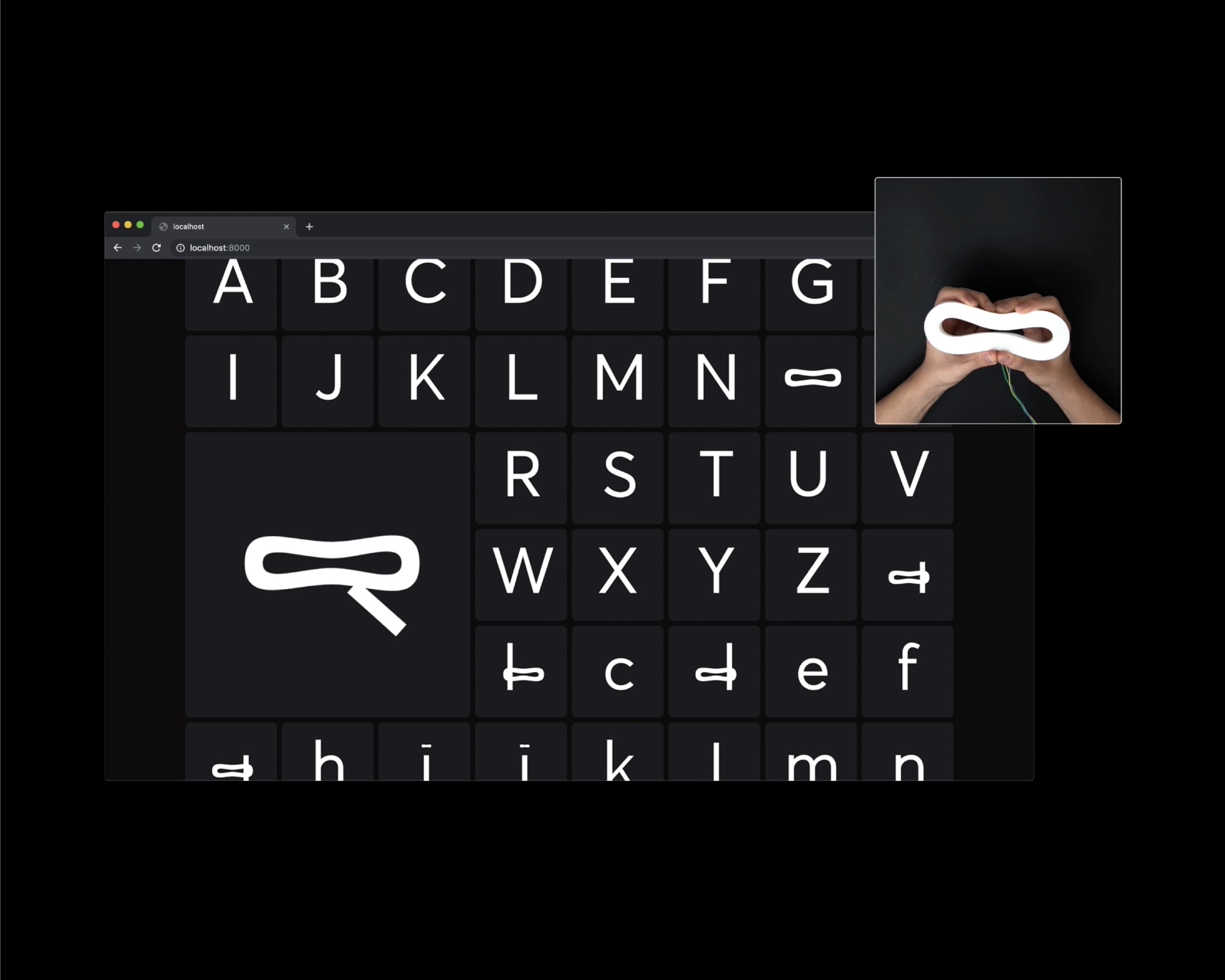
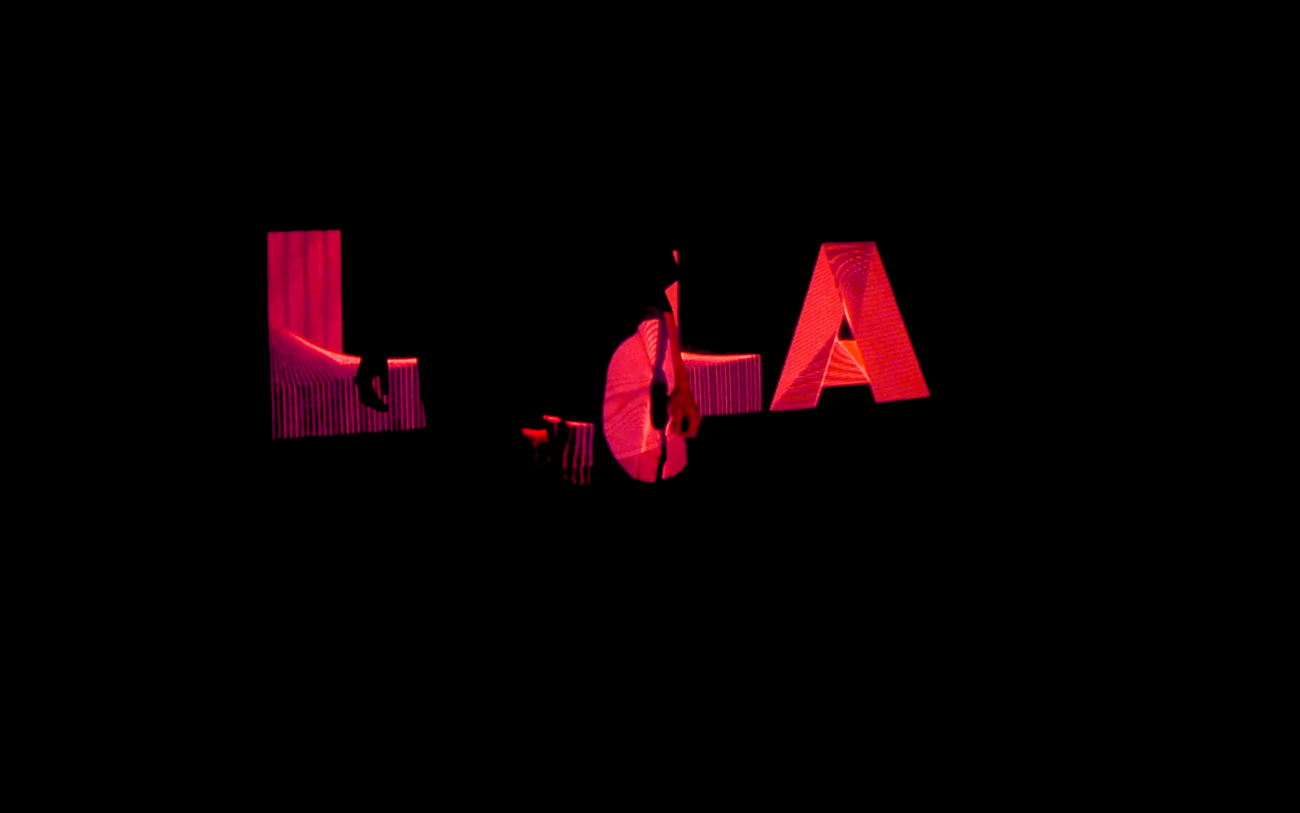
This is an experimental and interactive set of type components that enables users to bring physical gestures into the whole letter set. Each component was found by breaking and tweaking the typeface Avenir into seven essential letter parts: Stroke, Diagonal, Counter, U shape, Shoulder, Terminal, and Spine. Utilizing bidirectional flex sensors and silicone controllers, the project explores the boundary between the physical and digital space, which enables more intuitive typographic interaction.

Tangible Type TDC ECV

Design
Hyeong Geun Song
Providence, Rhode Island

URL
hnrysng.com

Advisors
Cem Eskinazi
Hammett Nurosi

School
Rhode Island School of Design

Principal Type
Avenir

Dimensions
Various

Voir aussi dans la même catégorie

retour catégorie page accueil TDC Type Directors Club

PORT Magazine “Der CONTENT ist der CONTENT”

The PORT is an annually published student magazine with a changing main topic. Projects from all faculties are showcased. It was particularly important to us in 2019 to counter the lack of exhibition space at our university while questioning the magazine’s ability to be an exhibition or (even) an archive. We felt that the depicted works should be shown as authentically as possible so as to offer genuine insight into the projects that is not overshadowed by the design of the magazine itself. In order to represent the varied works from different fields, we worked with the Artivive app. This augmented reality feature enabled us to digitally expand the analog, two-dimensional medium and made it multidimensional to reflect the character of every project in a more vivid way.

PORT Magazine “Der CONTENT ist der CONTENT”

Design
Carla Baumeister
Antonia Dieti
Coco Lobinger
Weimar, Germany

Professor
Ricarda Löser

School
Bauhaus-Universität Weimar

Principal Type
Neue Haas Unica
Neue Machina

Dimensions
9.5 x 13 in.
(24 x 33 cm)

Voir aussi dans la même catégorie

retour catégorie page accueil TDC Type Directors Club

A Simulacra of Place

How does architecture reflect the process of a country’s urbanization? How does urbanization influence the development of architecture? With these two questions, in the special case of China, this book will observe and discuss an abnormal architectural phenomenon—the “duplitecture” phenomenon in which entire townships appear to have been airlifted from their historic and geographic foundations in Europe and the Americas and spot-welded to Chinese cities. This phenomenon will then be utilized as a magnifying lens to reflect the process of urbanization in the New China and to question the future of the “Chinese Dream.”

Design
Sunny Tianqing Li
Pasadena, California

URL
sunnyli.design

Instructor
Brad Bartlett

School
ArtCenter College of Design

Principal Type
Founders Grotesk
SangBleu Kingdom

Dimensions
8 x 10 in.
(20.3 x 25.4 cm)

Voir aussi dans la même catégorie

retour catégorie page accueil TDC Type Directors Club

Intangible Cultural Heritage

Culture comes from a group of humans, and at the core of every human is their consciousness. Through our consciousness as humans, we perceive the world through sensation and our experience defines who we are and where we belong to. Therefore, I introduce shapes that evoke that sensation and five categories that define intangible culture into the visual system of Intangible Cultural Heritage (ICH). The selected shapes are driven from the visual language that originally appears on ancient pottery. The dynamic visual identity of this project breaks the stereotypical image of the current out-of-date model. This sends a new message to the public that ICH will adopt the most advanced technology to document intangible culture from all aspects. With a dynamic typeface and ever-changing logo, the visual identity system is representative of the way various cultures change, evolve, and mix together.

Design
Jiayu Ma
Pasadena, California

Instructor
Brad Bartlett

School
ArtCenter College of Design

Principal Type
Intangible Sans

Dimensions
24 in x 36 in.
(61 x 91.4 cm)

Voir aussi dans la même catégorie

retour catégorie page accueil TDC Type Directors Club

(TITLE) NON-PLACE

(TITLE) NON-PLACE is based on the theory of non-places, coined by the French anthropologist Marc Augé. The idea behind the book was that places and non-places exist—there isn’t a space that can be just a “place” or a “non-place.” The book is divided into two sections: the “physical non-place” and the “digital non-place,” showing places and non-places coexisting in the physical and digital space. Typefaces, colors, and other design decisions were deliberately made to reflect the loss of identity in a non-place.

Design
Heena Chung
Los Angeles

URL
heenachung.info

Instagram
@heena.chung

Instructor
Brad Bartlett

School
ArtCenter College of Design

Principal Type
Neue Haas Grotesk
Untitled Serif

Dimensions
7 x 10 in.
(17.8 x 25.4 cm)

Voir aussi dans la même catégorie

retour catégorie page accueil TDC Type Directors Club

Tippet Rise Art Center Rebrand

Tippet Rise Art Center is an intersection where art, music, land, sky, and poetry can weave together into an algorithm that is greater than the sum of its parts. Music isn’t about notes any more than poetry is about words. Notes and words and the angles of a sculpture are just the shadows of the essences that hide behind them. Every landscape is a work of the mind shaped by the memories and obsessions of its observers. With Tippet Rise, I am hoping to provide a branding on the land where these transfers of energy and knowledge can take place. Typeface Designer: Kenneth Kuh.

Design
Kenneth Kuh
Pasadena, California

URL
kennethkuh.info

Instructor
Brad Bartlett

School
ArtCenter College of Design

Principal Type
EarthLab Sans

Dimensions
24 x 36 in.
(60 x 91 cm)

Voir aussi dans la même catégorie

retour catégorie page accueil TDC Type Directors Club

Grundklasse Prof. Gerwin Schmidt 17/18

The neutral yet detailed design reflects the publication’s diverse content without distracting from it. To achieve the high quality that the subtle design requires, great care is taken with the selection of materials and techniques employed. Neobond is used for the dust jacket, Bristol card stock for the cover; both are screen printed. The wrapped color fabric indicates the content and connects everything. The other main design element is the typographic treatment.

Design
Oliver Haeusle
Stuttgart

Contributors
Book binding at book workshop
Katja Liebig, ABK Stuttgart

URL
oliverhae.com

Professors
Gerwin Schmidt
Patrick Thomas

School
State Academy of Art and Design, Stuttgart

Principal Type
Suisse Int’l
Suisse Works

Dimensions
5.8 x 8.3 in.
(14.8 x 21 cm)

Voir aussi dans la même catégorie

retour catégorie page accueil TDC Type Directors Club

Haruomi Hosono—Watering a Flower

The project was album packaging with a randomly assigned music genre and art movement; I was paired with Ambient and Brutalism. As a huge fan of ambient music, I didn’t think twice about designing the cover for the cult classic Watering a Flower by Haruomi Hosono, an odd and mysterious collection of two ambient tracks. Inspired by the hard-edged and raw aesthetics of Brutalist architecture, the project was interesting to design because it involves something rooted in nature. The two motifs on the back and front depict the Water(ing) and the Flower. The belly band features custom typography derived from these minimal motifs. Typeface Designers: Rohan Rege, David Jonathan Ross.

Design
Rohan Rege
New York

Instructors
Justin Colt
José Fresneda

School
School of Visual Arts, New York°

Principal Type
Roslindale
Custom

Dimensions
12.25 x 12.25 in.
(31.1 x 31.1 cm)

Voir aussi dans la même catégorie

retour catégorie page accueil TDC Type Directors Club

Bouncy Ball Competition

This was a series of posters for a bouncy ball competition.

Design
Elvira Akateva
Moscow

URL
elyaforelya.tumblr.com

Professor
Svyat Vishnyakov

School
Bang Bang Education

Principal Type
Druk
Stratos

Dimensions
33.1 x 23.4 in.
(59.4 x 84.1 cm)

Voir aussi dans la même catégorie

retour catégorie page accueil TDC Type Directors Club

Spector Books

Spector Press is settled squarely in the intersection of art, theory, and design. Based in Leipzig, Germany, this publisher explores the possibilities offered by an active exchange among all parties involved in the book production process: artists, authors, book designers, lithographers, printers, and bookbinders. The identity of the publisher was inspired by the idea of spectator. As a book publisher, Spector Press acts as a spectator in the intersection of art, theory, and design by capturing different perspectives. A circle of the letter “o” from “Spector” was used to emphasize the role of a spectator by simplifying the idea of spotlight.

Design
Yura Park°
San Francisco

URL
yurapark.com

Instructor
Brad Bartlett

School
ArtCenter College of Design

Principal Type
Sharp Grotesk

Dimensions
8.25 x 11 in.
(21 x 27.9 cm)

Voir aussi dans la même catégorie