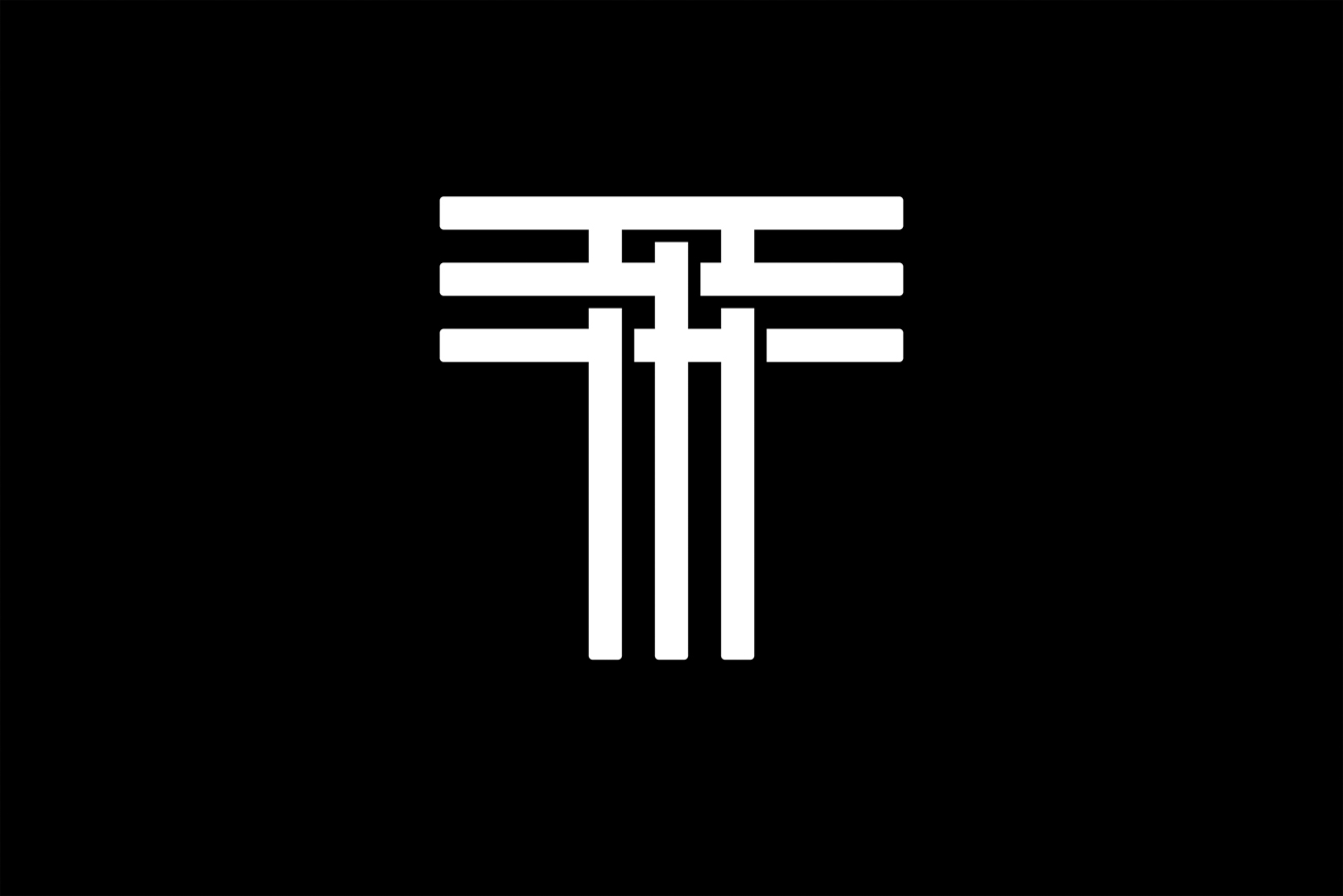
type directors club - exposition typographique internationale - 15 mars > 26 avril - type directors club - exposition typographique internationale - 15 mars > 26 avril - type directors club - exposition typographique internationale - 15 mars > 26 avril -
retour catégorie page accueil TDC Type Directors Club

Nea

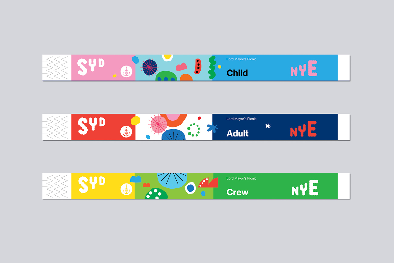
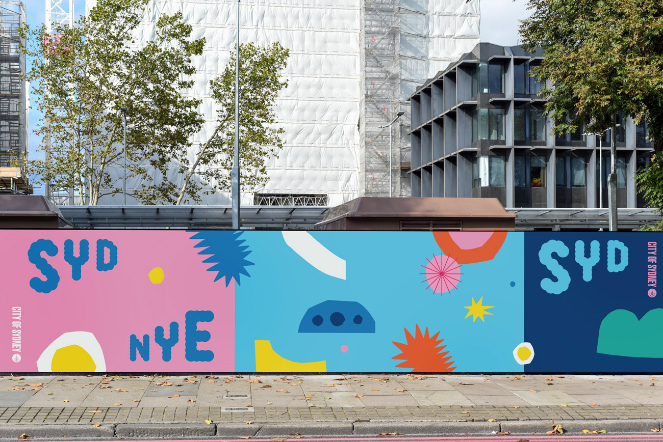
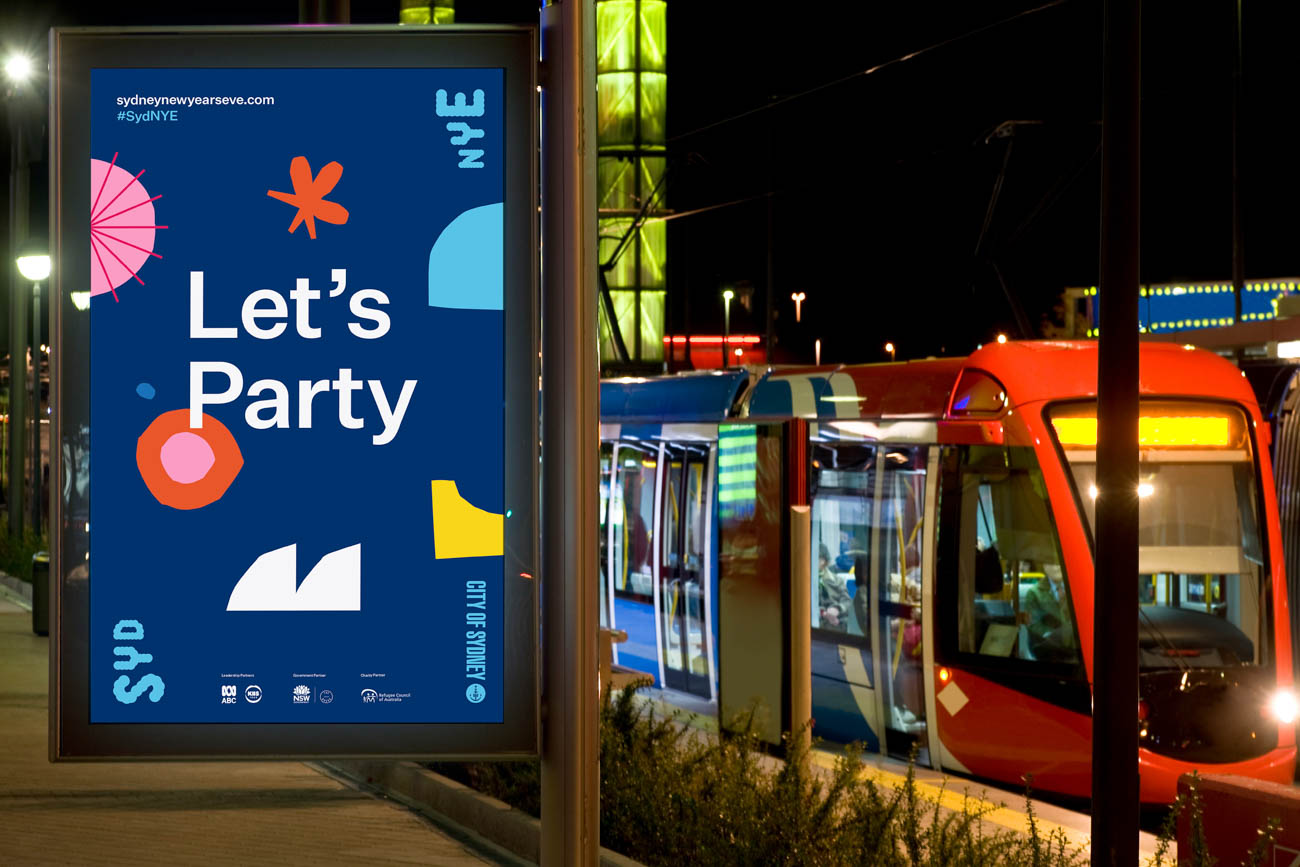
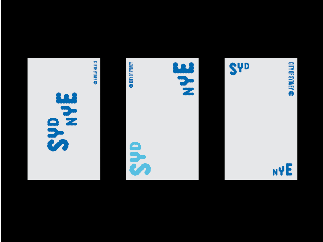
This is the visual identity for the newly signed artist Nea. Among the produced elements were a logo with custom bold letters, a tape logo system that can be applied to everything, everywhere (campaigns, merchandising, apparel…), as well as artwork design and music video titles for the first track, “Some Say,” released September 6, 2019.

Design
Gregory Page
Geneva

URL
pigment.ch

Instagram
@gregory_page_

Studio
Pigment

Client
Milkshake/Sony Music

Principal Type
Inferi

Dimensions
6.5 x 10 in.
(16.5 x 25.4 cm)

Voir aussi dans la même catégorie

retour catégorie page accueil TDC Type Directors Club

Fisher-Price

The refreshed identity created for Fisher-Price pays homage to the brand’s extraordinary heritage, retaining the personality and iconic elements their audiences grew up with, but modernizing them for today’s world. The original bright red “awning” shape evolved from four scallops to three, representative of the three original founders (one of them a woman, Helen Schelle, who was never recognized in the name). The typeface retained the quirky proprietary features of the original brand type, but was redrawn and modernized to feel cheerful, chubby, and slightly simplified. The hyphen in the logo also reflects the cheerful refresh, appearing as a smile.

Fisher-Price TDC ECV

Partner
Emily Oberman°

Associate Partners
Laura Berglund
Tim Cohan

Senior Designers
Mira Khandpur
Greg Morrison

Senior Project Manager
Lisa Grant

URL
pentagram.com

Design Firm
Pentagram Design

Typographic Support
Jeremy Mickel

Principal Type
Let’s Be Glyphs
Maax

Client
Fisher-Price
Chuck Scothon, Senior Vice President and General Manager
Joel Smith, Vice President, Brand Creative
Kelly Biernat, Senior Manager Global Brand Marketing
Jody Gavin, Manager Global Brand Marketing


Voir aussi dans la même catégorie

retour catégorie page accueil TDC Type Directors Club

Wendy Murray Poster Artist

The logo was originally designed as a book cover. A Sydney-based street poster artist moving from Sydney to L.A. commissioned a book to showcase her posters and help launch her career in the United States. A typographical device was designed using the artist’s initials, WM, as the principal typeface. This created a strong, graphic narrative illustrating the artist’s evolution and journey. It has a feeling of movement and progression.

Design
Kristian Molloy
Sydney

URL
kristianmolloy.com

Twitter
@KristianMolloy

Design Firm
KRISTIAN

Client
Wendy Murray

Principal Type
Hand-drawn

Voir aussi dans la même catégorie

retour catégorie page accueil TDC Type Directors Club

Geam—Grupo de Estudos Amazônicos e Ambientais (Amazon and Environmental Studies Group)

The study group focuses on the production of knowledge about traditional populations and ethnic emergencies involving remnant quilombo communities and indigenous peoples in the Amazon. The logo was inspired by graphic elements present in indigenous art, as well as the cuts made in rubber trees to obtain latex.

Design
Thiago Lacaz
Rio de Janeiro

Assistant Designer
Leonardo de Vasconcelos

Graphic Production
Lilia Góes

URL
thiagolacaz.com

Instagram
@tlacaz

Client
Graduate Program in Anthropology
Fluminense Federal University

Principal Type
Euclid Triangle

Voir aussi dans la même catégorie

retour catégorie page accueil TDC Type Directors Club

Sydney New Year’s Eve Logo

New Year’s Eve celebrations are Sydney’s flagship event. The letters in “SYDNEY” offered a unique opportunity for a double-take “surprise and delight” moment. By swapping the Y and E, we could create “SYDNYE”—incorporating the acronym for New Year’s Eve. The dynamic typography of the logo alludes to the year coming to an end and the coming new year through the scaling letterforms. The logotype is designed to be used in several orientations: horizontal, stacked, and split up and used as a framing device on communications material such as posters, printed material, and digital media.

Sydney New Year’s Eve Logo TDC ECV

Design
Danielle de Andrade
Paul Garbett
Sydney

URL
garbett.com.au

Twitter
@garbettdesign

Design Firm
Garbett

Client
City of Sydney

Principal Type
Custom

Voir aussi dans la même catégorie

retour catégorie page accueil TDC Type Directors Club

Play & Pray

Play & Pray is a preaching platform in which users play strategic games. This is not a “from top to bottom” type of gospel sharing; it’s actually a transformation journey. Play for fun, but behind it all, seeking eternal joy is the ultimate goal. The logotype has fun with the letters “l” and “r” in the words “play” and “pray,” so that “pray” hides behind “play” through an upward gradational transformation. The logotype uses AG Stencil, a sans serif rounded stencil font, which is playful yet stable and easily acceptable; moreover, stencil-type fonts are often used in military applications, which matched well with the client’s business.

Design Direction
Andrew Tang
Hong Kong

URL
jamfactory.org

Design Studio
Jamfactory

Client
Play & Pray

Principal Type
AG Stencil

Voir aussi dans la même catégorie

retour catégorie page accueil TDC Type Directors Club

egy.

The dynamic, animated logo was designed for a Hungarian media platform. The ever-changing appearance signifies that although we are different, and different themes are in focus, we are all one.

egy. TDC ECV
egy. TDC ECV
egy. TDC ECV

Design
Anna Farkas
Budapest

URL
anagraphic.hu

Design Firm
Anagraphic

Client
Stratcomm

Principal Type
Orelo

Voir aussi dans la même catégorie

retour catégorie page accueil TDC Type Directors Club

Textile

The logo was created in celebration of the forty-fifth anniversary of the Icelandic Textile Association. It references textile art and stands for the unity of the distinctive members of the textile association.

Design
Einar Gylfason
Reykjavík, Iceland

URL
leynivopnid.is

Twitter
@EinarGylfa

Design Firm
Leynivopnið

Client
Icelandic Textile Association

Principal Type
Custom

Voir aussi dans la même catégorie

retour catégorie page accueil TDC Type Directors Club

Ding and Dong

This is a logo for Ding and Dong, an electrical installation service. The D is buzzing with energy and good vibrations.

URL
leynivopnid.is

Twitter
@EinarGylfa

Design Firm
Leynivopnið

Design
Einar Gylfason
Reykjavík, Iceland

Client
Ding and Dong

Principal Type
Custom

Voir aussi dans la même catégorie

retour catégorie page accueil TDC Type Directors Club

Proto Proto—Prototyping New Aesthetics

Proto Proto is a platform celebrating diversity through design and objects. Together with talented craftspeople and designers from around the globe, they create unique, handmade items that will make you smile and shine. Proto Proto is a progressive company, looking to pave the way for new visual expressions within world culture. The brief was to position Proto Proto as a friendly company that challenges conventional aesthetics and then model how things are produced, speaking to open-minded design consumers. The result: eight variations of a logotype, created from glyphs from thirty-two different alphabets.

Design
Fibi Kung
Stockholm

Creative Direction
Perniclas Bedow
Anders Bollman

URL
bedow.se

Design Studio
Bedow

Voir aussi dans la même catégorie