type directors club - exposition typographique internationale - 15 mars > 26 avril - type directors club - exposition typographique internationale - 15 mars > 26 avril - type directors club - exposition typographique internationale - 15 mars > 26 avril -
retour catégorie page accueil TDC Type Directors Club
Fisher-Price TDC ECV

Fisher-Price

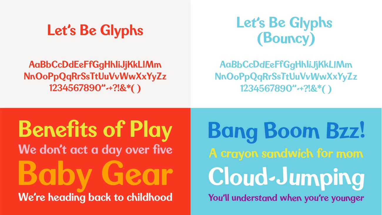
The refreshed identity created for Fisher-Price pays homage to the brand’s extraordinary heritage, retaining the personality and iconic elements their audiences grew up with, but modernizing them for today’s world. The original bright red “awning” shape evolved from four scallops to three, representative of the three original founders (one of them a woman, Helen Schelle, who was never recognized in the name). The typeface retained the quirky proprietary features of the original brand type, but was redrawn and modernized to feel cheerful, chubby, and slightly simplified. The hyphen in the logo also reflects the cheerful refresh, appearing as a smile.

Fisher-Price TDC ECV

Partner
Emily Oberman°

Associate Partners
Laura Berglund
Tim Cohan

Senior Designers
Mira Khandpur
Greg Morrison

Senior Project Manager
Lisa Grant

URL
pentagram.com

Design Firm
Pentagram Design

Typographic Support
Jeremy Mickel

Principal Type
Let’s Be Glyphs
Maax

Client
Fisher-Price
Chuck Scothon, Senior Vice President and General Manager
Joel Smith, Vice President, Brand Creative
Kelly Biernat, Senior Manager Global Brand Marketing
Jody Gavin, Manager Global Brand Marketing


Voir aussi dans la même catégorie